For Garufi's senior year capstone project, he took the lead for the S'23 of Halfmoon Clothing. His goal was to showcase his capability of heading the creative process from all aspects; designing, production, brand identity, photoshoots, commercials, final display, etc. All in a 3 month timeline.
find us on Instagram!
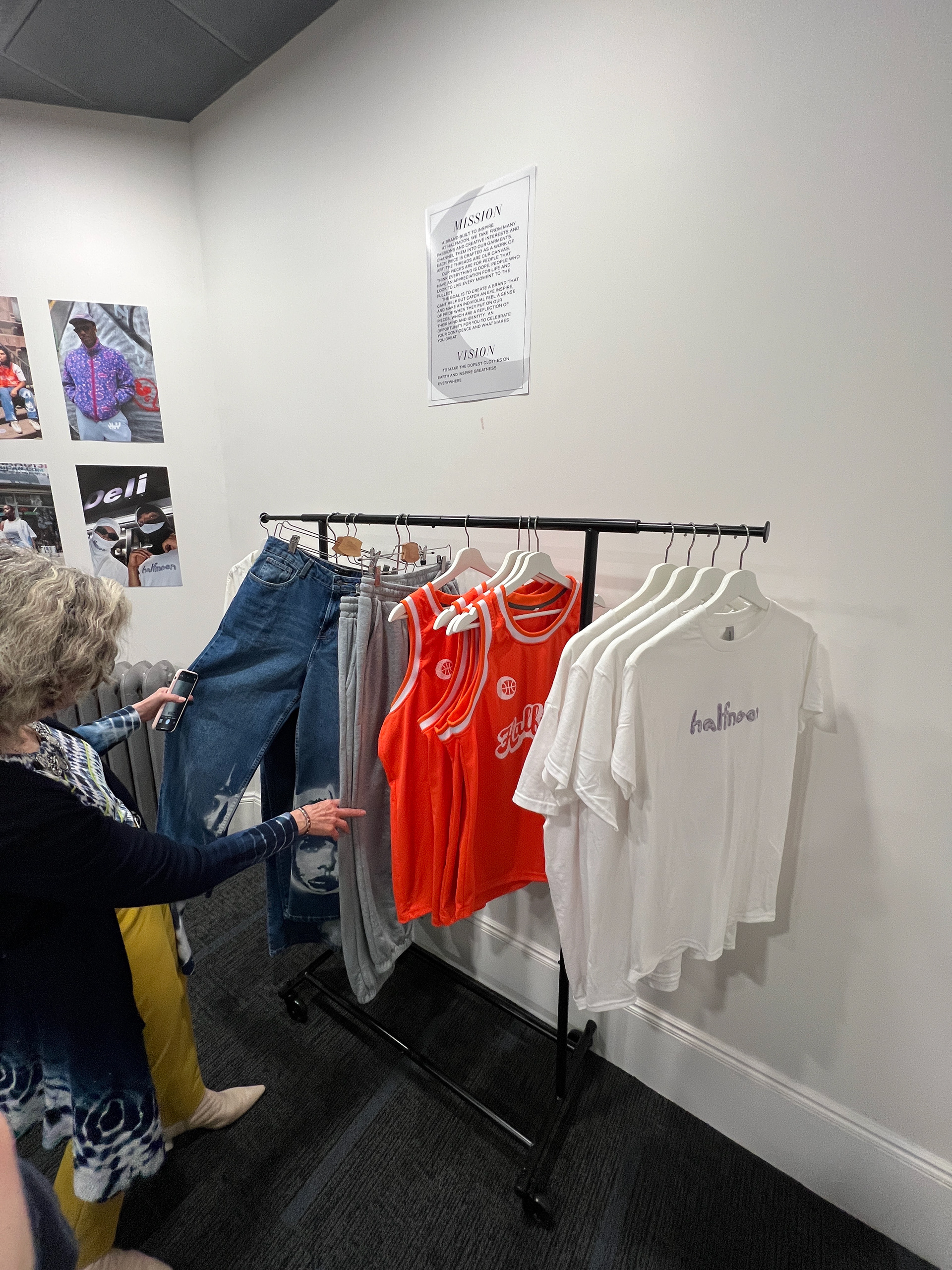
At Halfmoon Clothing, we take from a multitude of passions and creative interests and channel them into our garments. Each piece is crafted as a work of art; the threads are the canvas. Our pieces are for people that think everything is dope, people who have an appreciation for life and look to live every moment to the fullest.
The goal is to create clothes that can’t help but catch an eye, inspire, and make an individual feel a sense of pride in their pieces, which are a reflection of their mind and identity. An opportunity for you to celebrate your confidence and what makes you great.
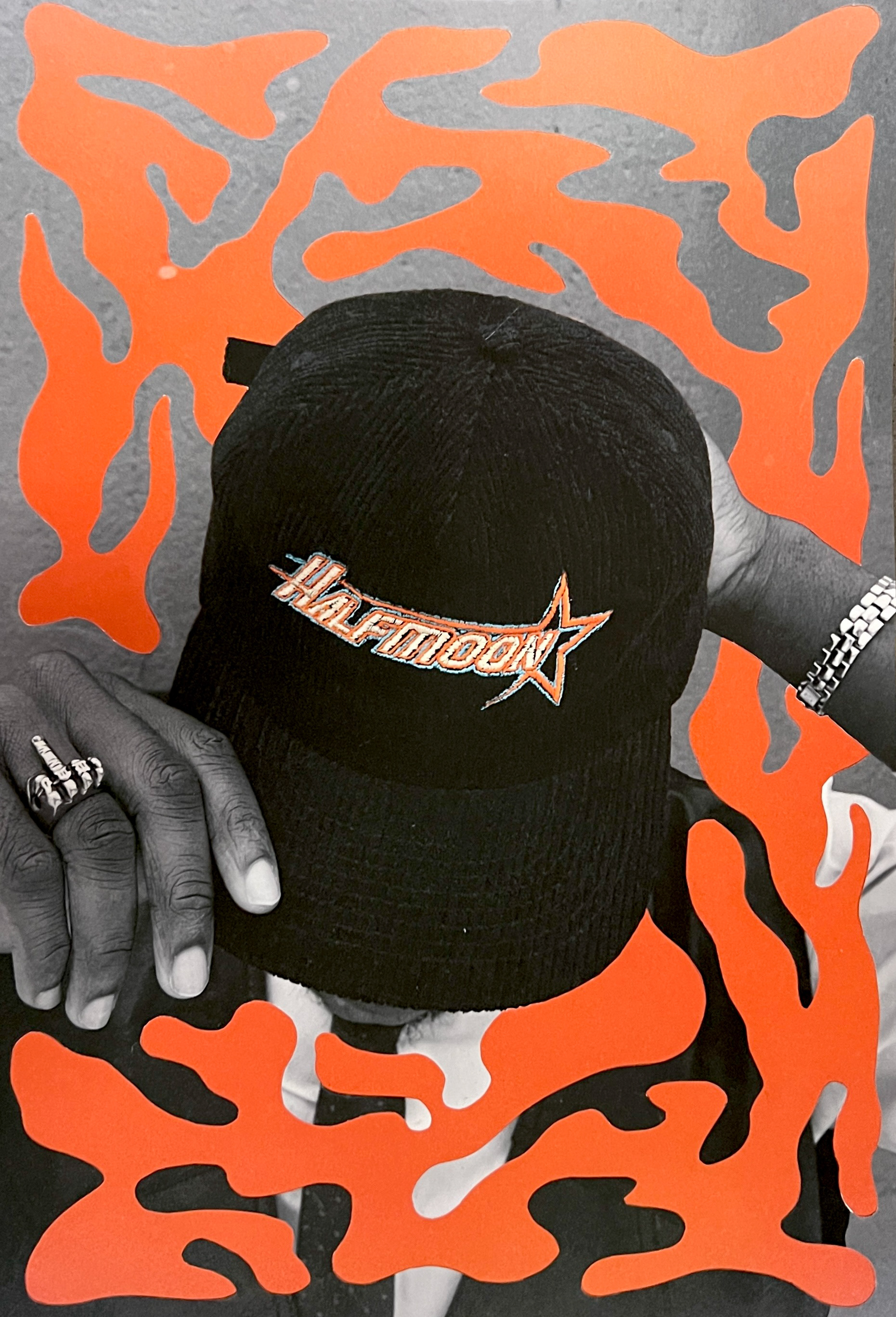
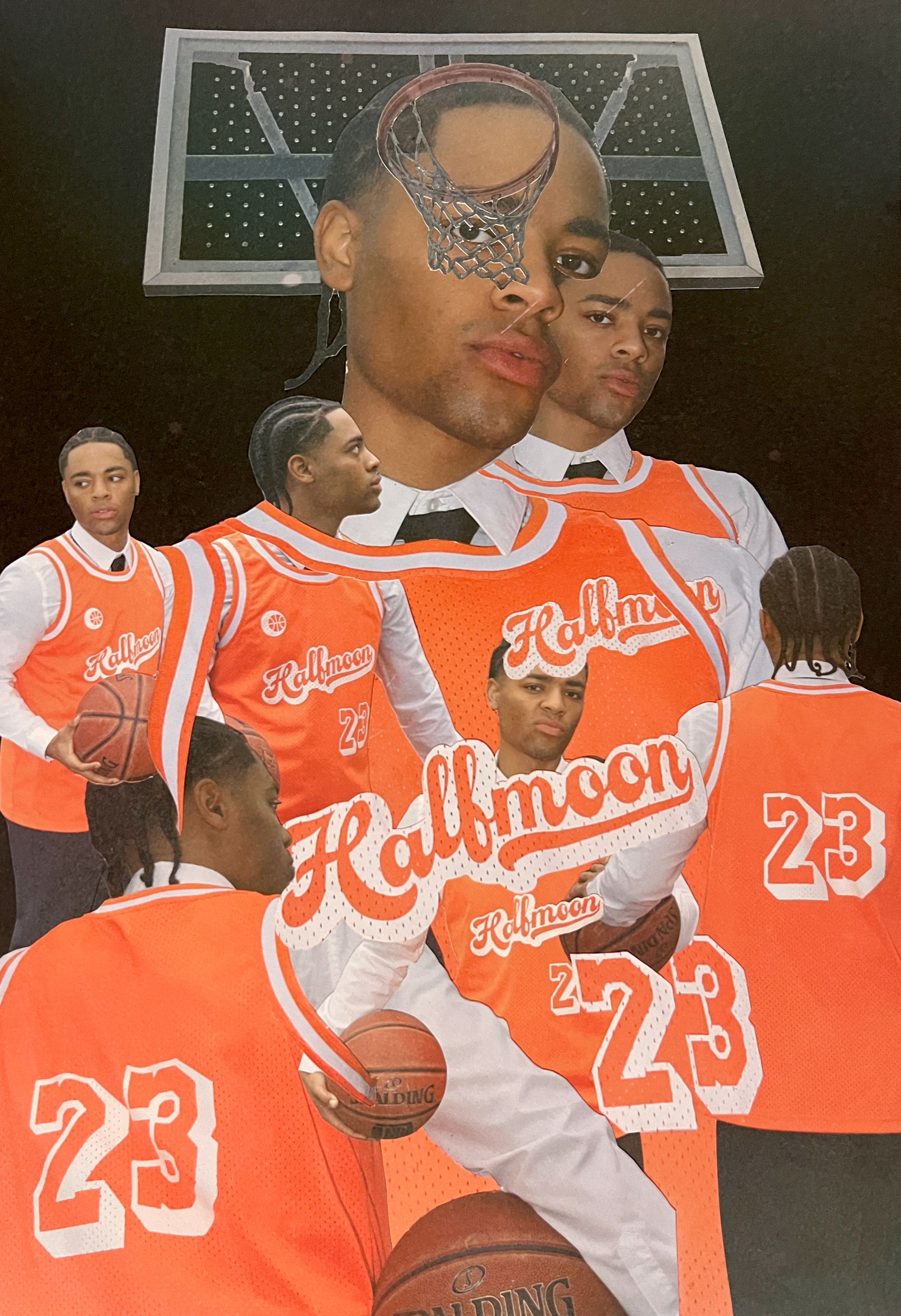
hand cut collages by Giovanni Garufi
S'23 Collection
(click on any image to enlarge)
S'23 Tee

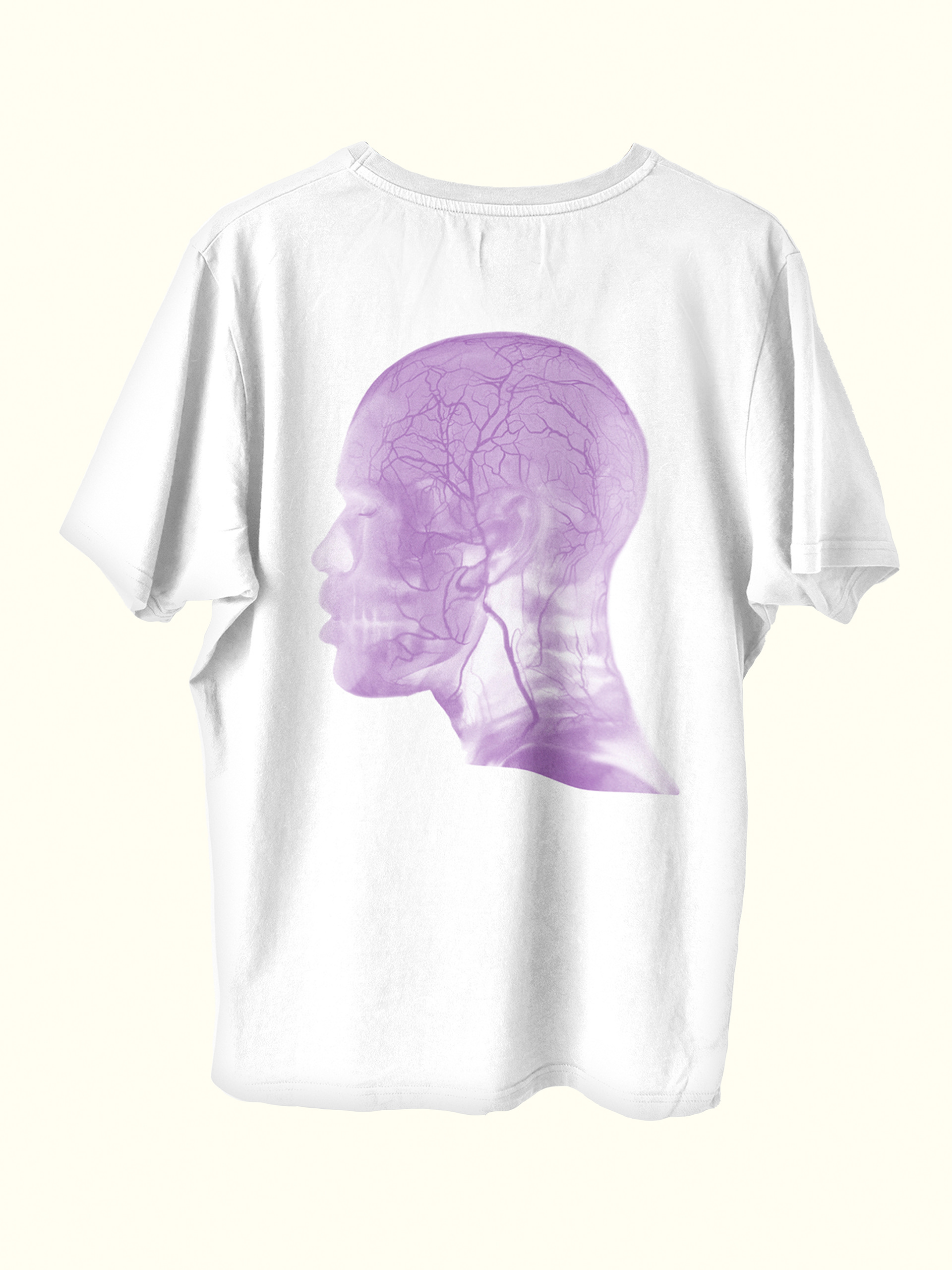

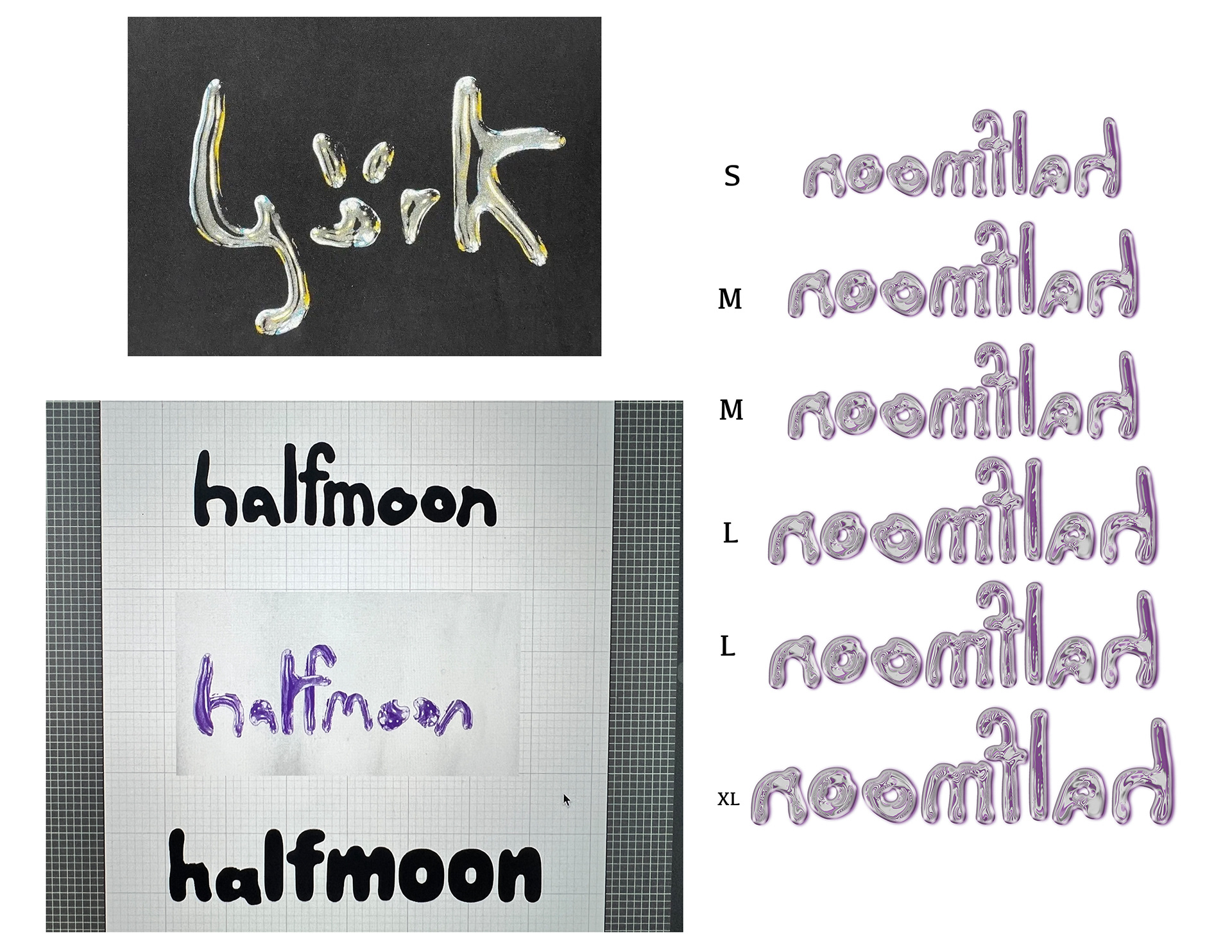

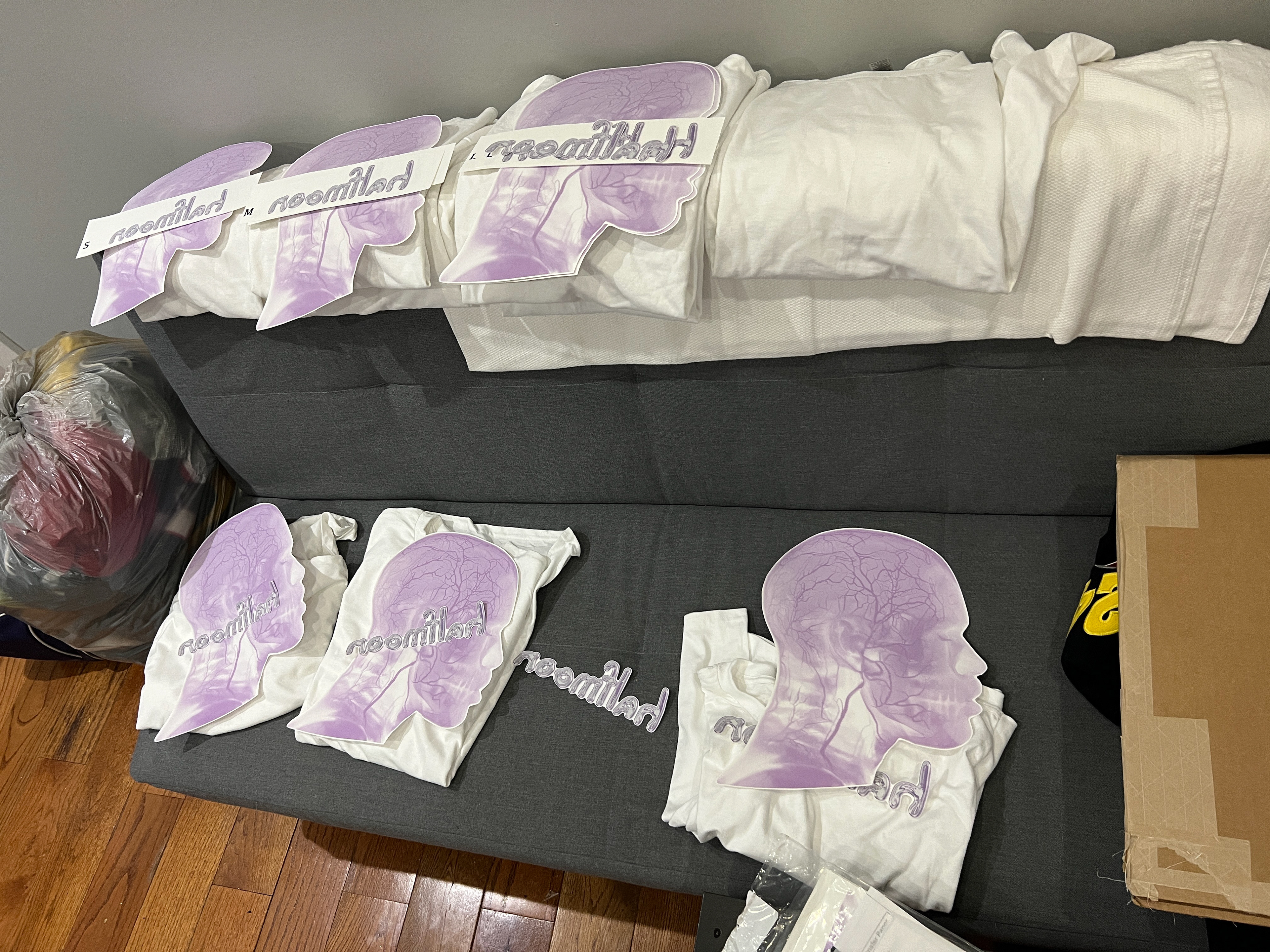
A blank white tee provides perhaps the best canvas to make a statement.
A big part of Giovanni's design process was utilizing design elements that have a timeless feel; designs that might look retro or futuristic, but nonetheless will stand the test of time.
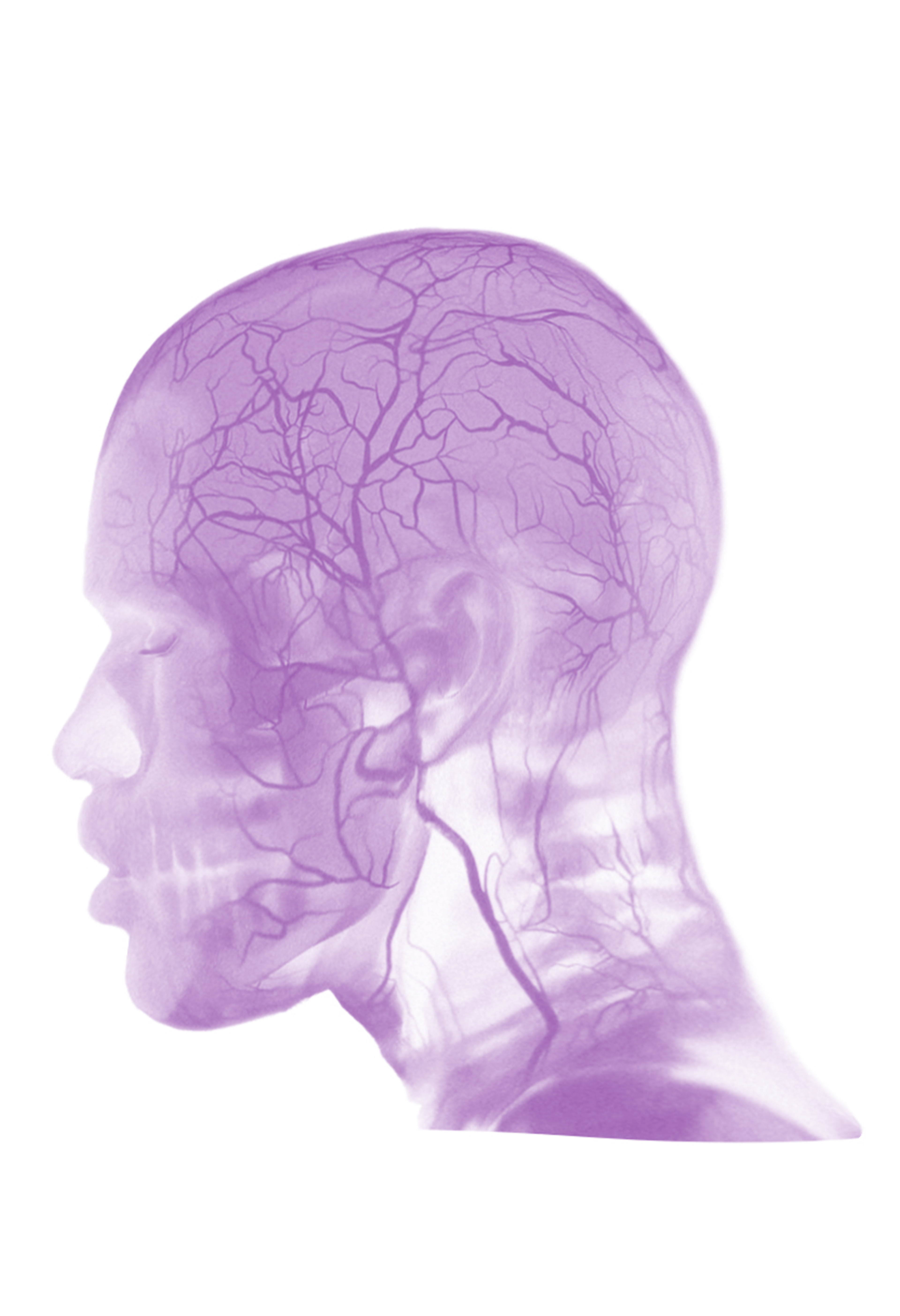
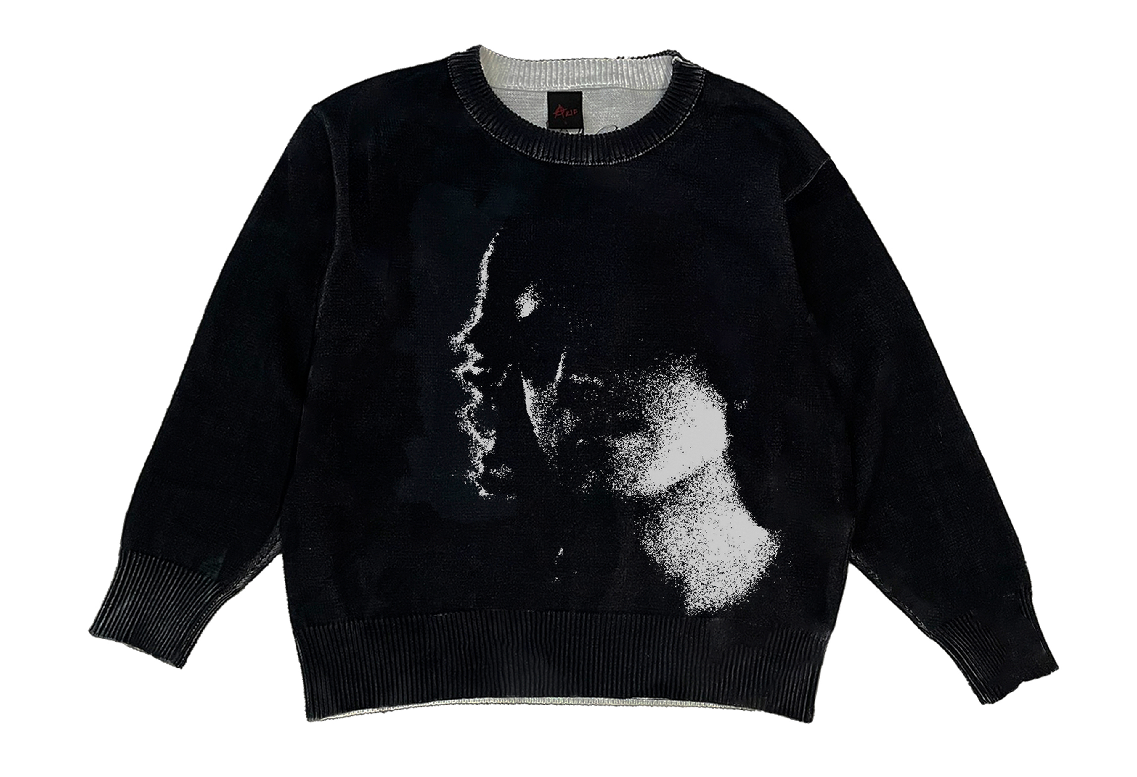
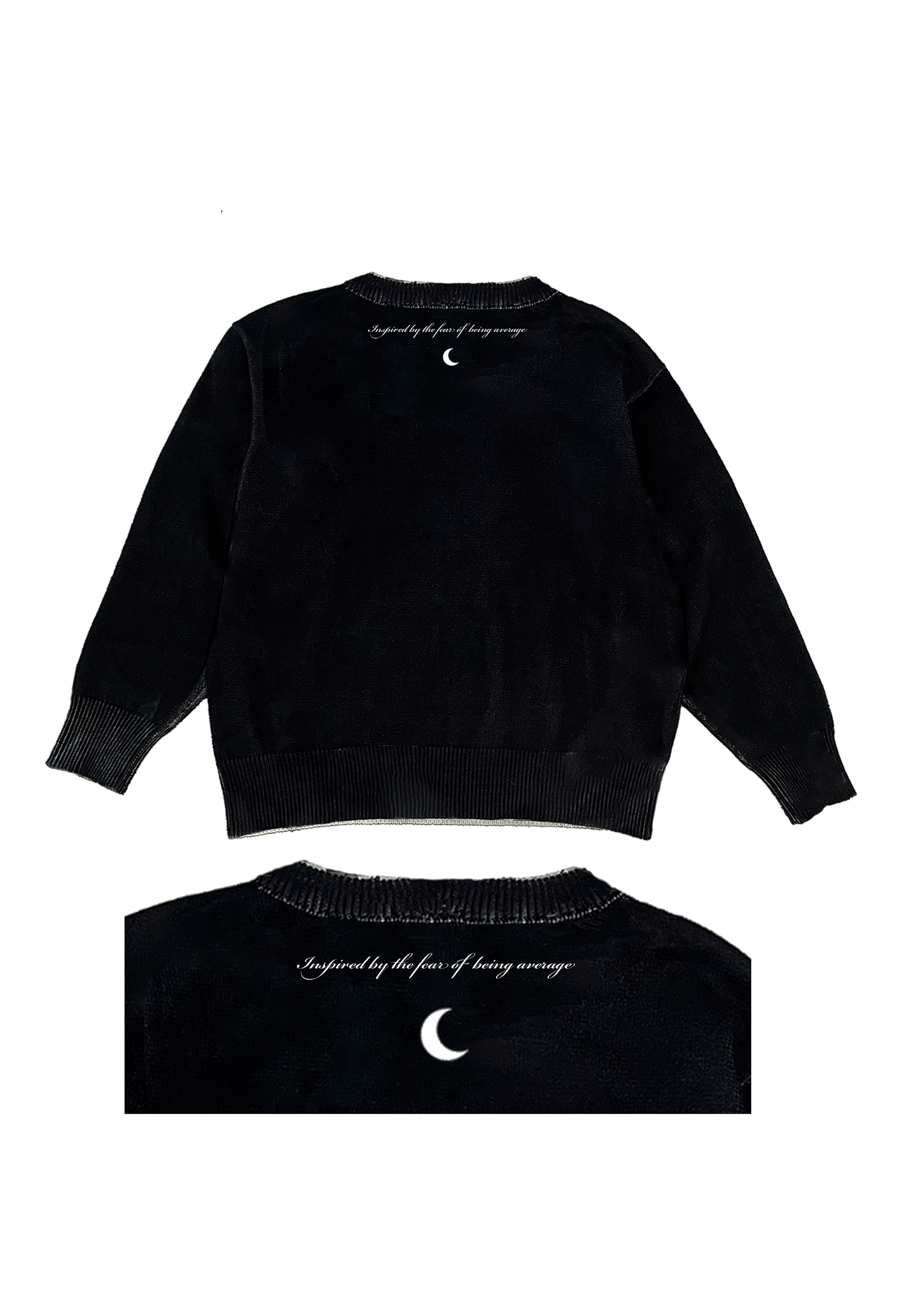
The metallic Halfmoon font was inspired by a 90's 'Bjork' tee, made in Illustrator and Photoshop, and the face silhouette on the back is an original artwork by Giovanni entitled Mental Frank, also made in Photoshop. The premise of the tee was to create a wearable work of art, that was captivating and exciting, and gave you a look into the creative minds that are Halfmoon Clothing.
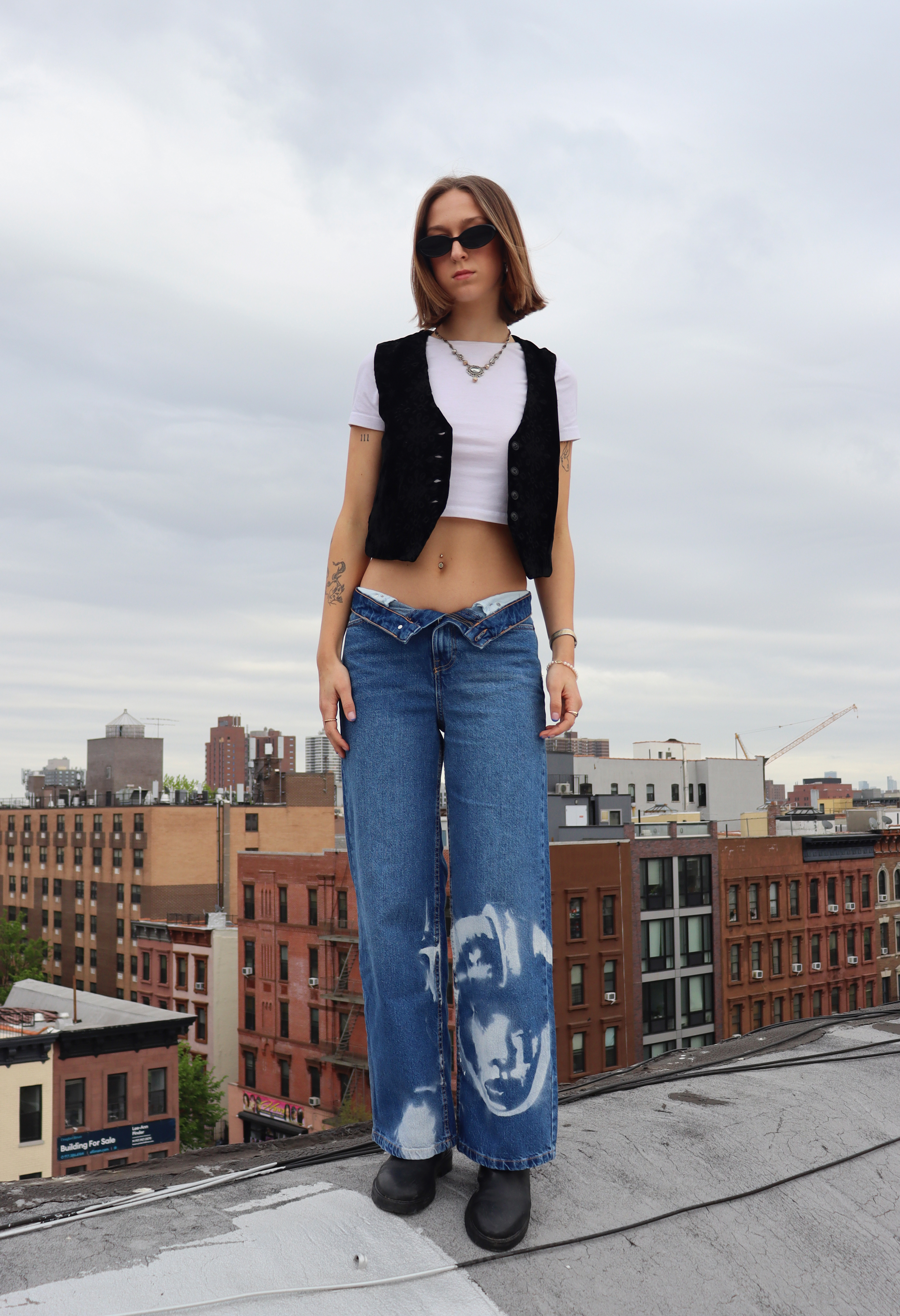
S'23 Spacegirl Denim

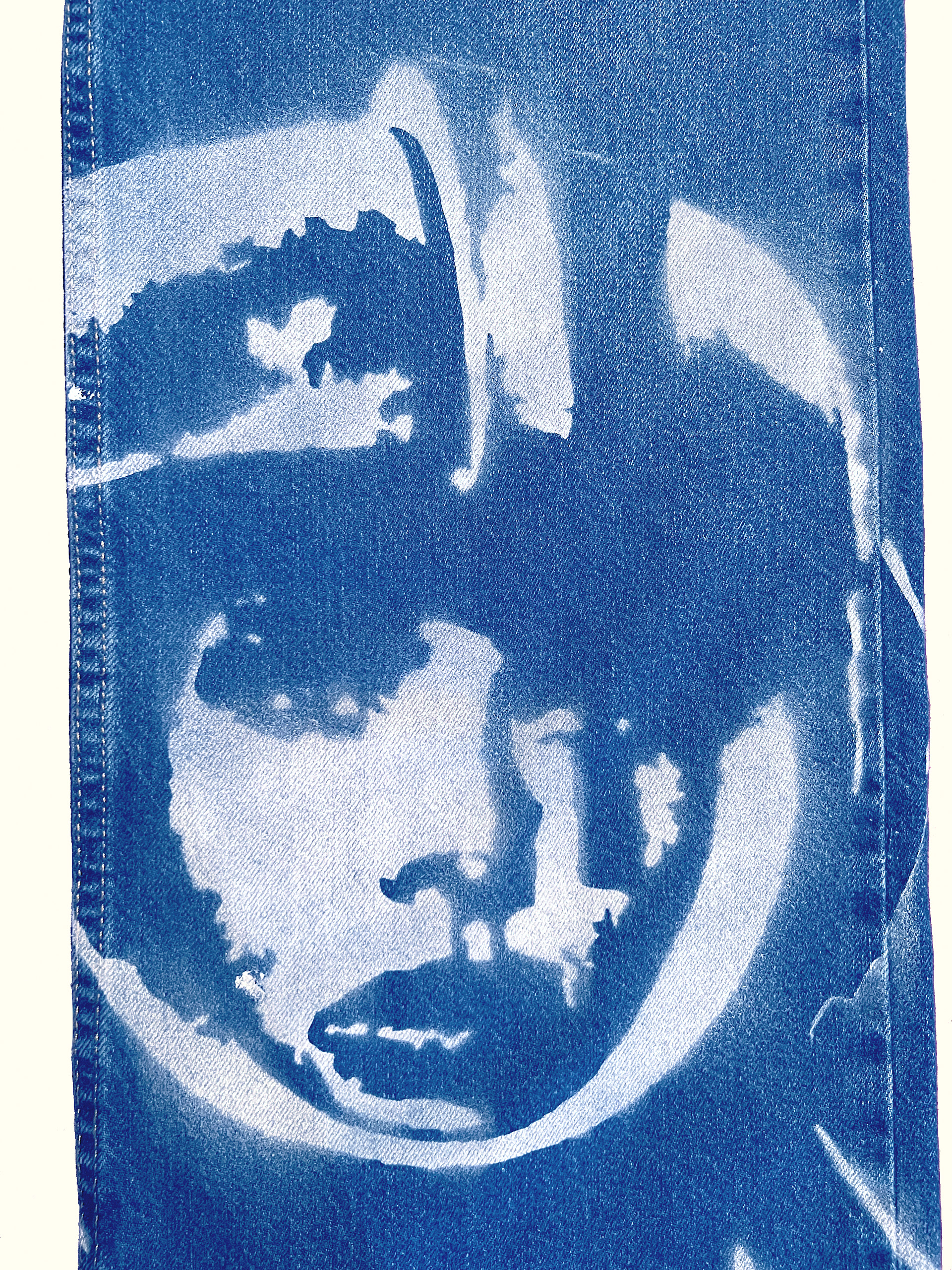
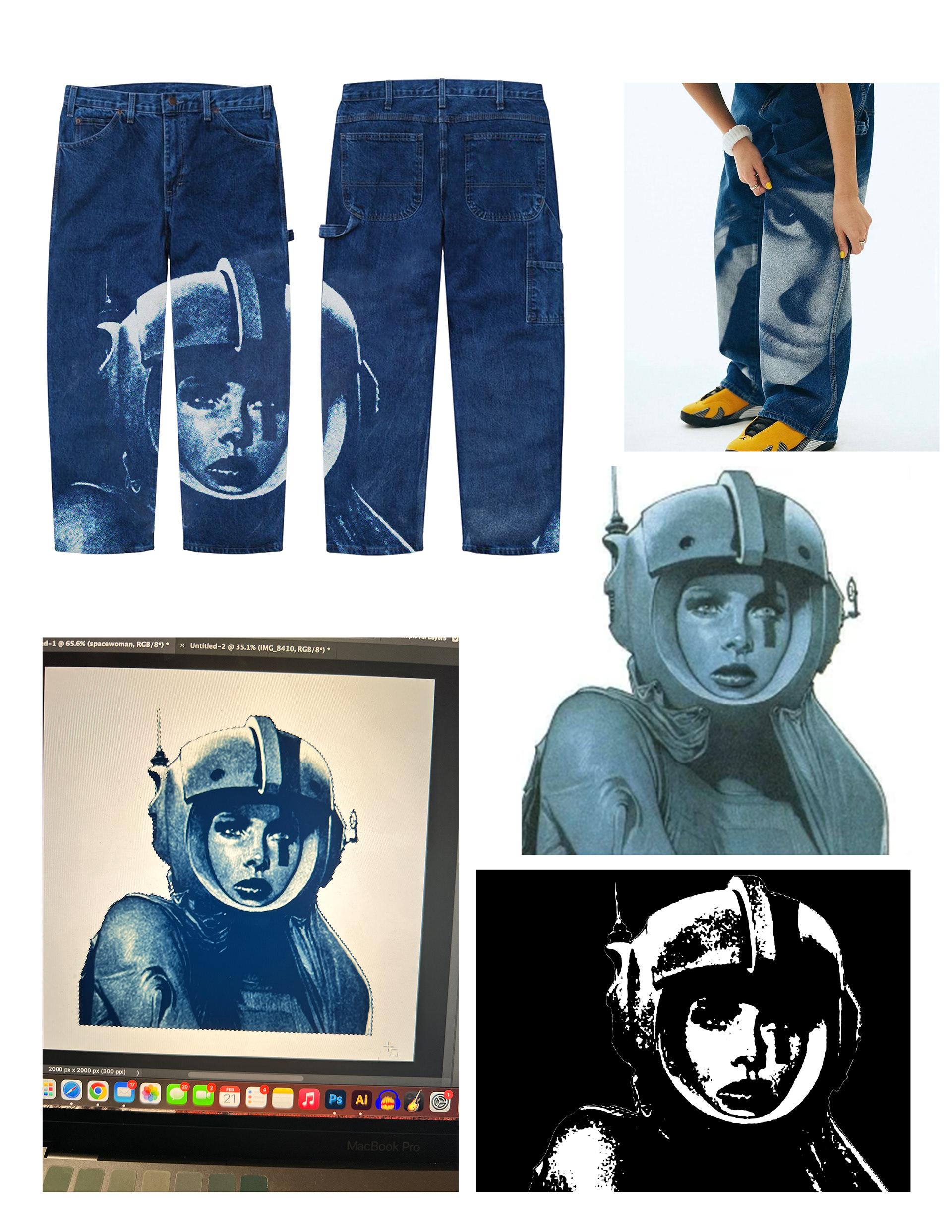

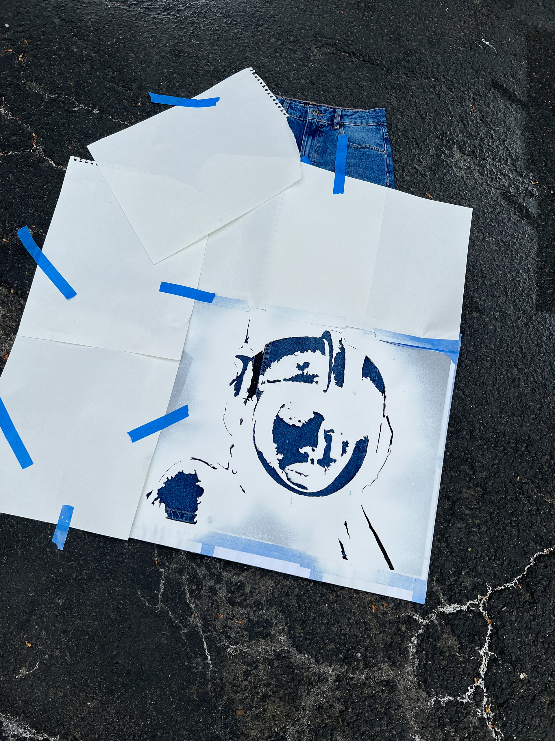
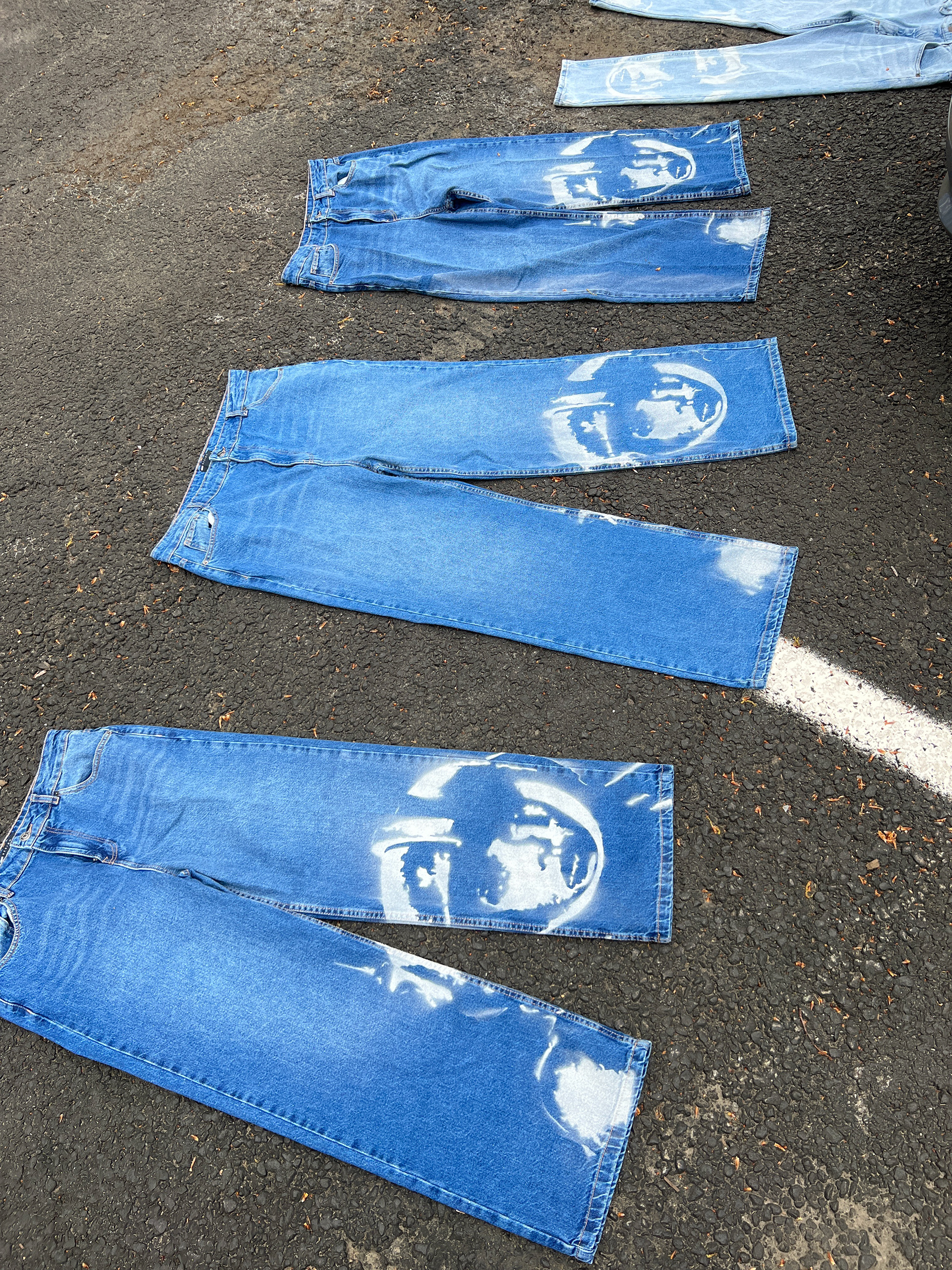
A statement piece that embodies inspiration and dreaming big.
Initially, the idea was for the design to be laser-etched into the denim. Then, it was to be screen printed. But due to cost, time, and feasibility, it appeared the jeans weren't going to be able to get made in time for the photoshoots.
In a last ditch effort, Giovanni stayed up until 4am before the photoshoots to finish hand-cutting the stencil, and woke up at 7am to go spray paint them in a parking lot at school. They dried in his car on the way into Harlem for the shoots.A happy accident perhaps as opposed to the other two methods, a softer, almost illuminative effect of the spacegirl due to the spray paint and stencil, coupled with a starker contrast of the lights and darks, made for a very effective design.
S'23 Corduroy Hats
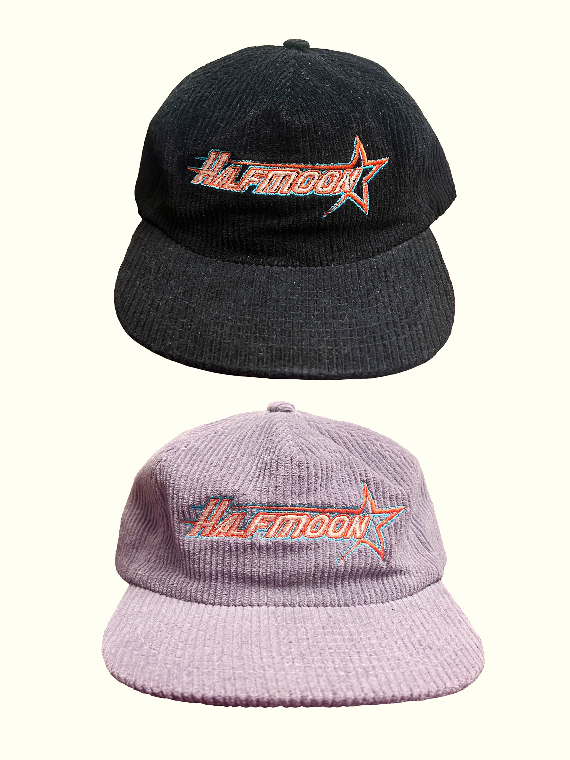
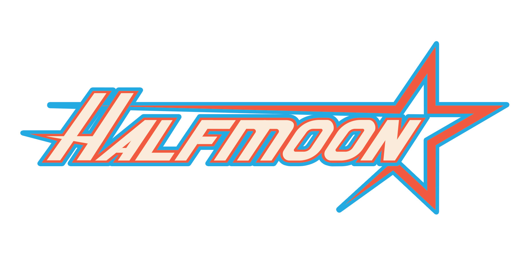
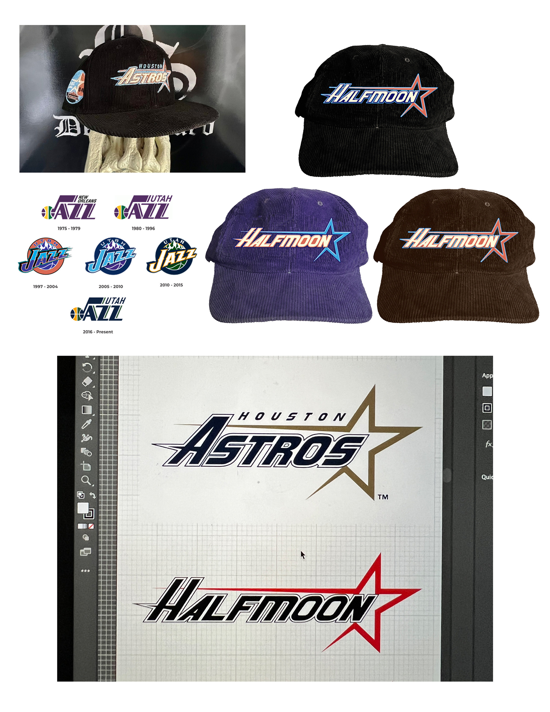
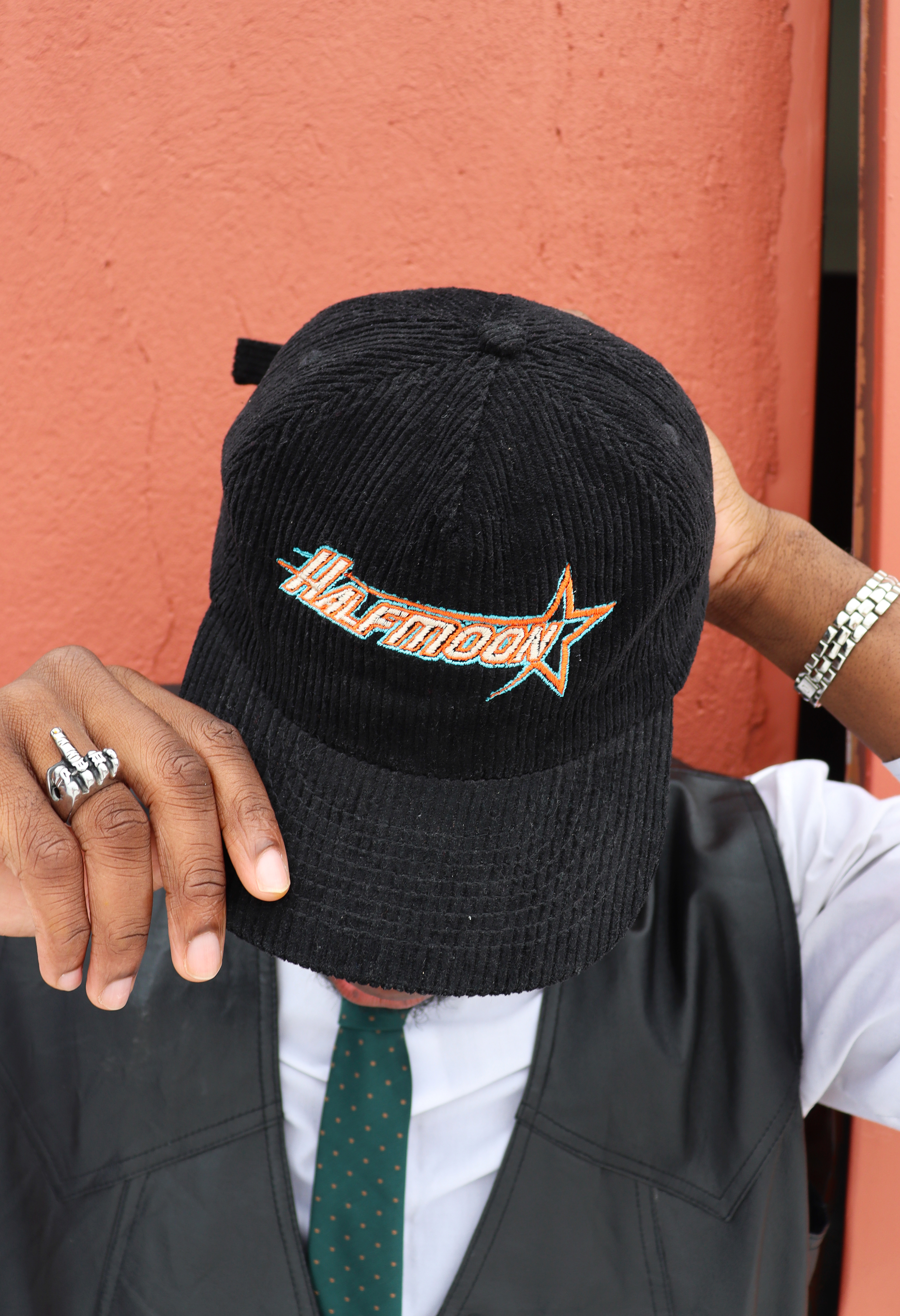
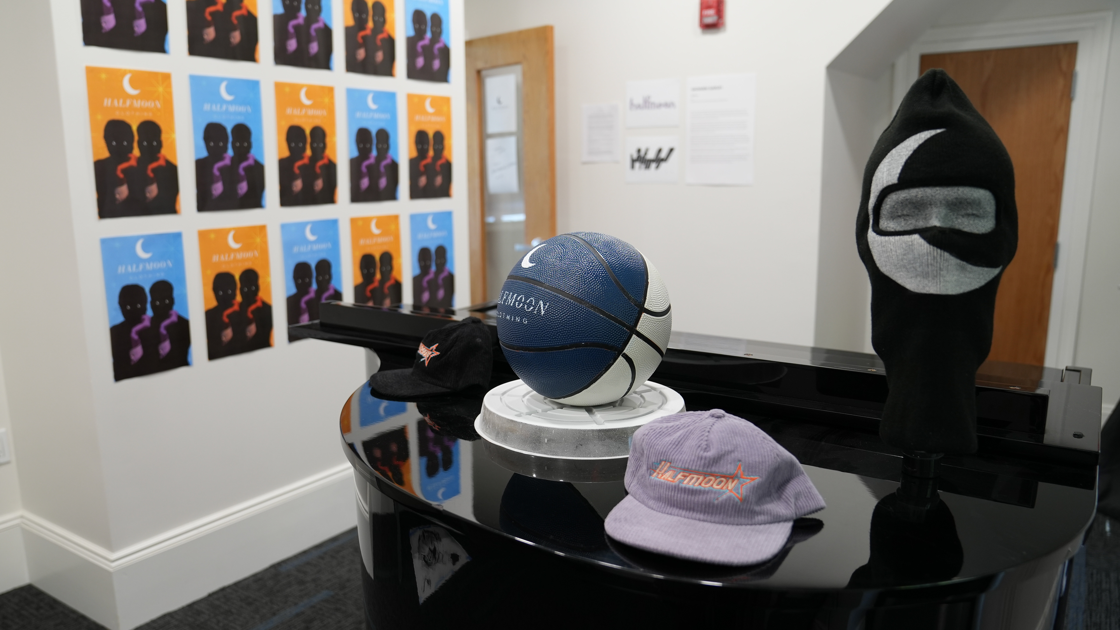
A common inspiration for Halfmoon was athletics; not only a staple of culture but of human excellence. The idea was to create the feeling of a retro classic, a hat that felt timeless and had the versatility to be paired with a range of clothing and styles. Featuring an adaptation of the Astros 90's logo, and color palette inspiration from both them as well as the Jazz in the late 90's, the Halfmoon S'23 hats were created using embroidery on corduroy. These were the only pieces not hand made by Garufi himself.
S'23 Halfmoon Basketball

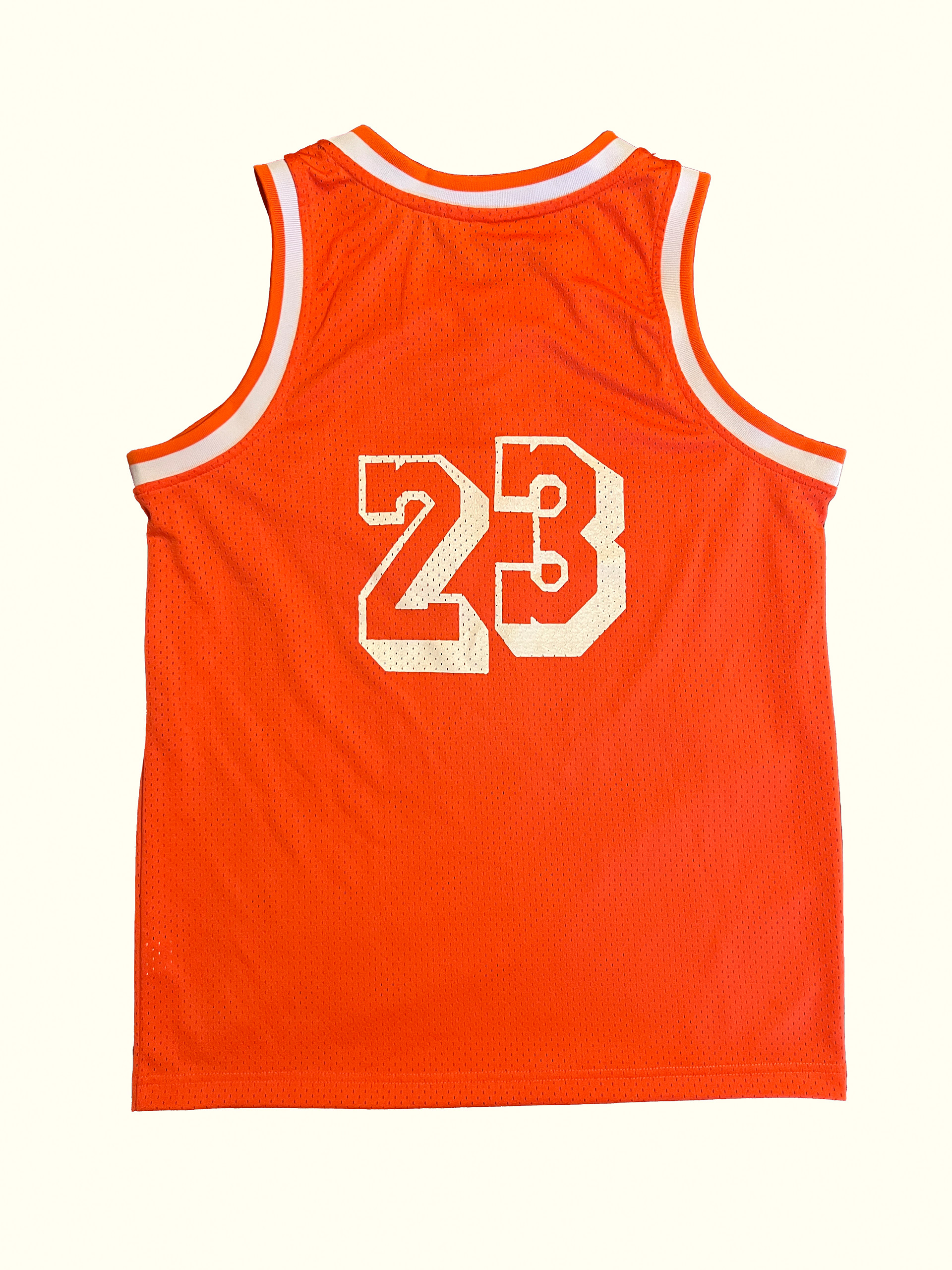

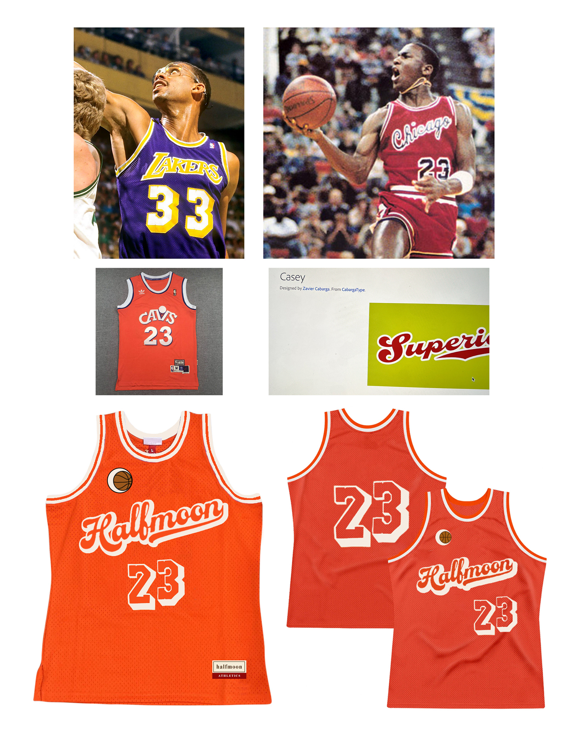
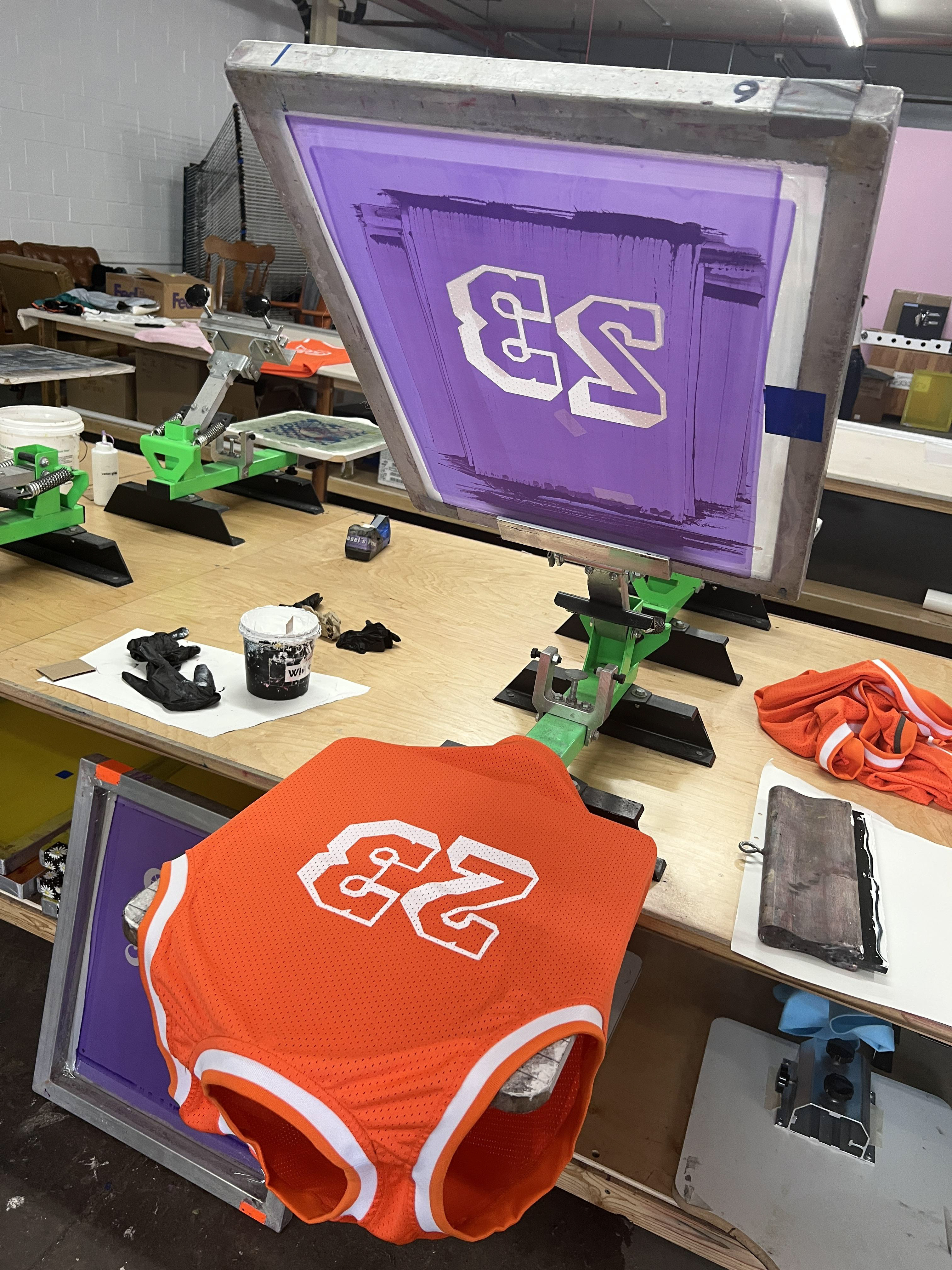
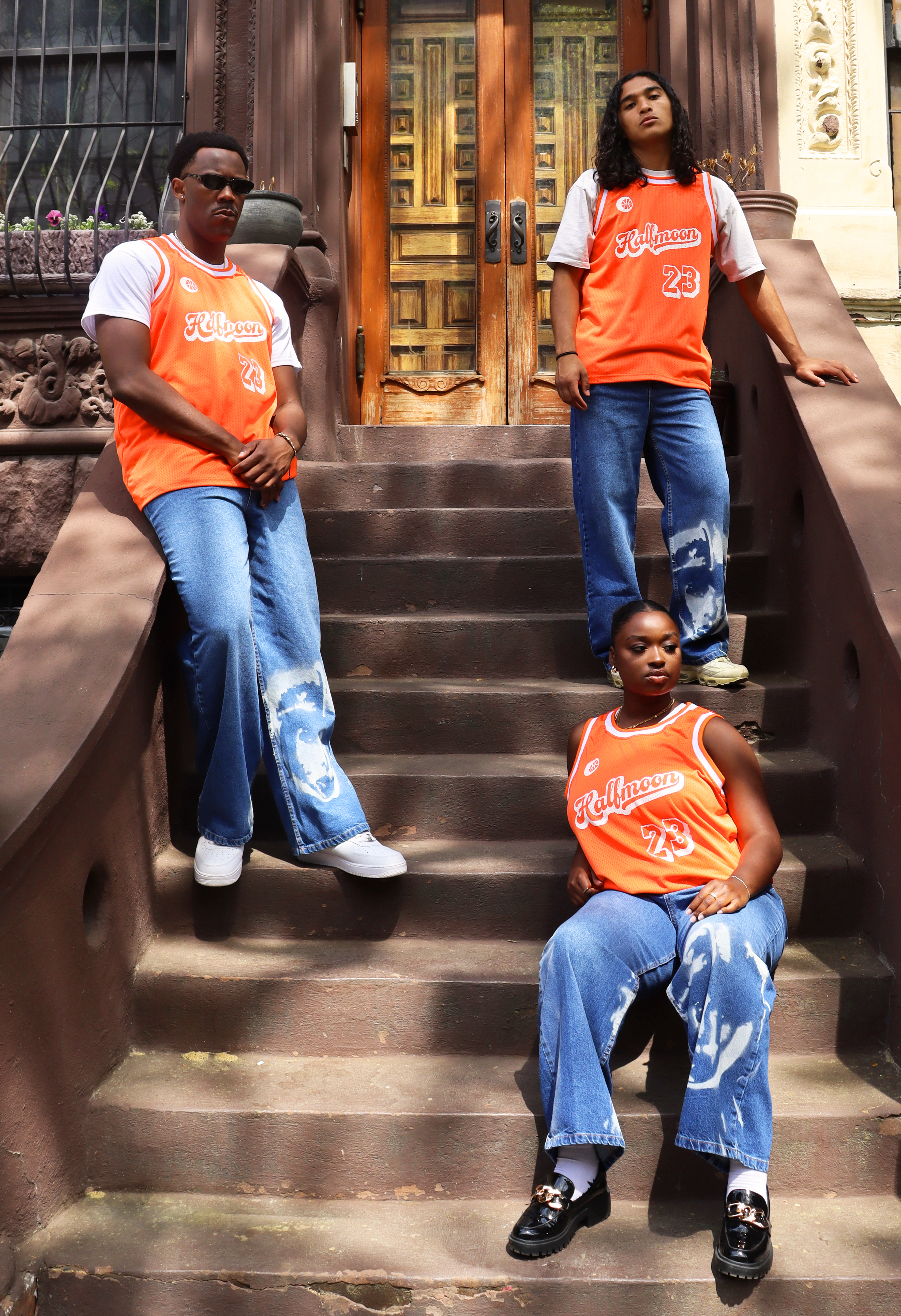
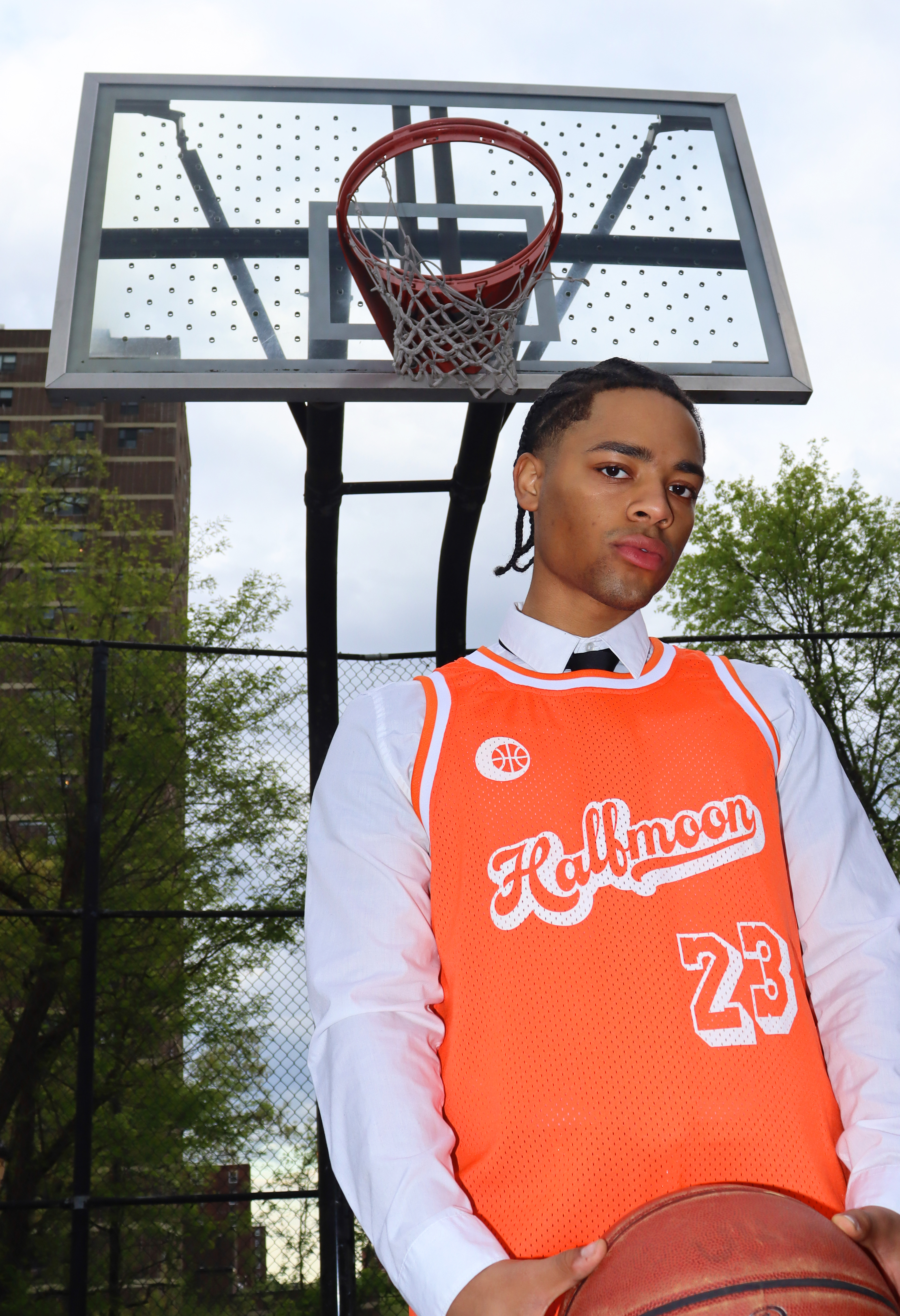
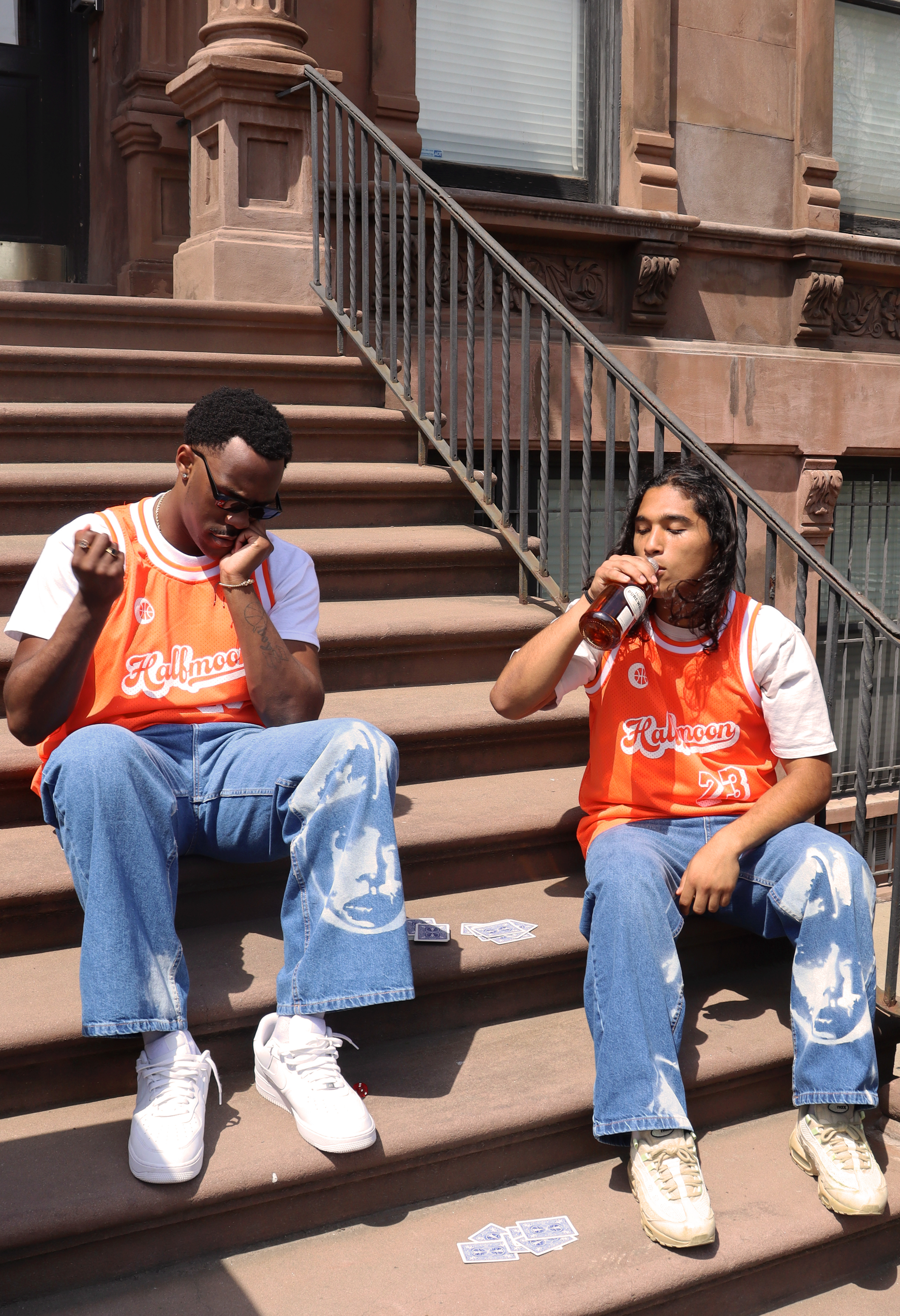
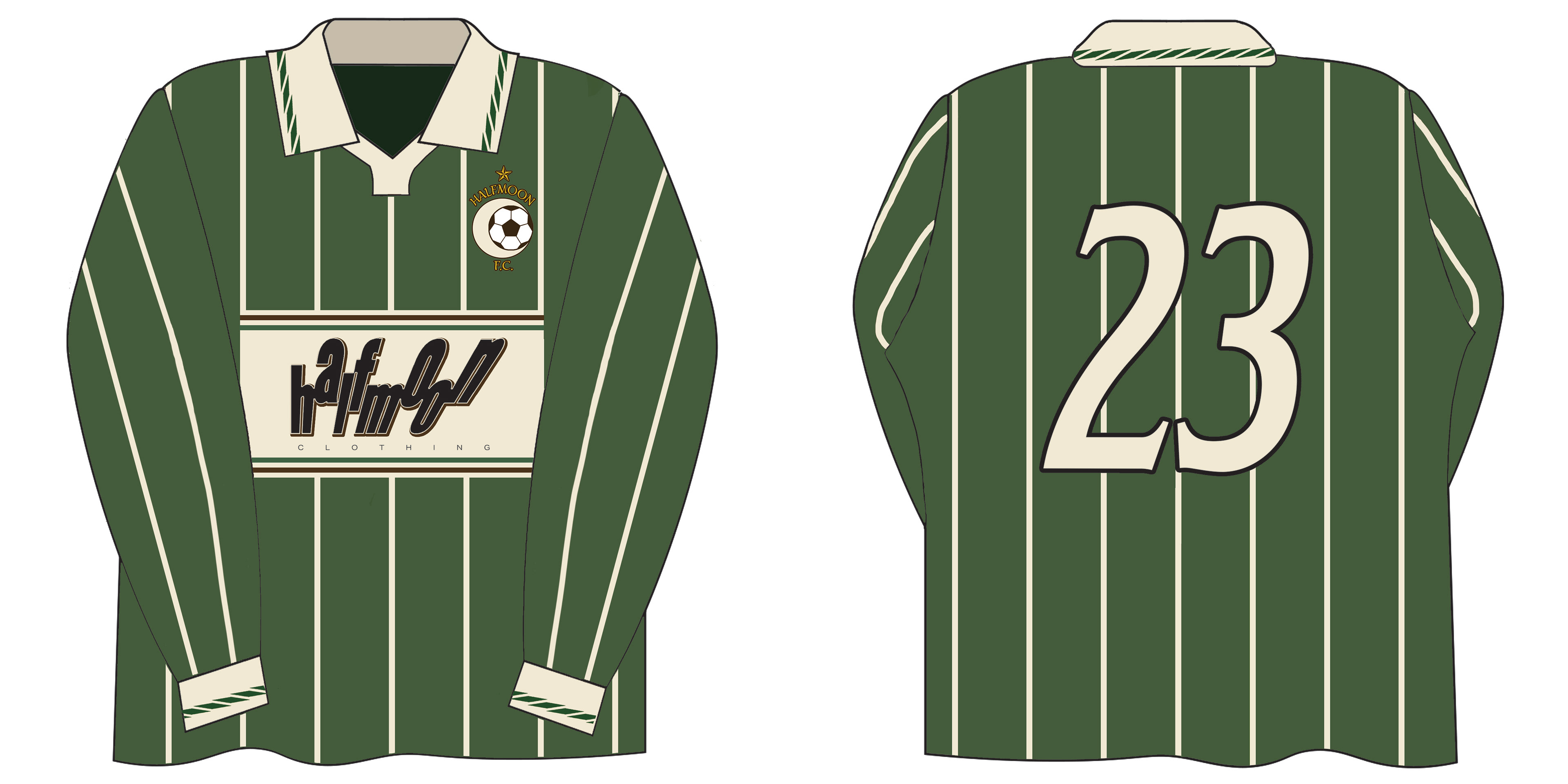
The goal was to create a jersey that would be a literal representation of having pride in your team. Halfmoon is designed for people to feel as though they’re a part of it. Though a young brand, the timeless look of the jersey evokes a feeling of heritage for the brand.
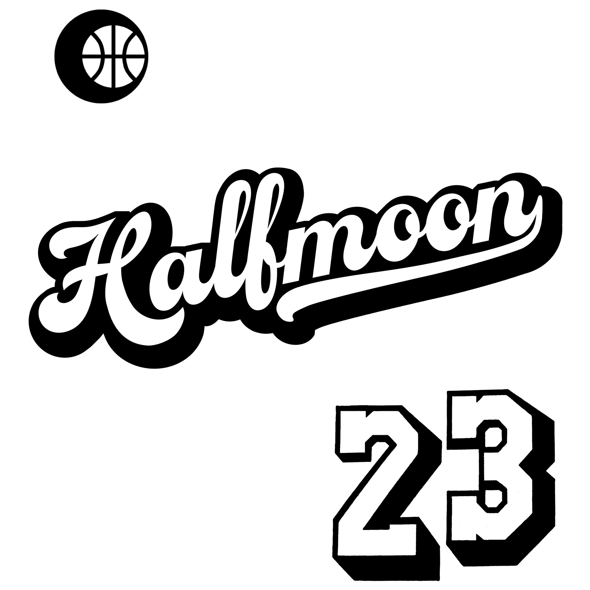
The designs were edited in Illustrator, altering the tails on the H & n, cleaning up the edges on the numbers, etc. Number 23 for season '23, not to mention it being the most iconic number in sports.
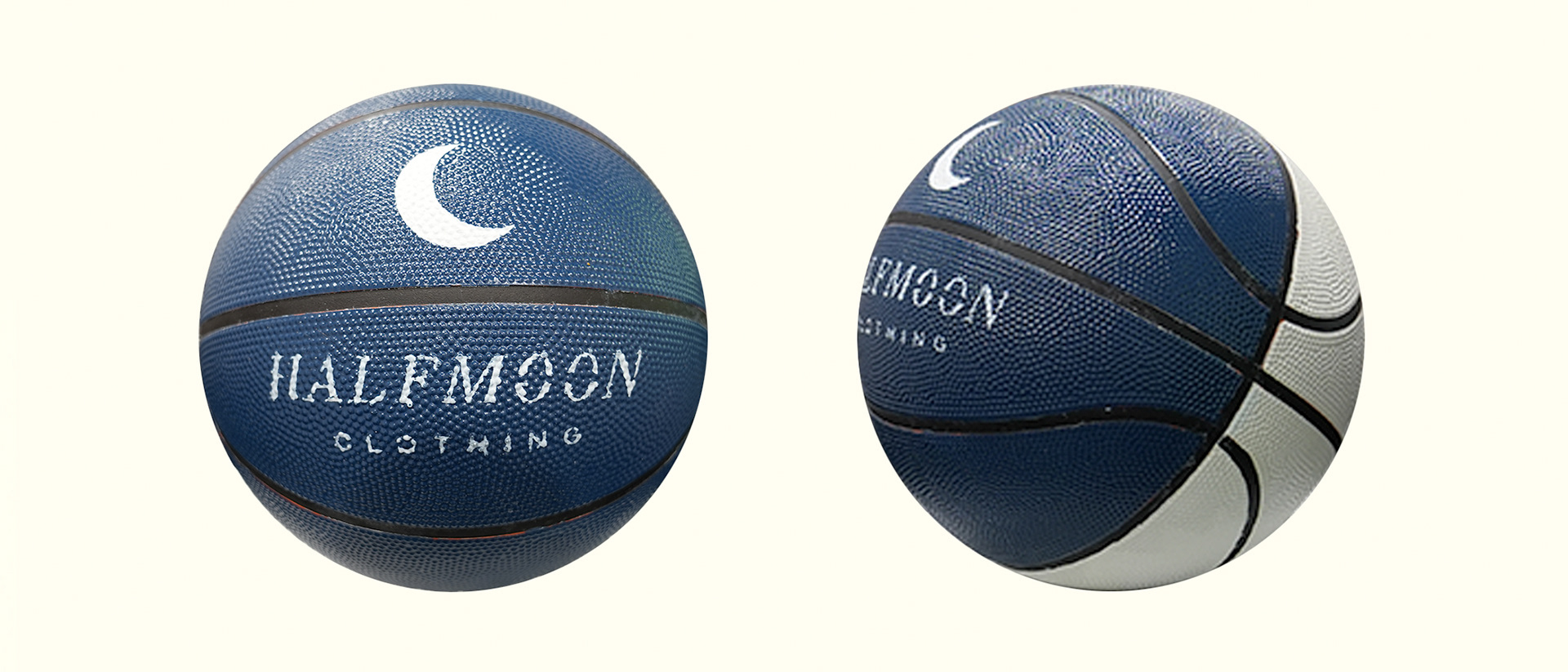
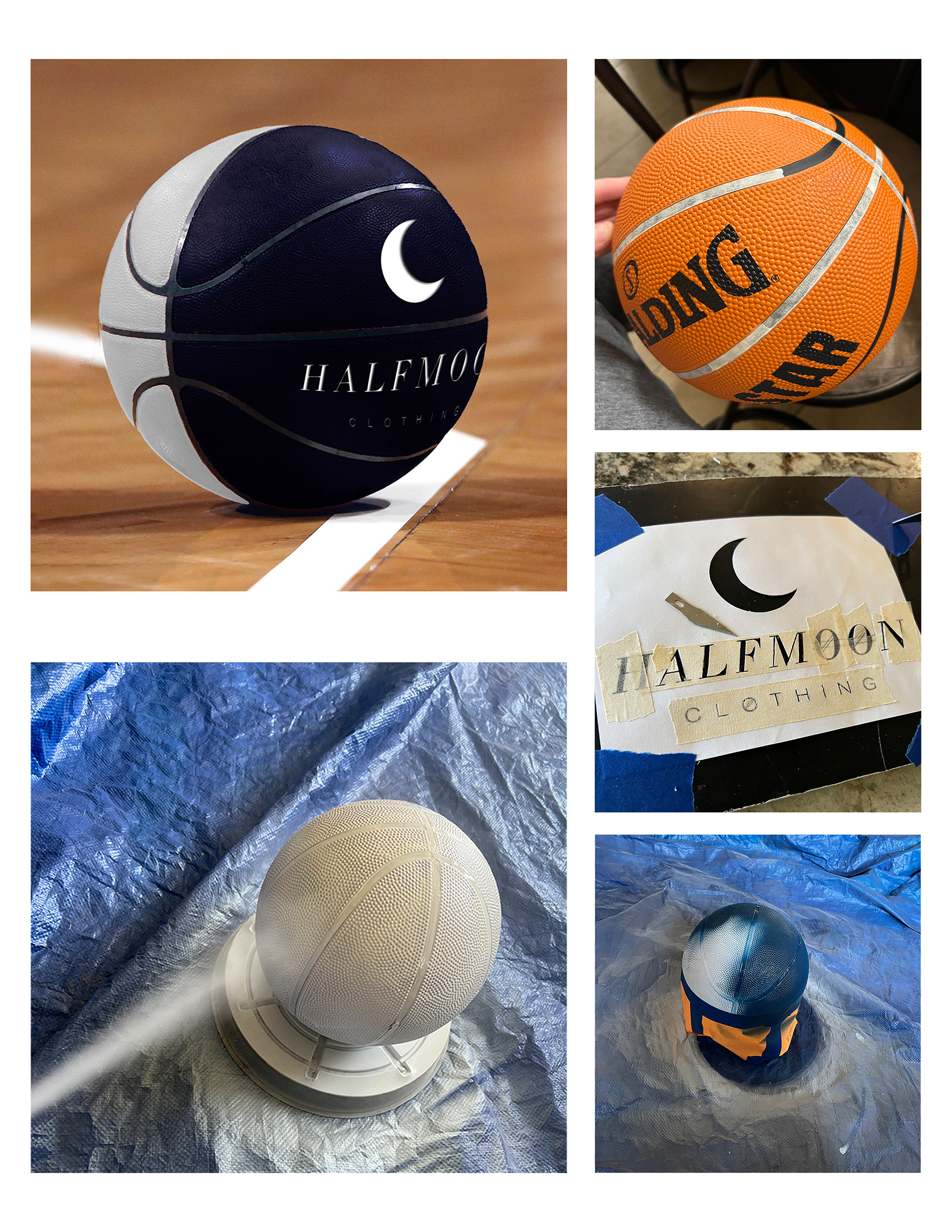
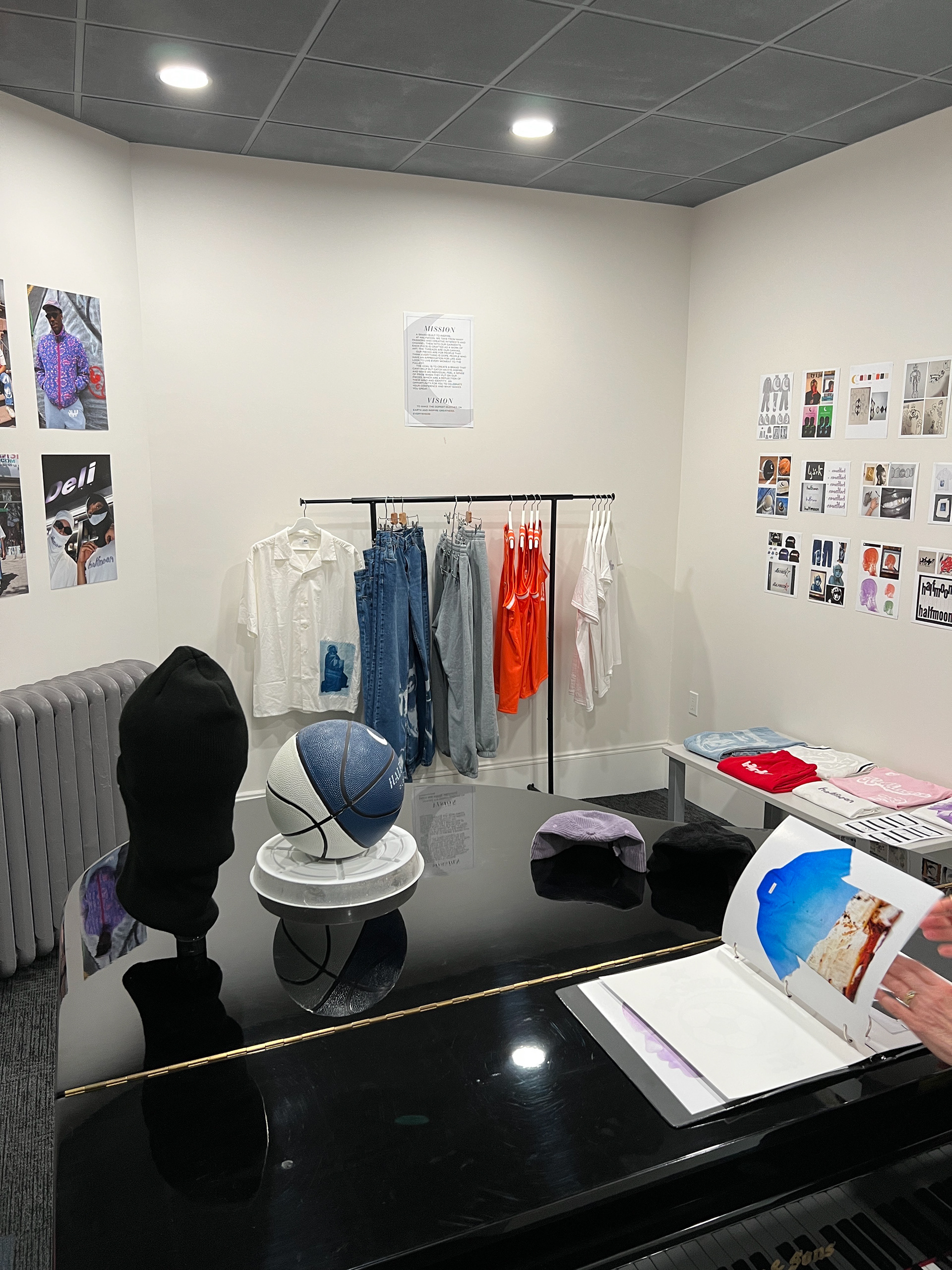
The basketball was created as a fun display for the pop-up shop exhibition, which you will see below. But the two-toned ball placed in the center of the room allowed for the viewer to see the 'phases of the moon' as the ball rotated to their view. Made with spray paint and a carefully hand-cut stencil.
S'23 Button-down
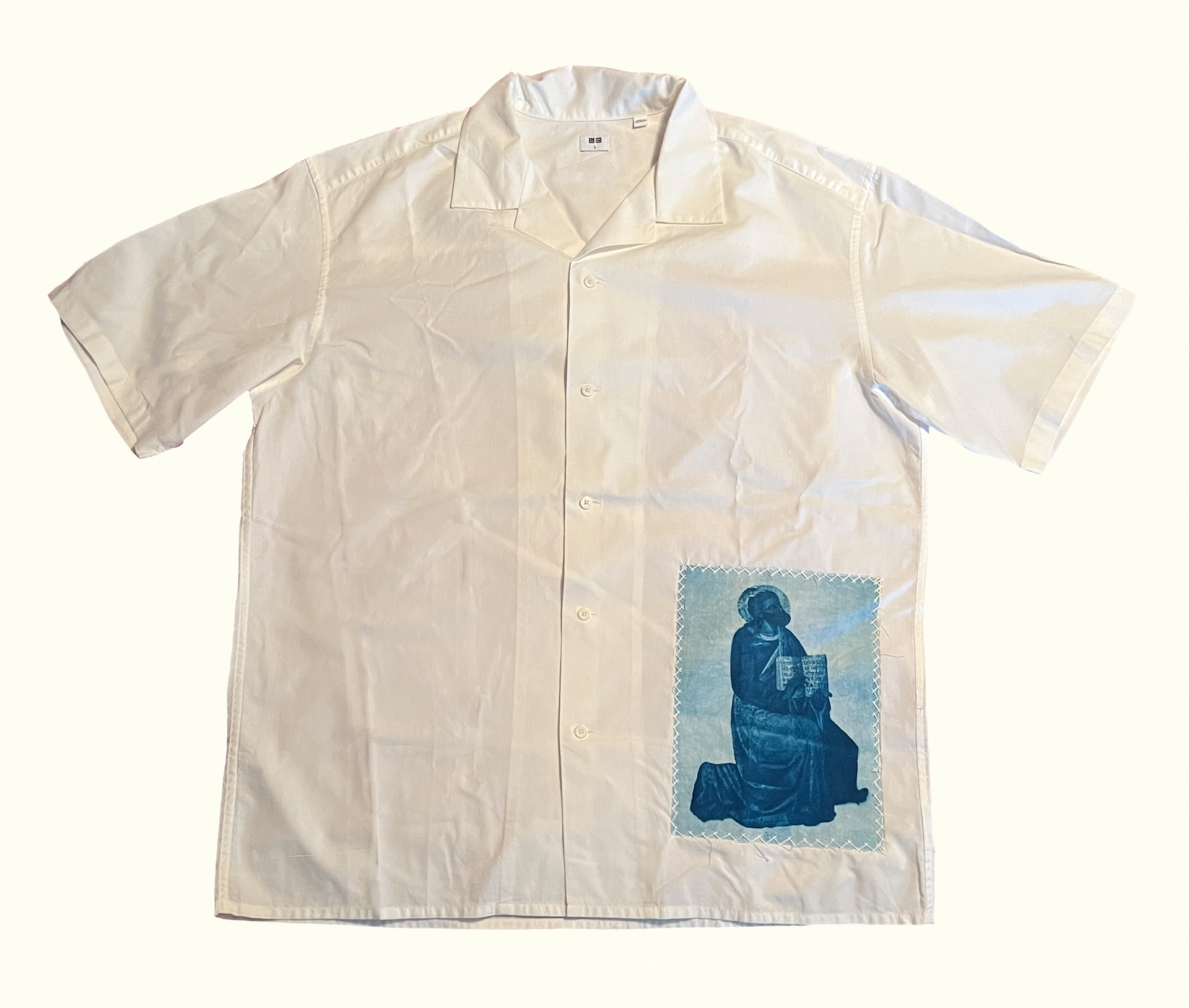
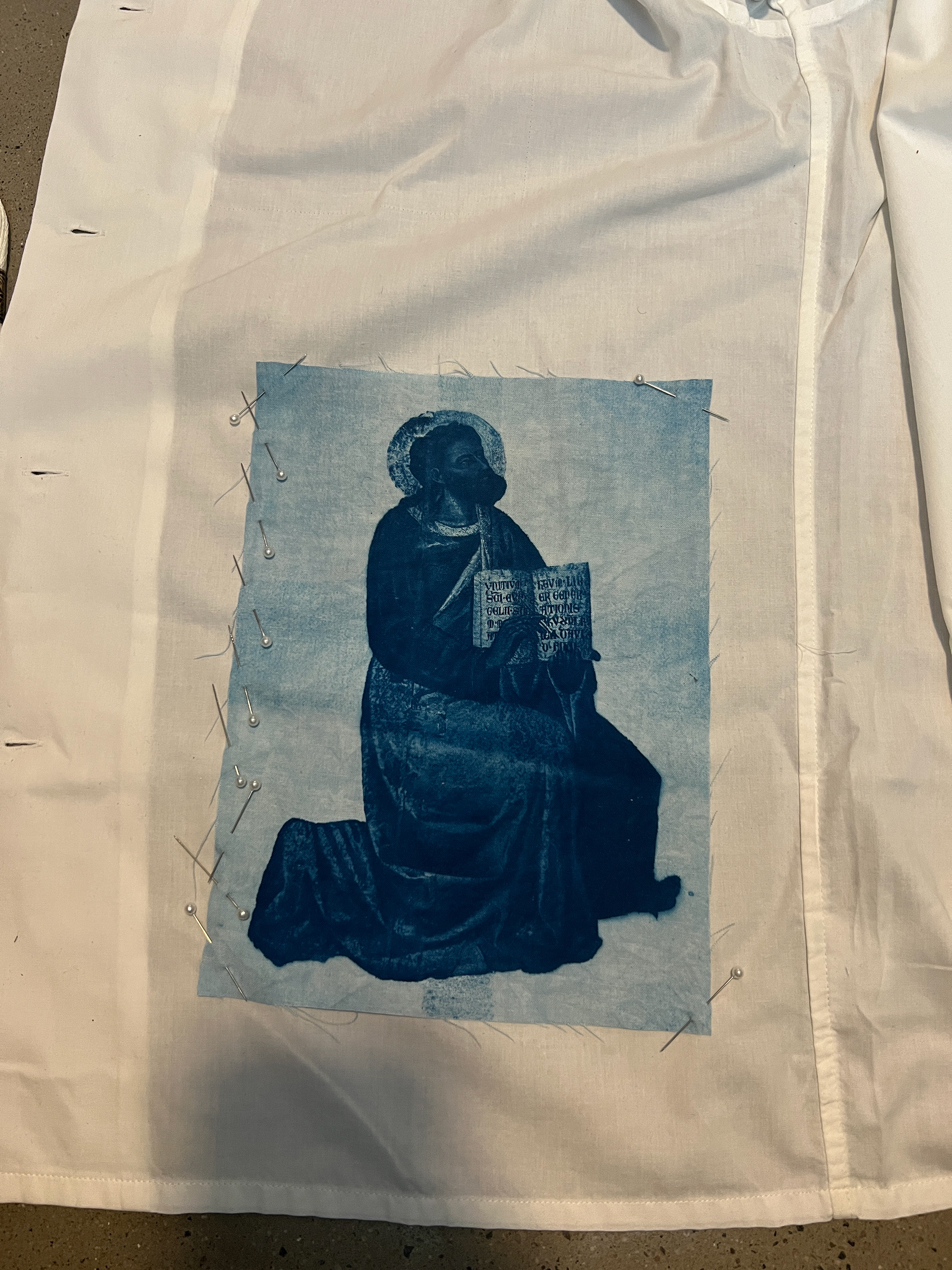
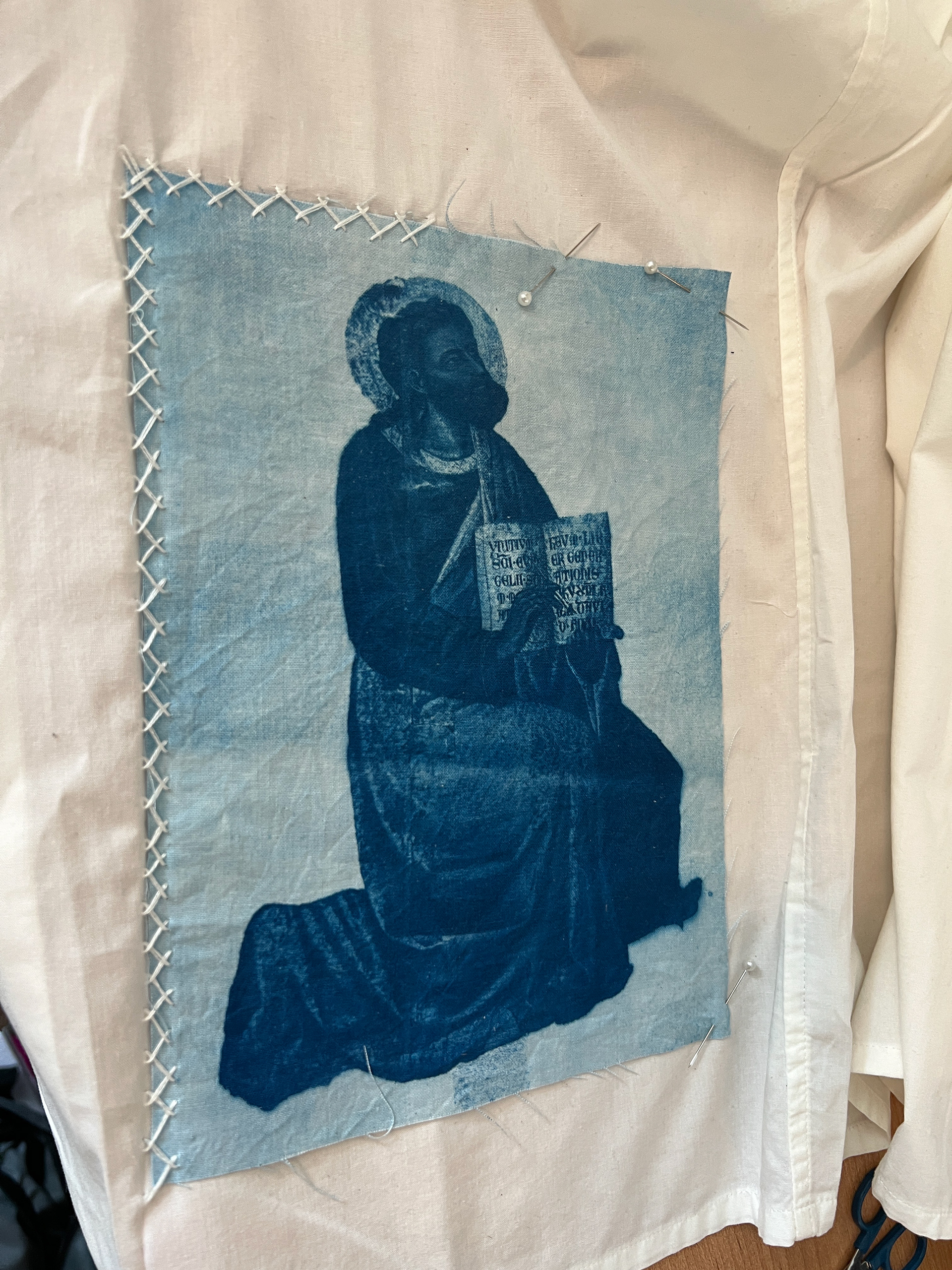
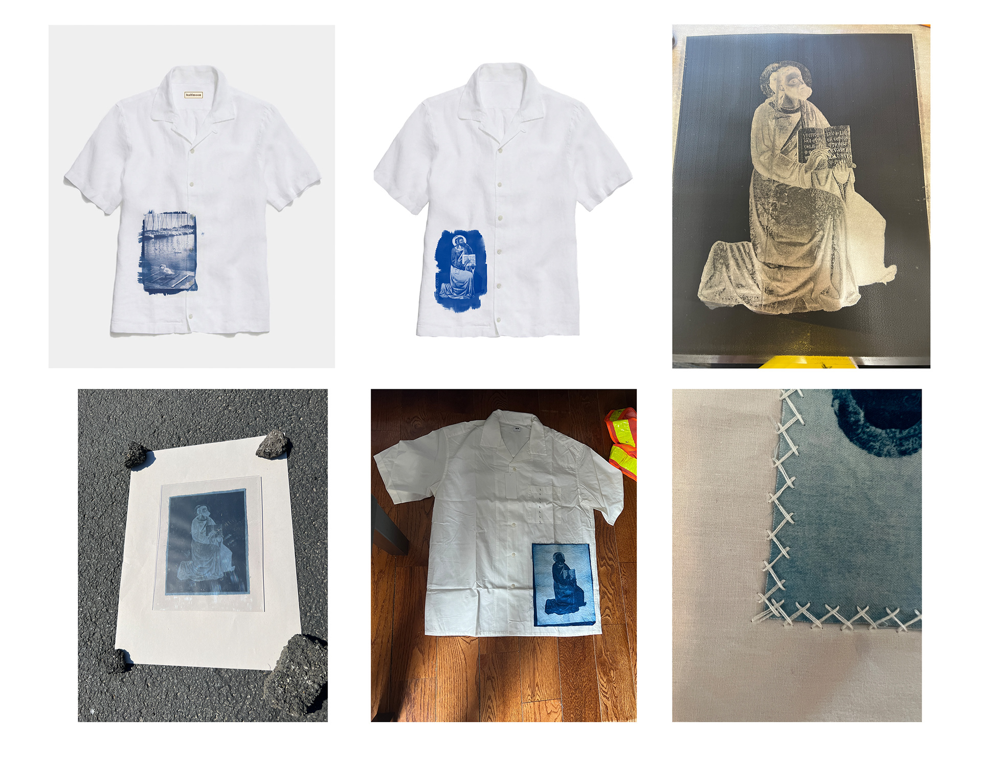
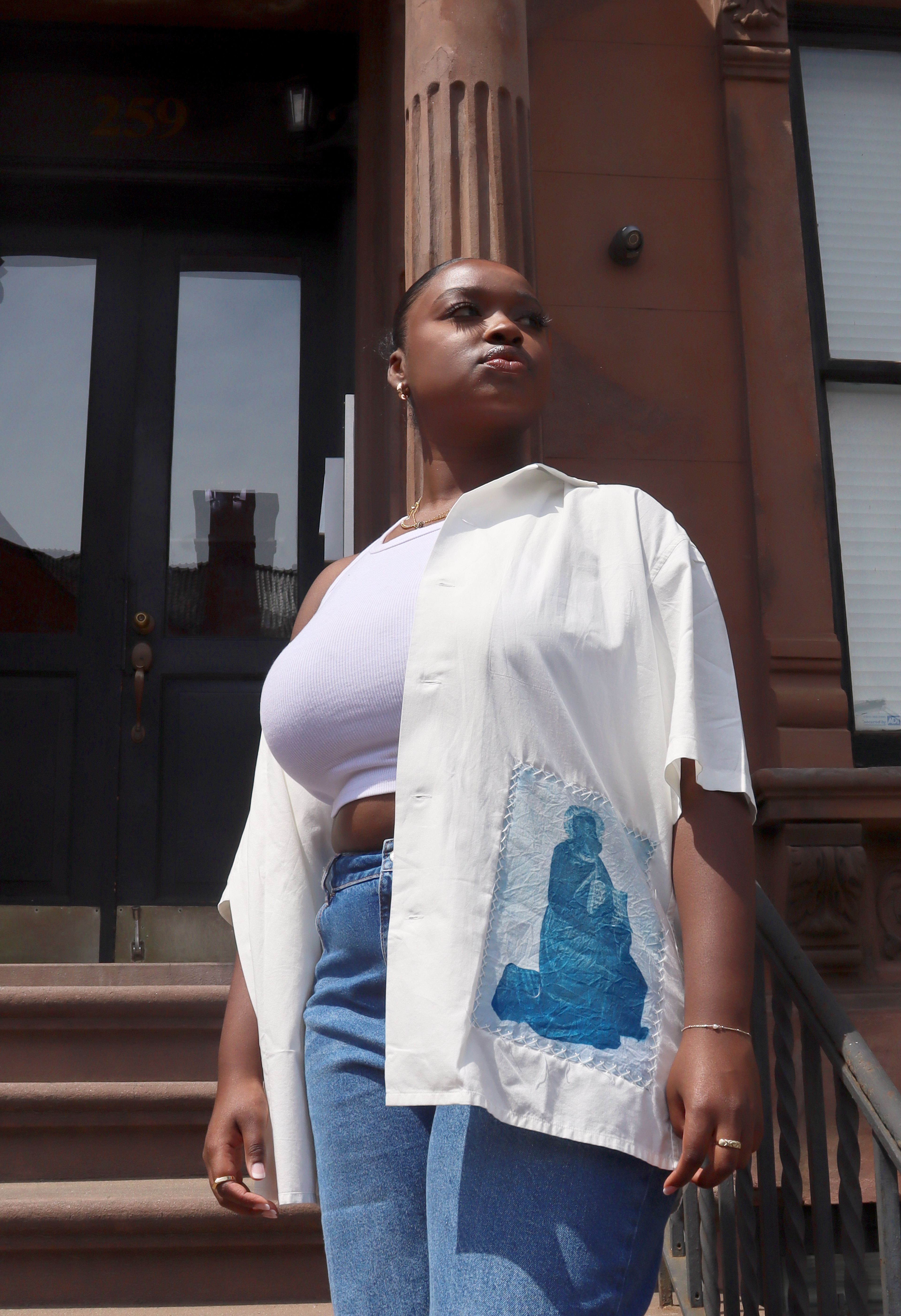
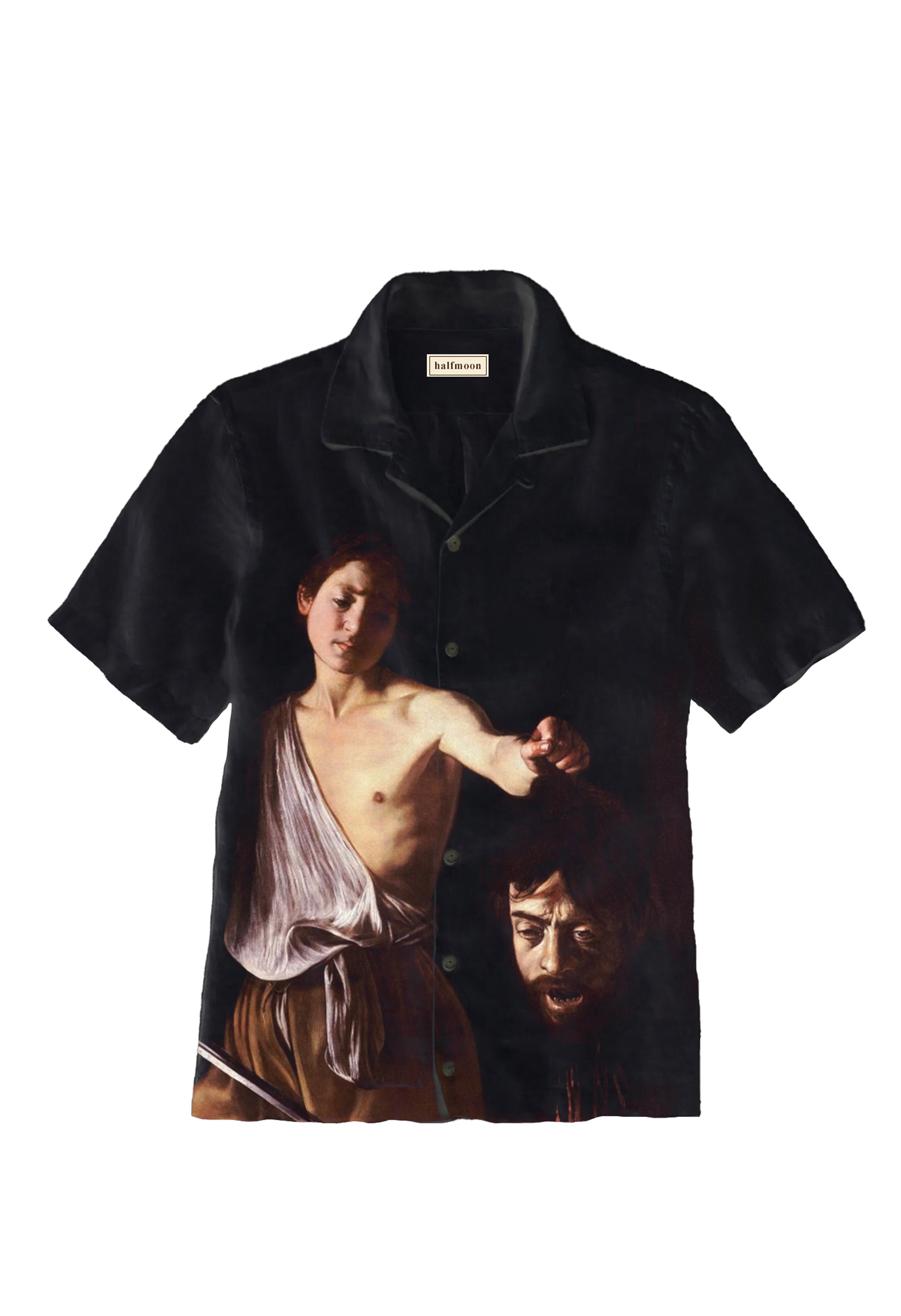
The range of artistic inspiration at Halfmoon is vast. Here, the subject matter was taken from a painting of the assumption of Mary that Garufi saw in the Uffizi museum in Florence. Additionally, religion and spirituality are a big part of Garufi's life. The holy figure subject was isolated from the rest of the painting in Photoshop. He appears to be holding some form of religious text and looking forward, signifying he is ready for the journey ahead.
The patch was made with a cyanotype pre-treated fabric, and tediously hand-stitched onto the button-down.
S'23 Balaclava
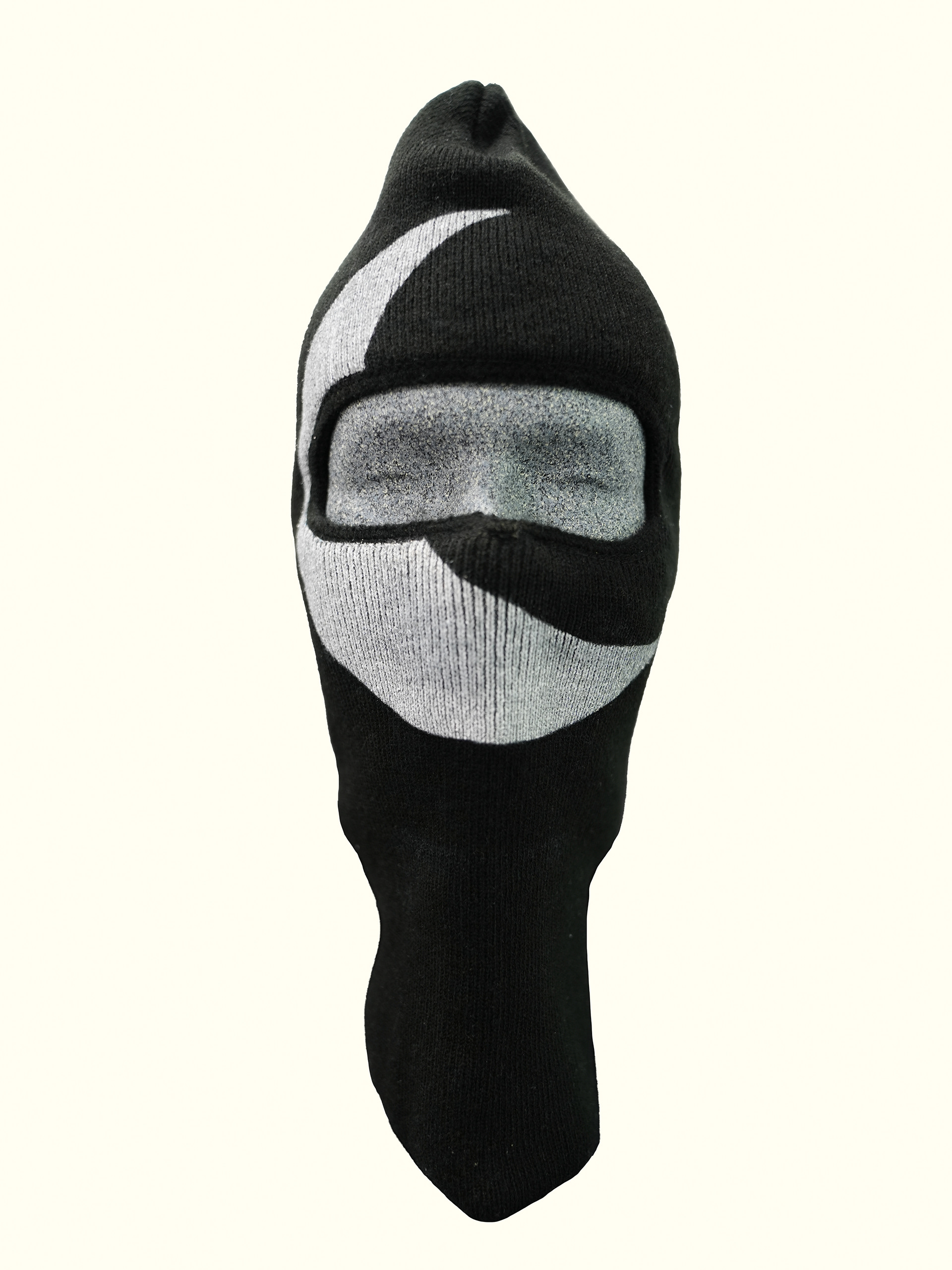
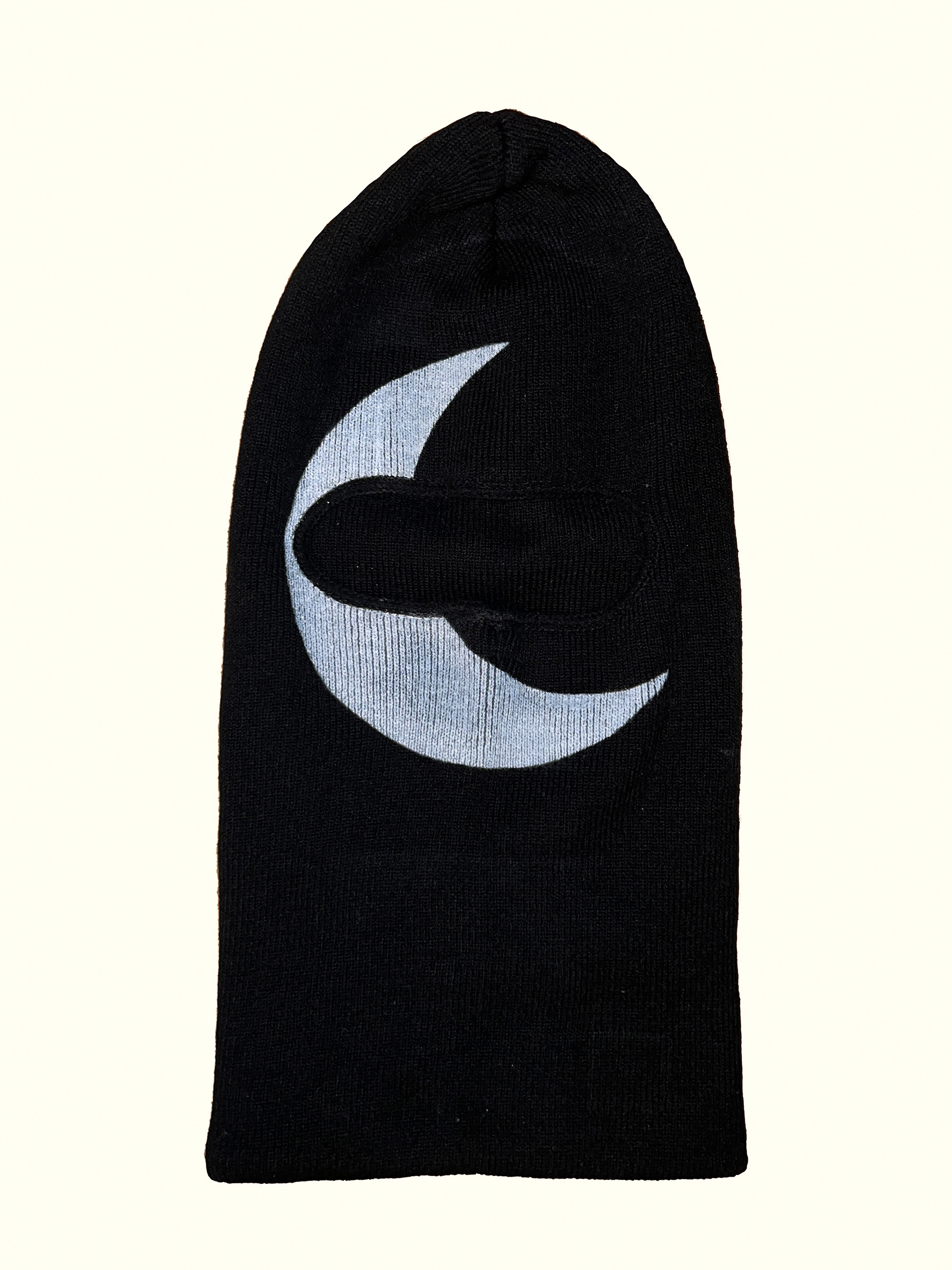
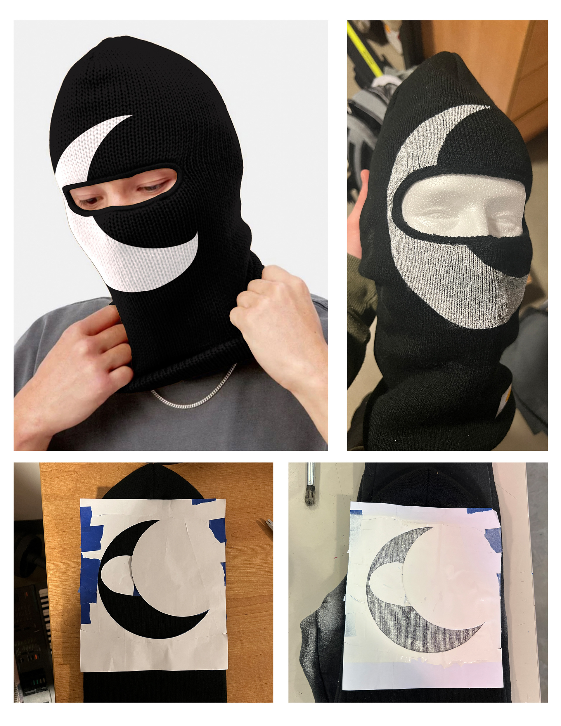
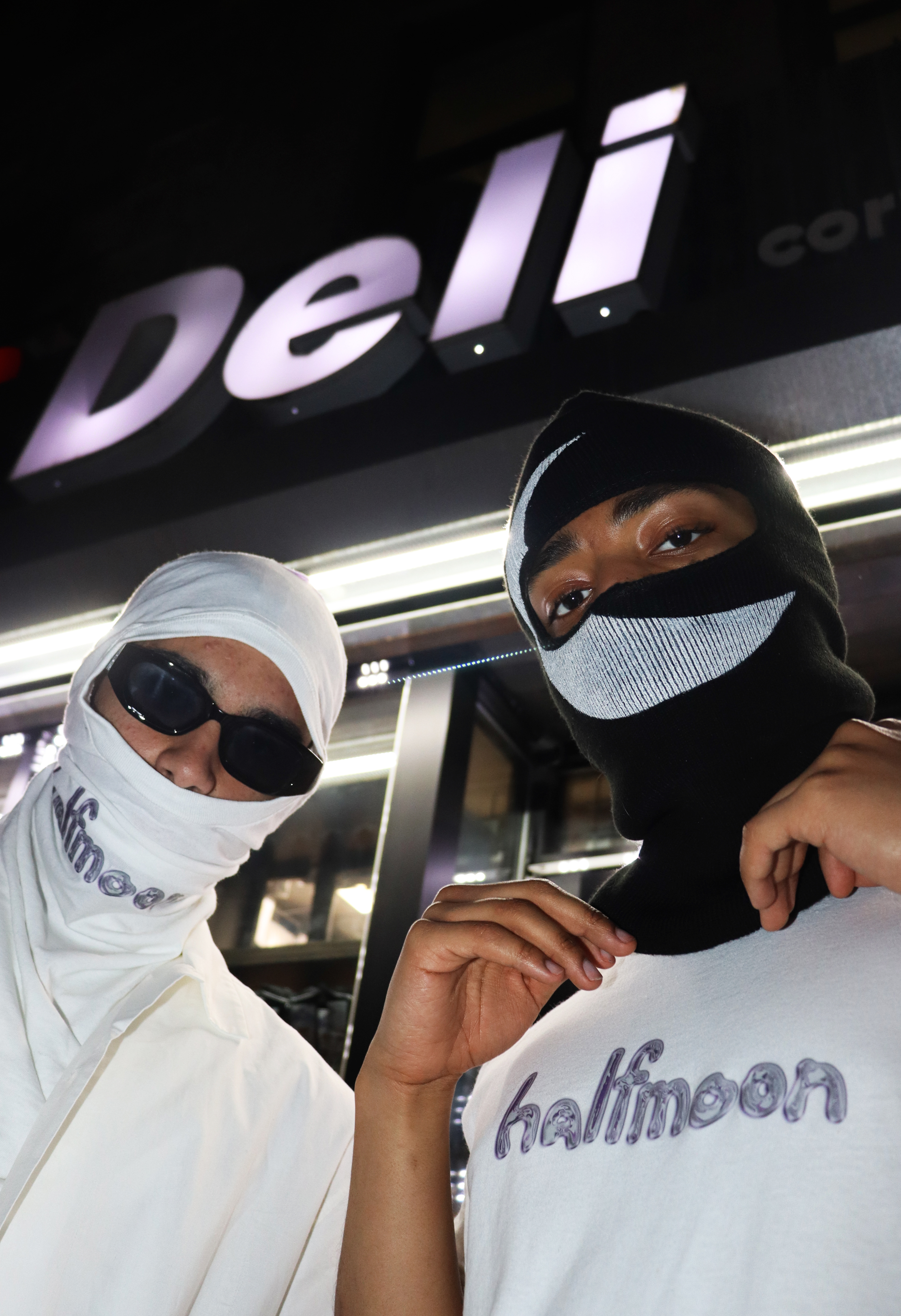
A piece that marries the spirit of New York with the spirit of Halfmoon. Created using acrylic spray paint and a hand cut stencil of the Halfmoon primary logo.
S'23 Sweats
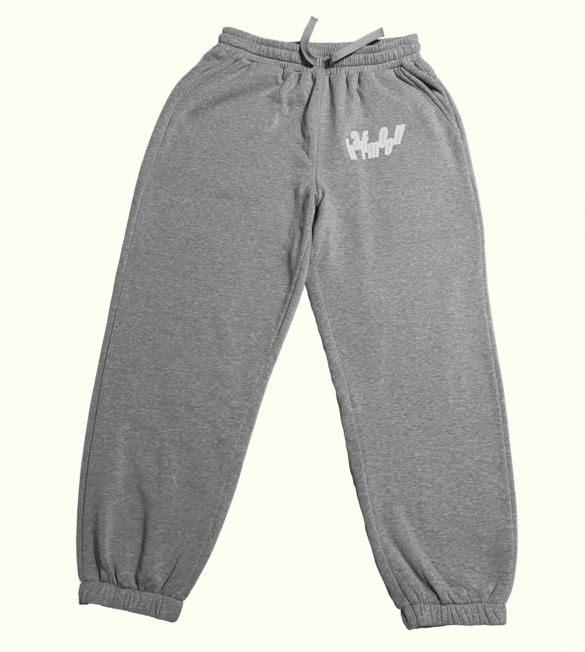

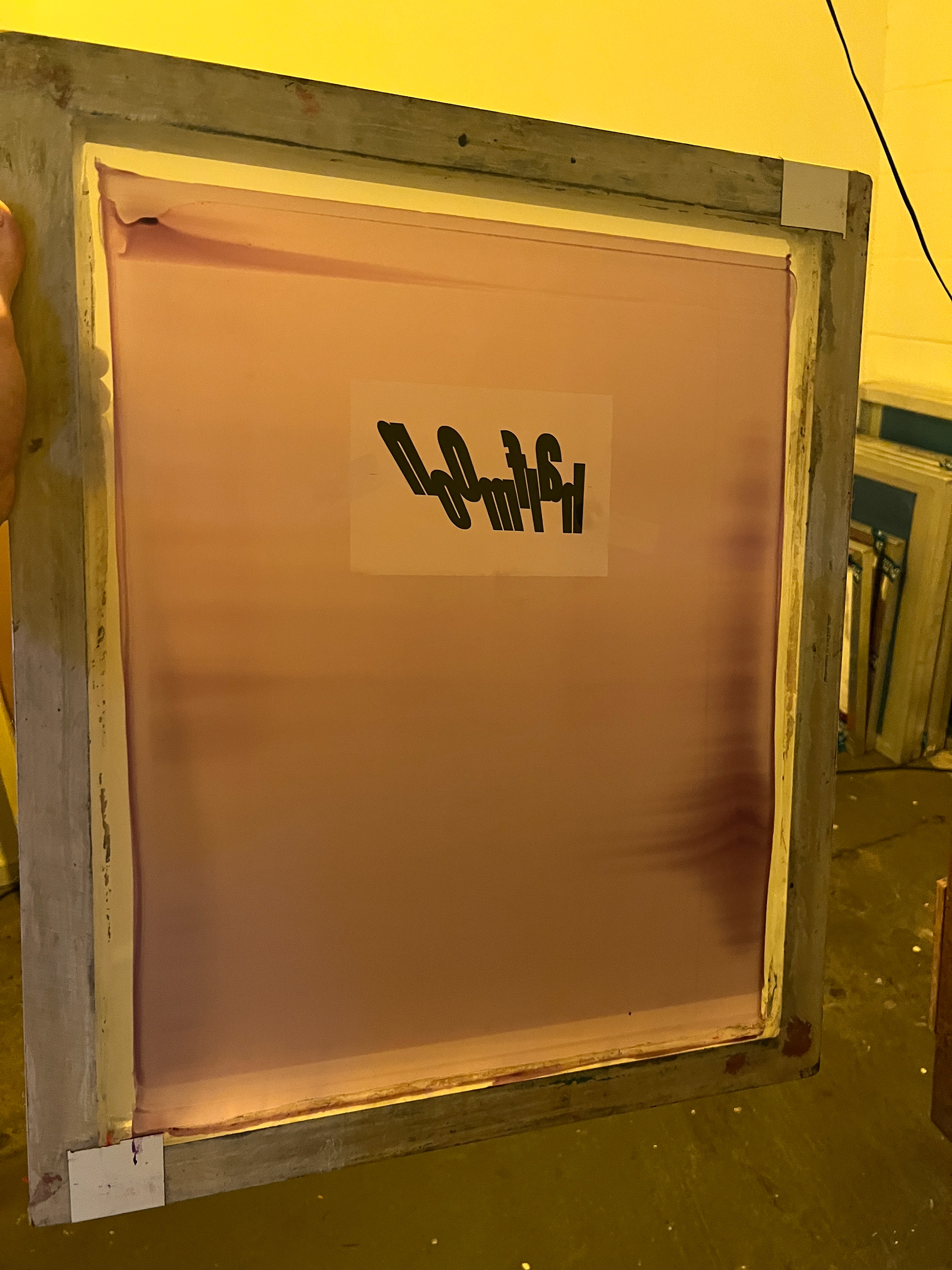
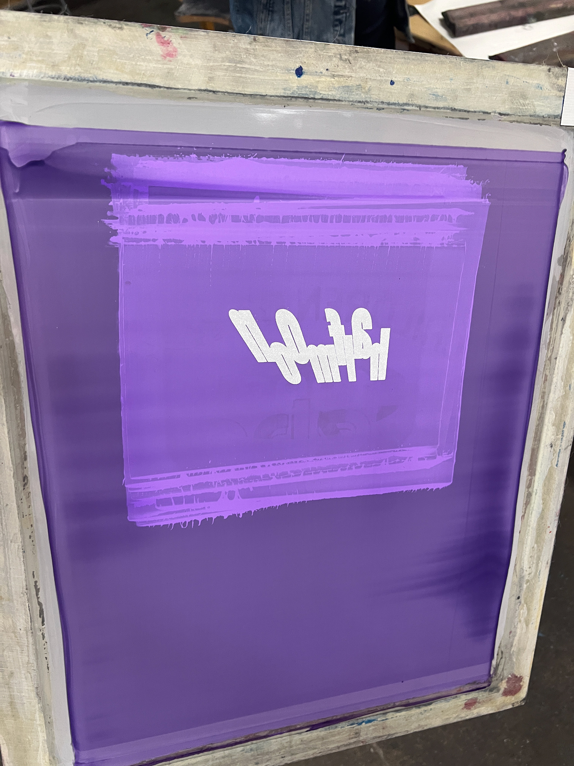
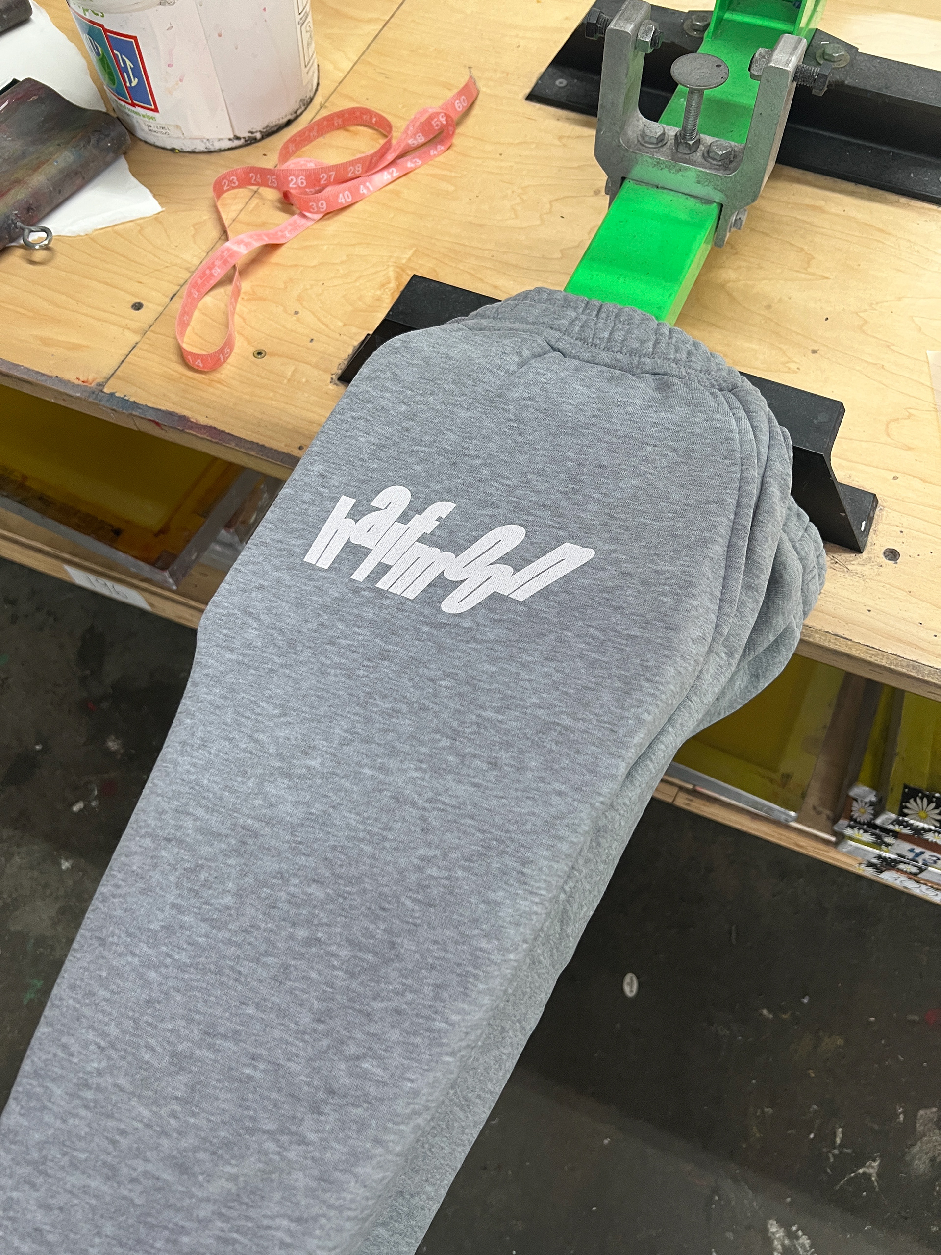
Athletics is a big part of the inspiration and identity at Halfmoon. The original concept was to create a sweatsuit that would provide inspiration, comfort, and swagger to the athlete that was donning it. Unfortunately with time being limited the vision wasn't realized, but some pairs of sweats were still made using a logo variation that was originally designed for a soccer jersey, that you will see below.
Photoshoots
(click to enlarge any image)
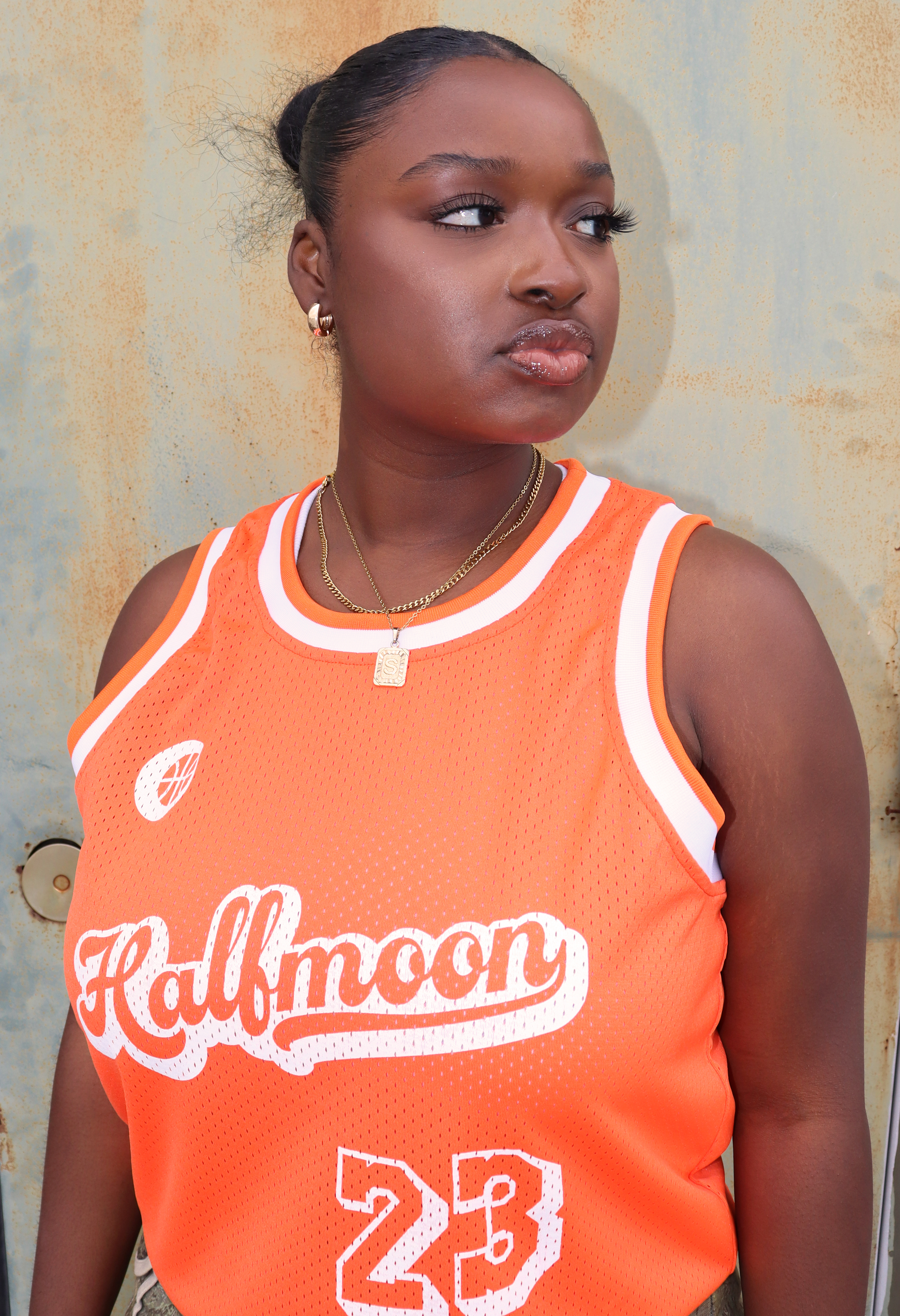
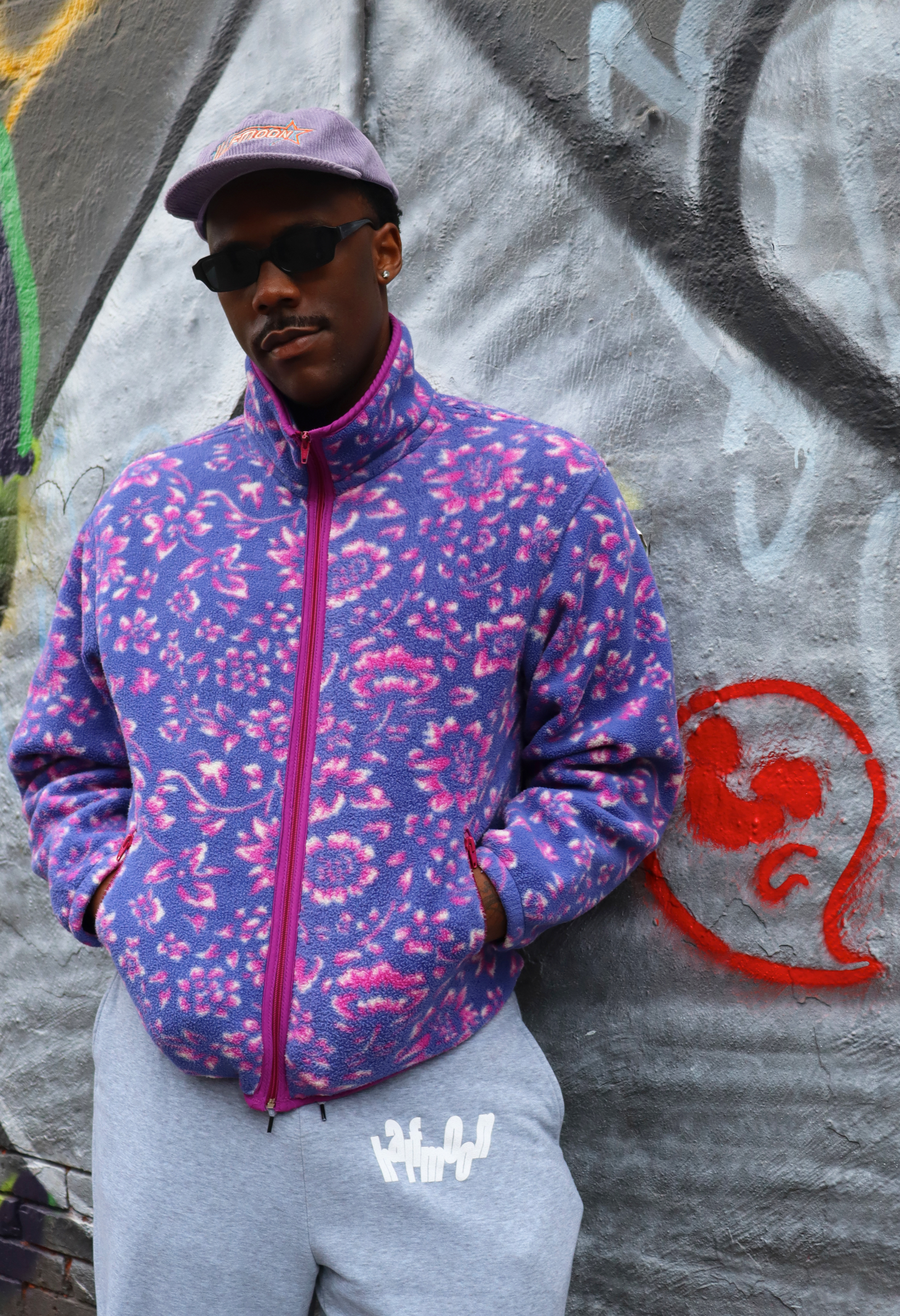
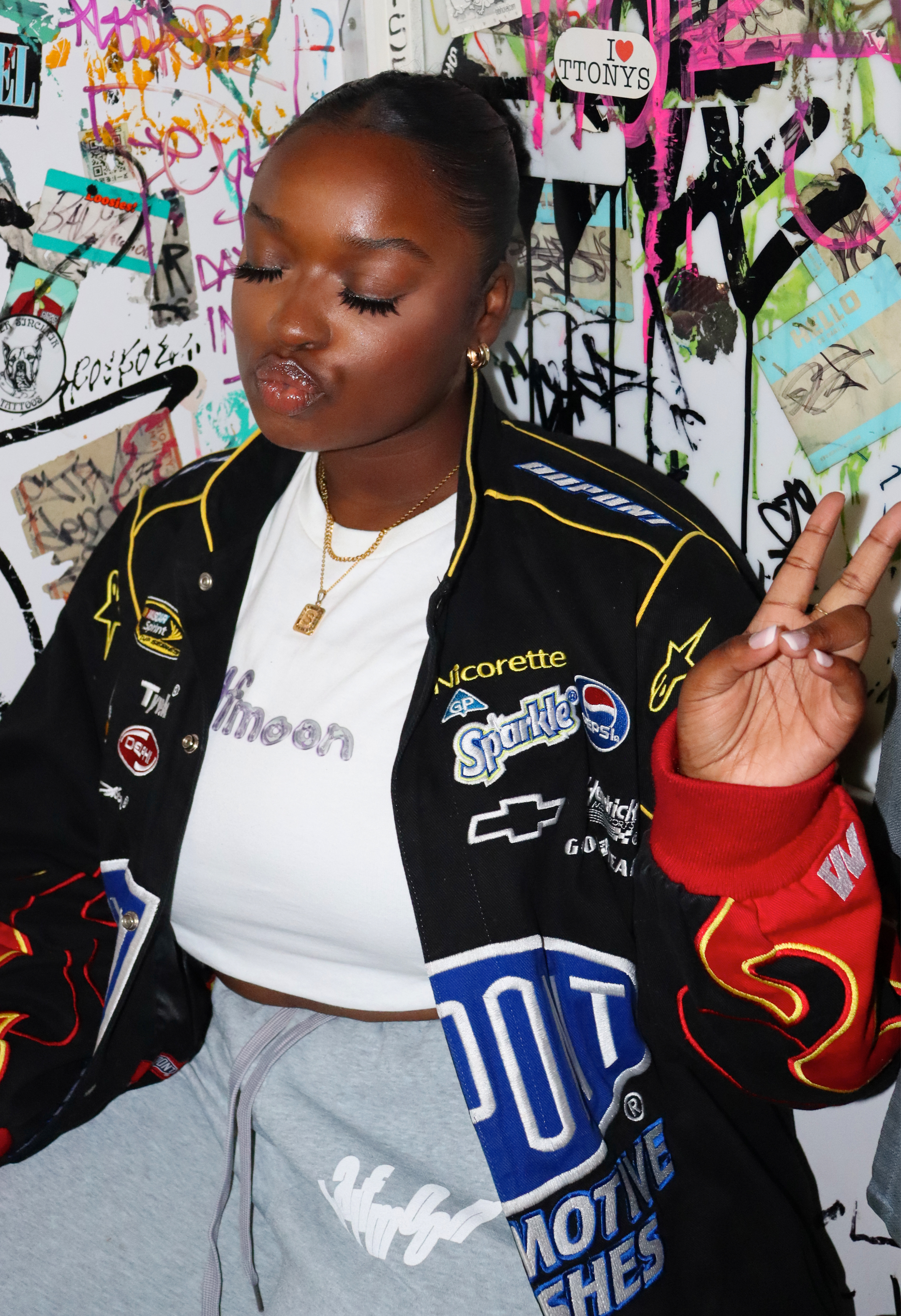
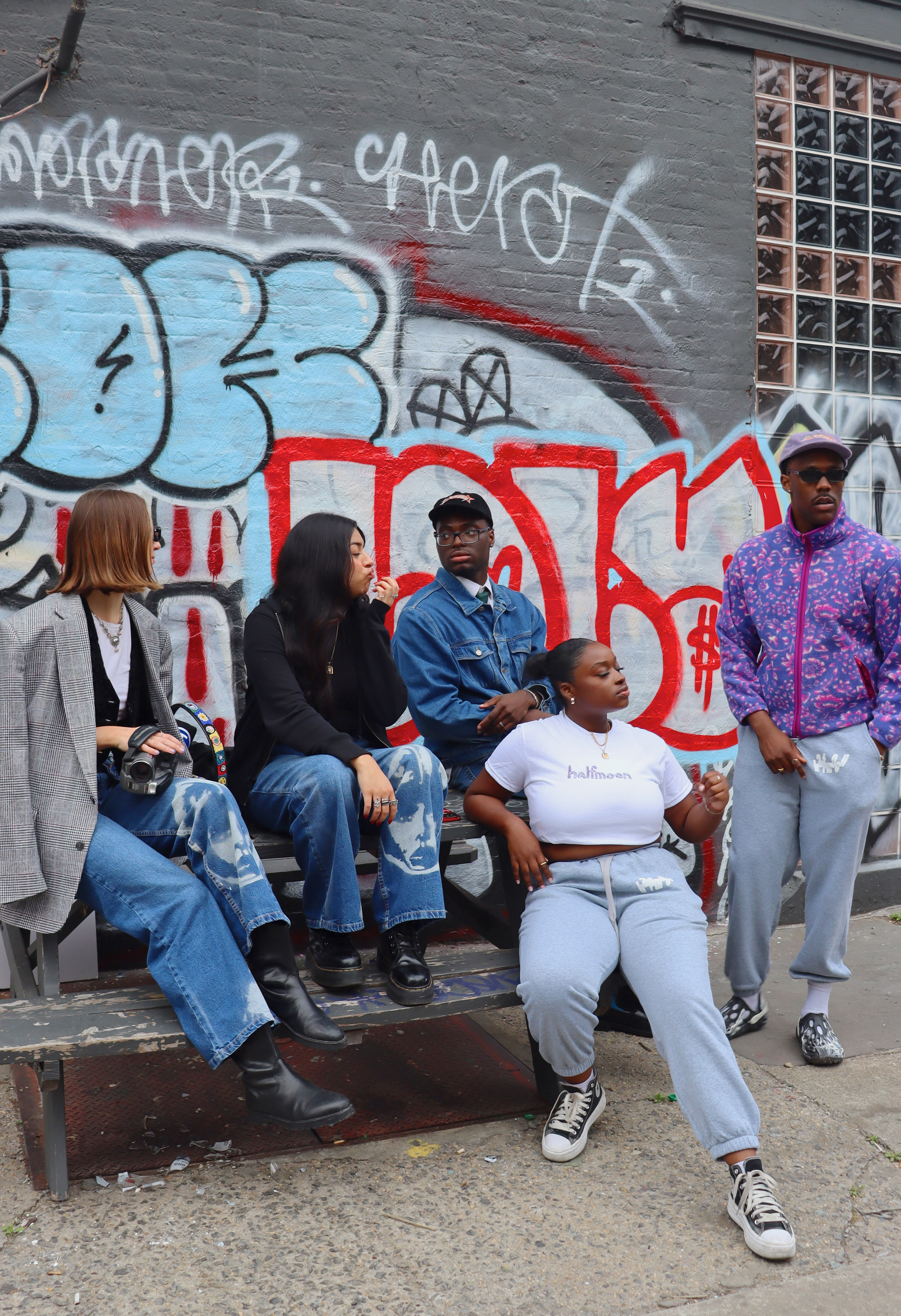
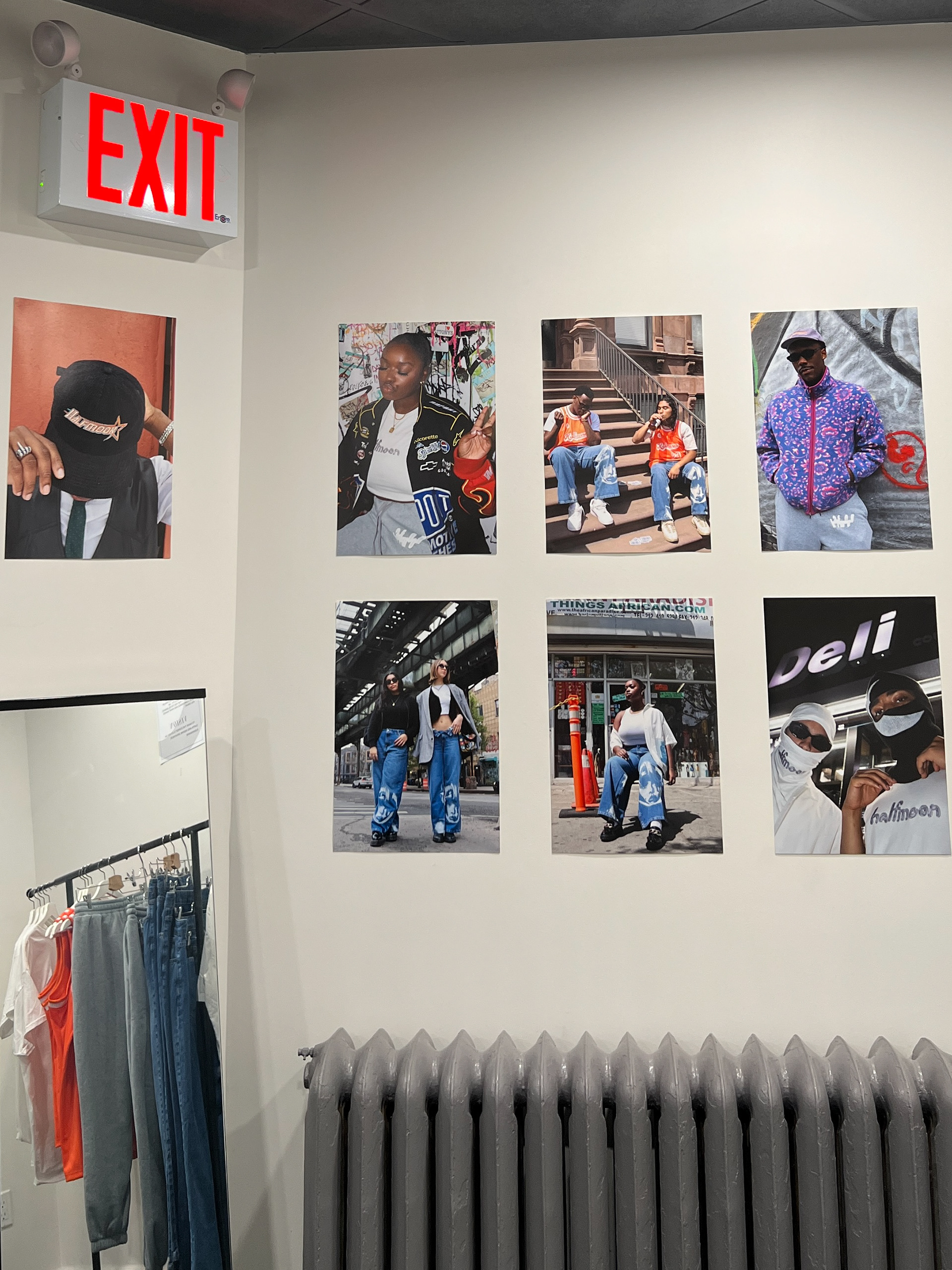
All photos were shot by Giovanni. The premise of the shoots was to showcase the different ways in which people would "live" in Halfmoon. To do this the looks were shot in different environments and settings around parts of New York City, with each model varying in style and fit. The goal was to appeal to everyone, and show that the pieces accentuated the individual's personality and unique qualities - that you, the wearer, could tailor Halfmoon to fit your style.
All models are friends of Giovanni. Not only did it make for a very enjoyable shoot experience, but subsequently a diverse group of individuals with different body types, something that those who viewed the final exhibit commented on, saying they felt the brand was appealing to all.





Commercials
Halfmoon Basketball
One of the first concepts that Giovanni came up with and was story-boarded out, this commercial was about capturing the energy of the city and spontaneity. Beginning on a park bench with two business men who were seemingly unfamiliar with one another, the two spot a stray basketball and decide to go to war. The scene parallels the idea of holding on to your inner child and unique sense of energy that the minds at Halfmoon possess.
All the benches on the court were occupied during shooting, so the bench scenes were actually filmed at another location in the park, with audio from the court placed over top and the shot of the resting basketball in between. When the two subjects got up from the bench and walked by the camera, the shot was cut, and then restarted back on the court from the same perspective to create a seamless transition.
The pairing of the jersey with a dress shirt and tie was intentional; not to look funny, but rather, fly. Many adults who viewed the pop-up store and saw the commercial made comments that they thought it was a 'hilarious' concept, but in the opinion of the minds at Halfmoon, the unorthodox pairing is both stylish and practical.
Uncle Carl
"Unc" introduced himself as such, among many other names, after Giovanni & Rashaad interrupted him in the middle of his fit-check video, having his iPhone propped up on a painted metal railing outside the brownstones of his Harlem apartment. After facing several rejections of getting a city-goer to don their apparel, Rashaad & Giovanni were hoping the all-maroon tracksuit wearer would be up for it, and he was. While Giovanni snapped photos, Rashaad began asking Carl questions about what it was like to grow up in a community with such strong cultural history.
Paired with NY jazz legend Lockjaw Davis, it created a bit of magic as Uncle Carl revisited Harlem's past up to its present, and gave his input on how he hopes NY's culture continues forward.
Pop-Up Exhibition
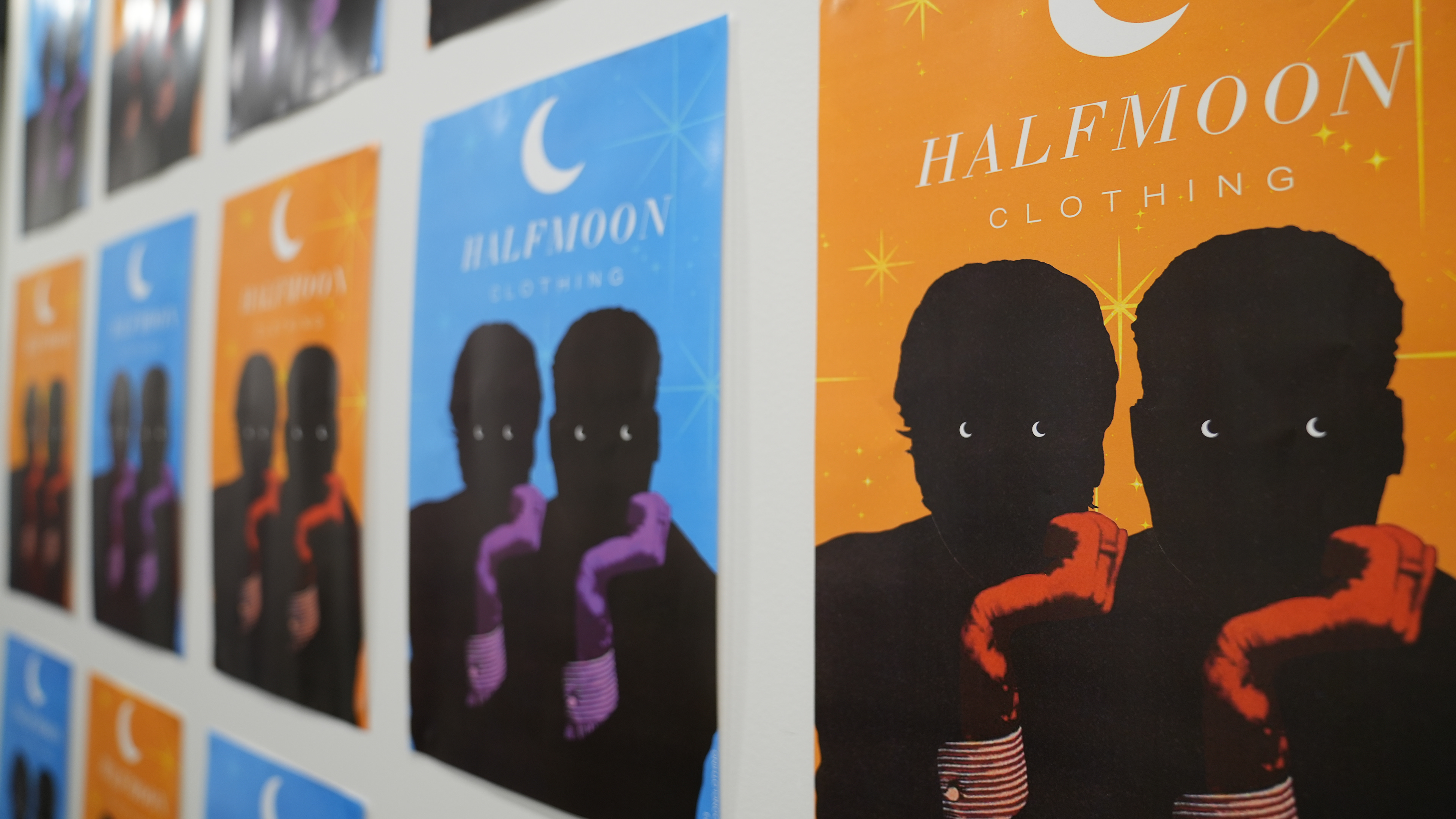
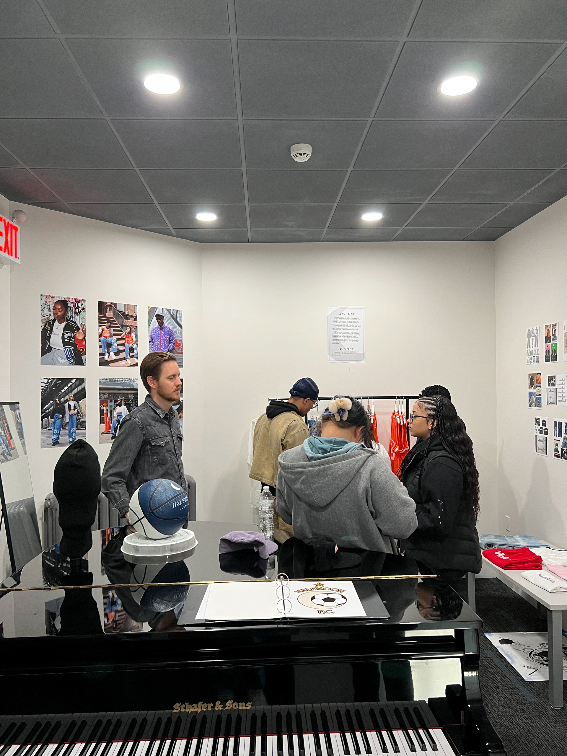
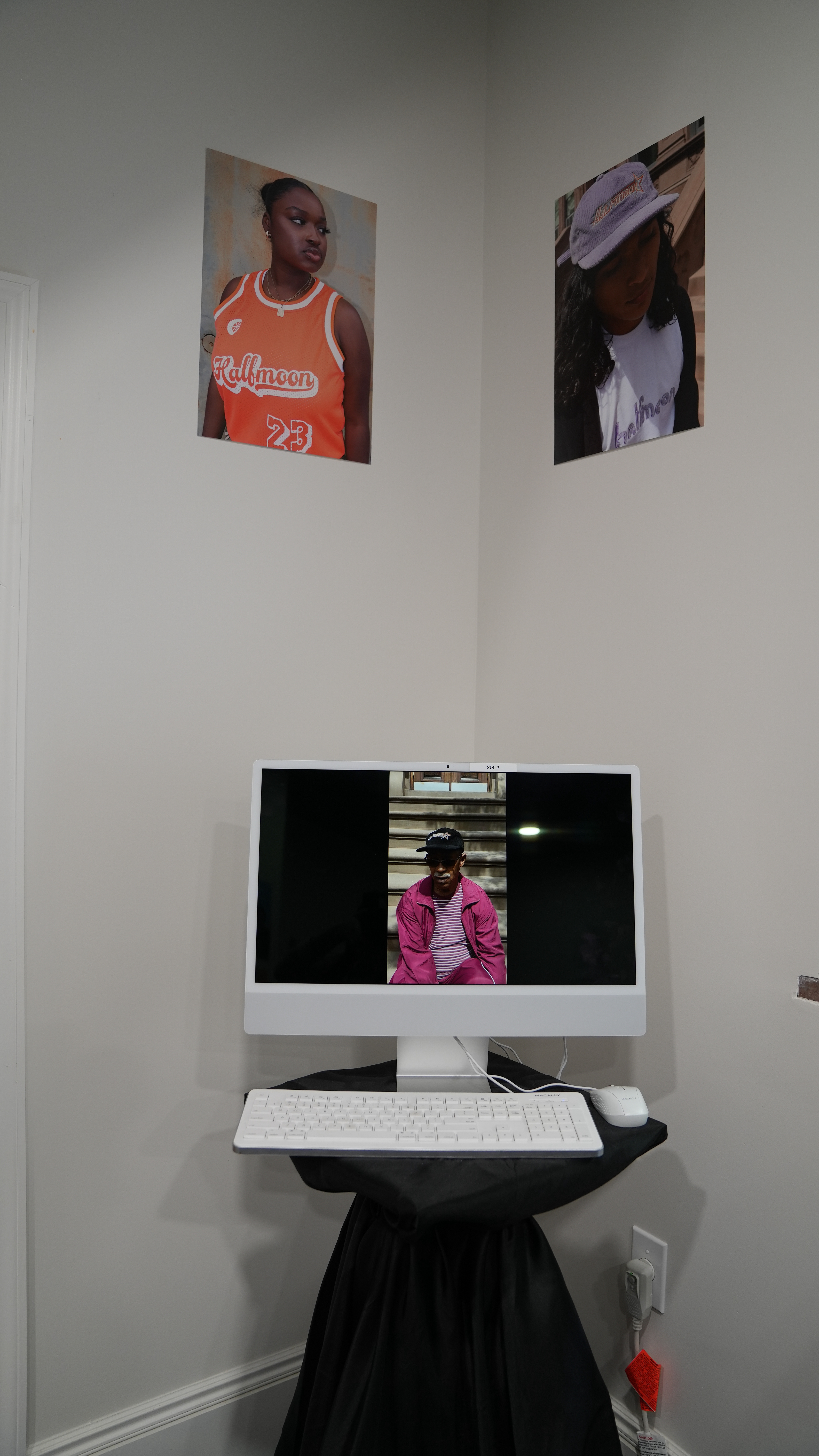
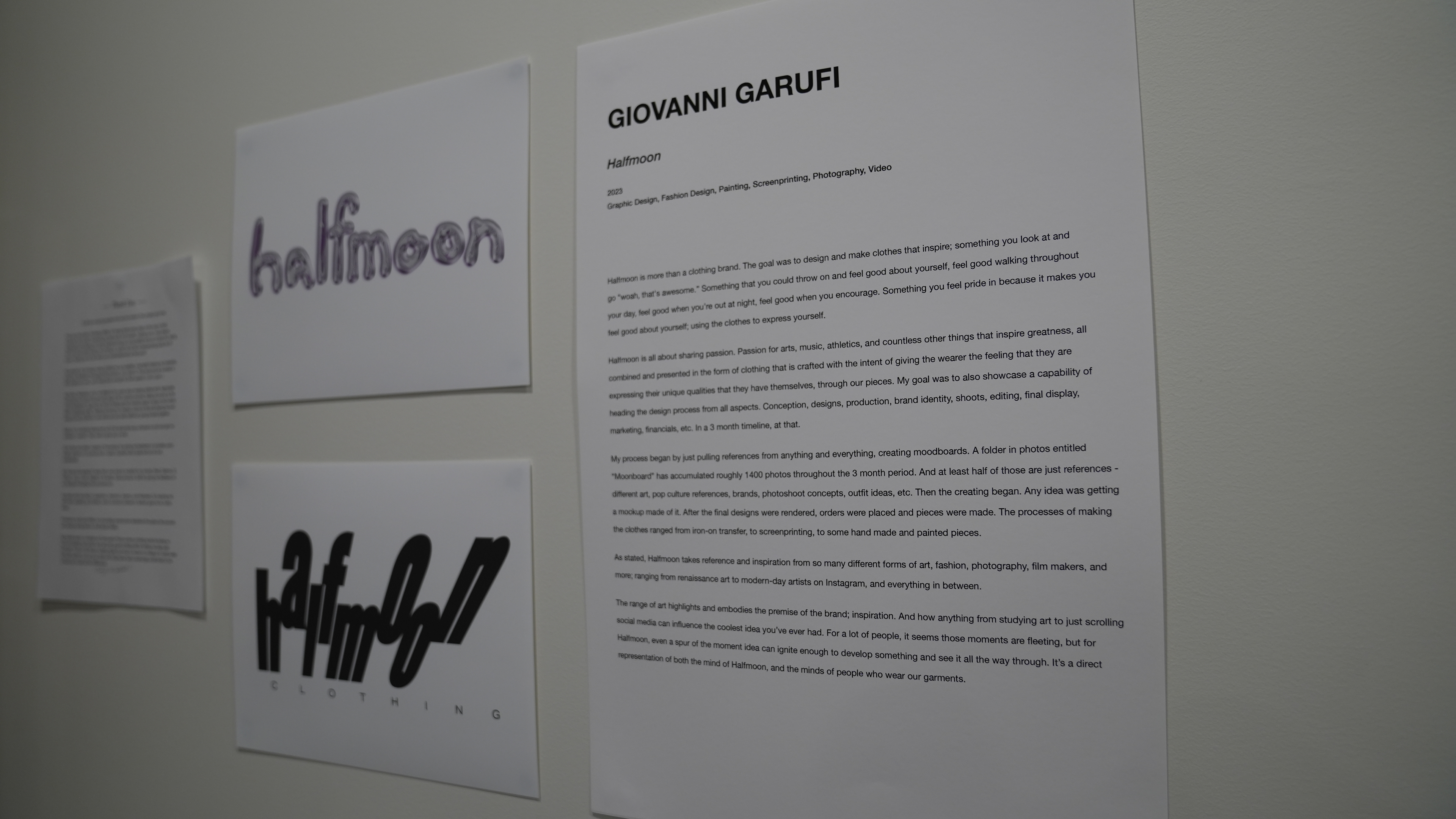
The presentation of the project was intended to feel as though one was walking through a pop-up shop in Soho. All the process work was included in the exhibition, but the emphasis was on the final products and creating an environment that excited people who walked in, not knowing what to expect.

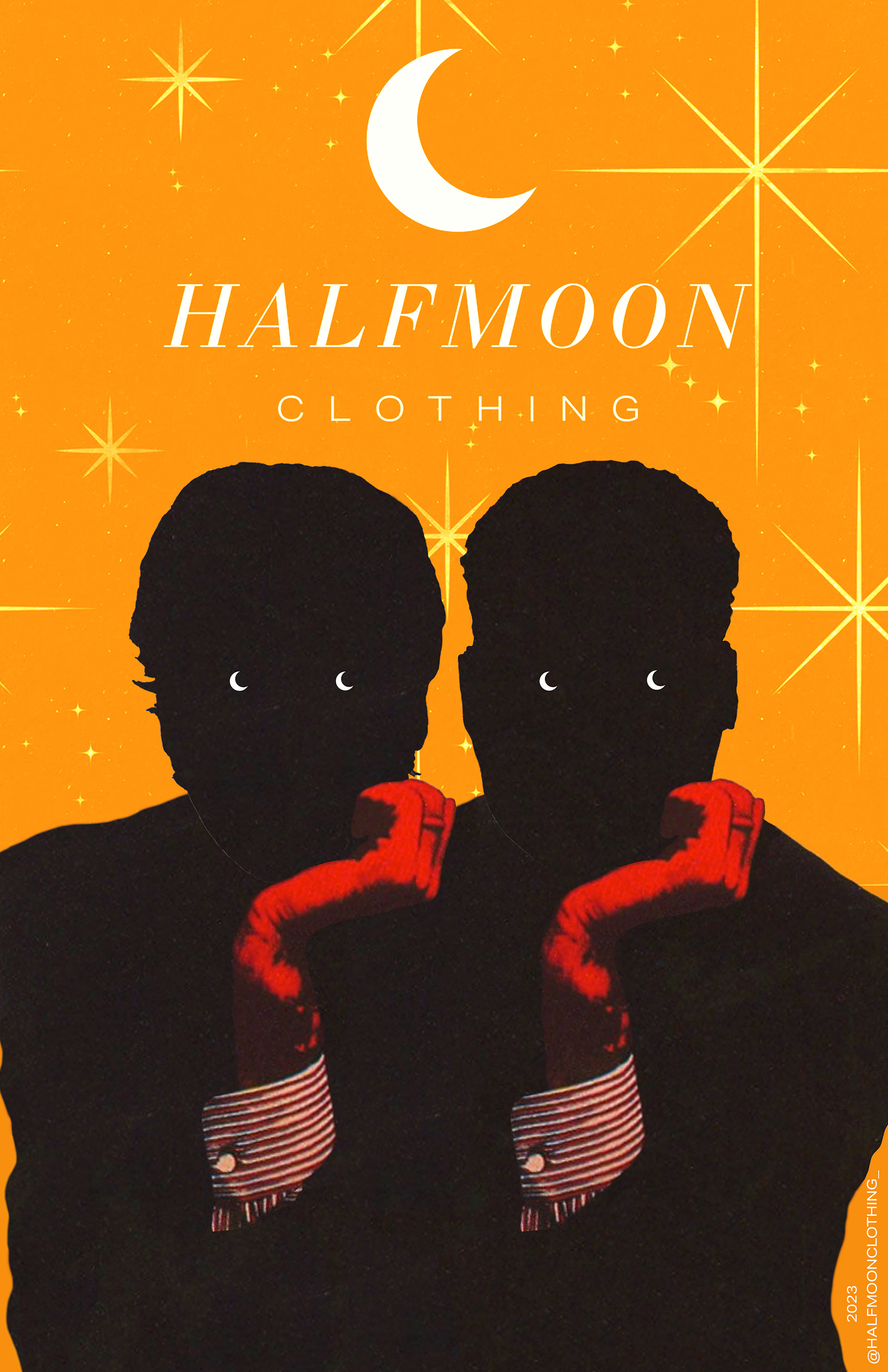
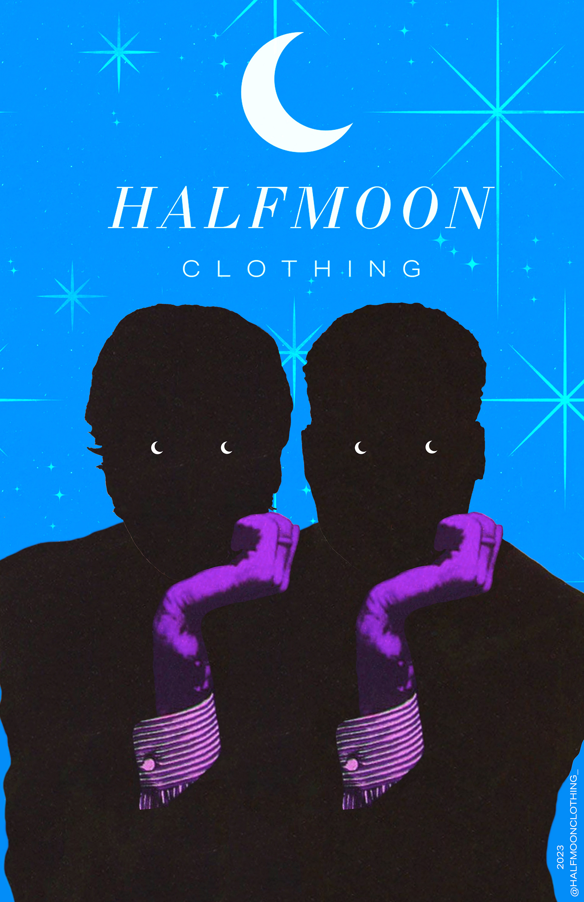
Posters
Web Design
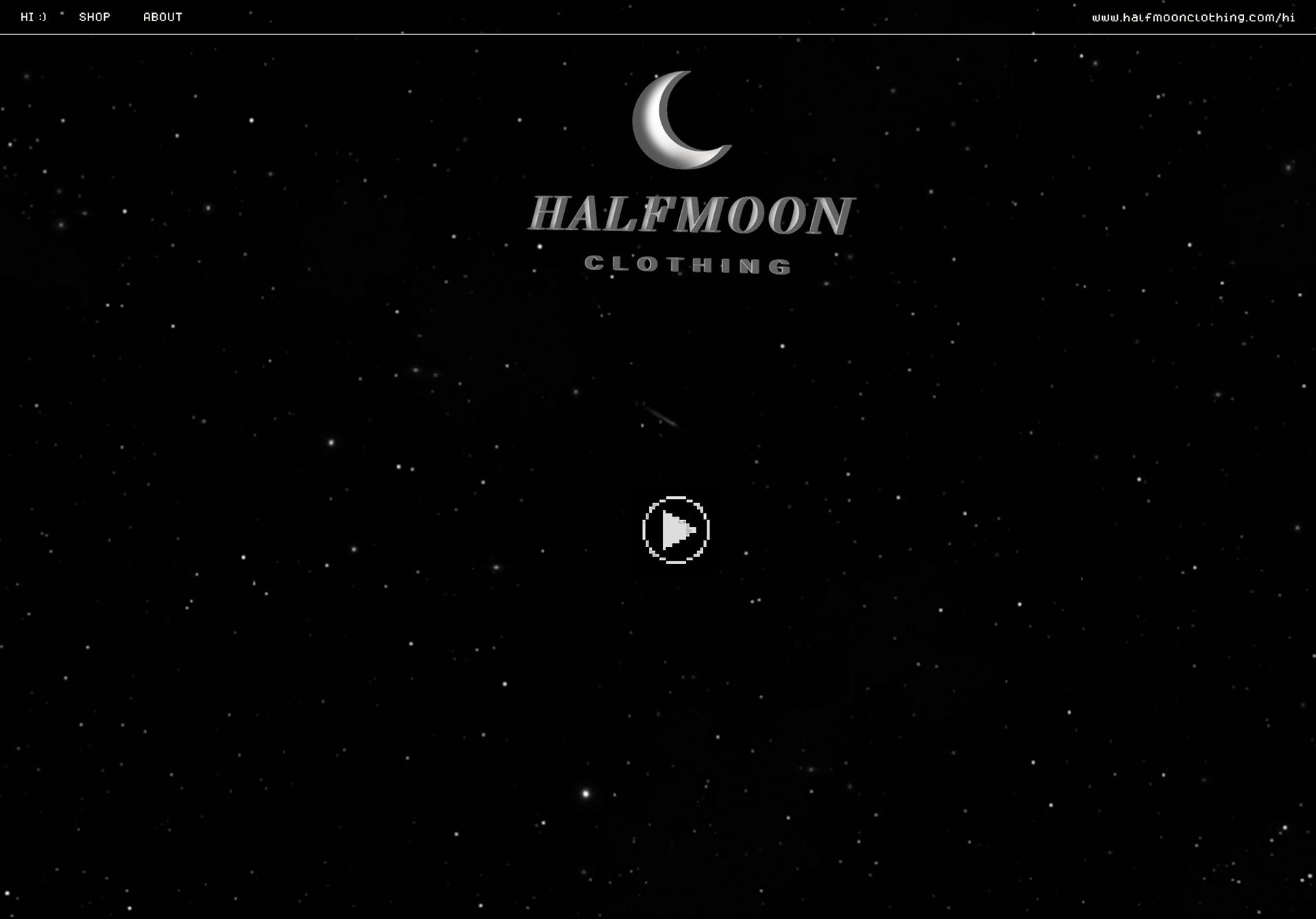


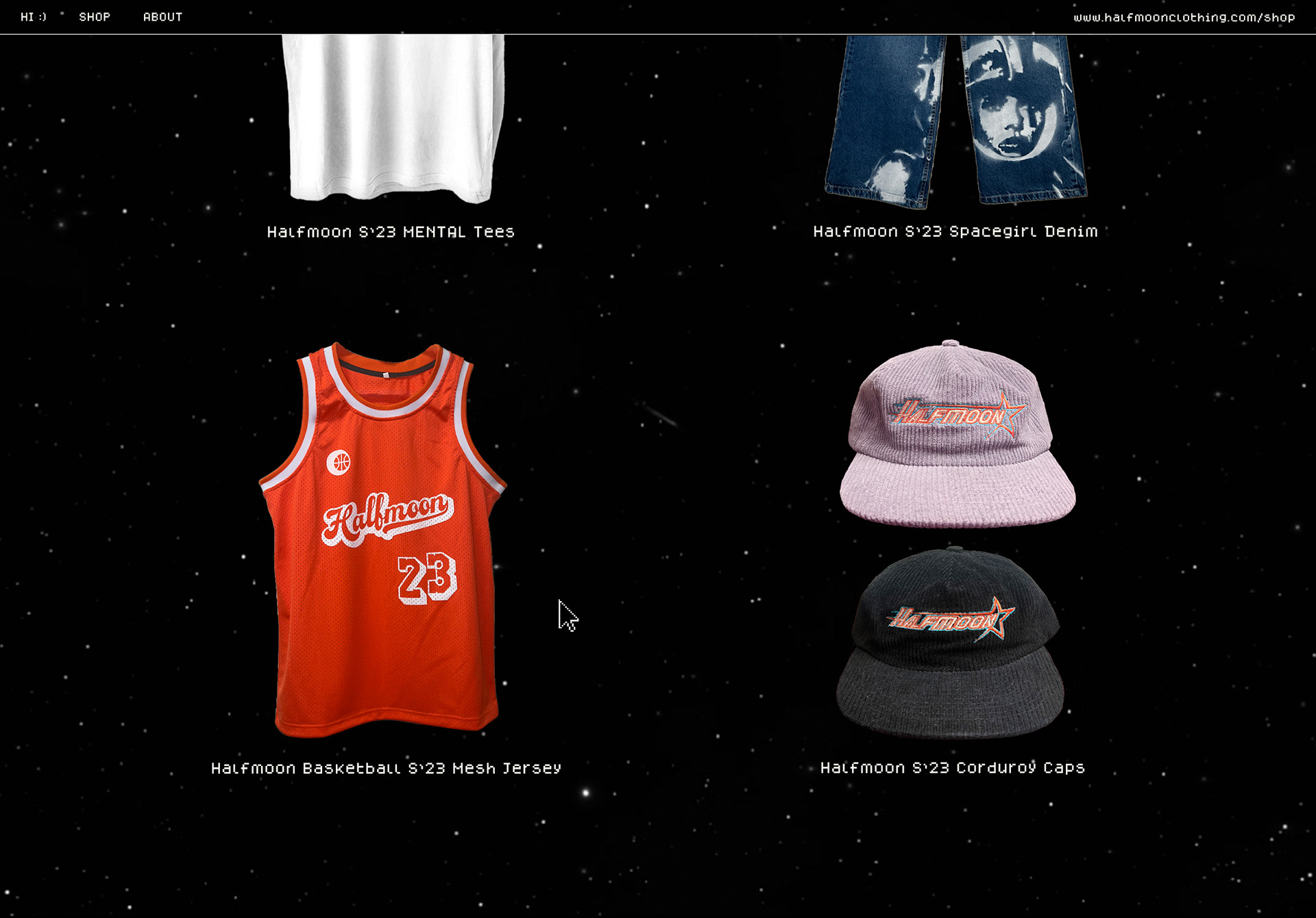
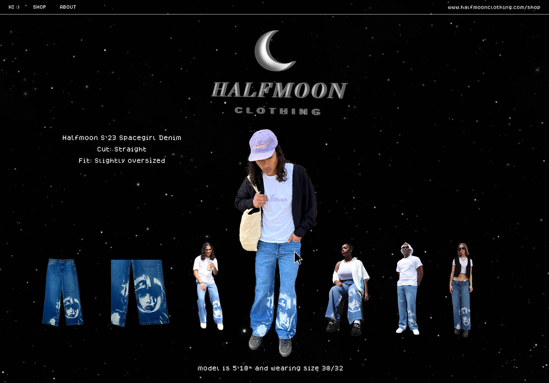
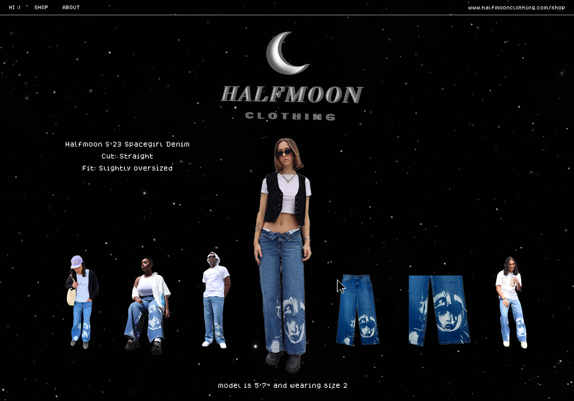


The goal was to create a simplified aesthetic with a retro-space vibe, utilizing pixel-bit font and different floating icons. The site will be somewhat interactive and always 'moving' to retain attention. The background will be a slow moving video of the night sky. The home page will contain behind the scenes videos from our shoots including interviews with the models and designers. The shop page will feature an image carousel of floating icons.
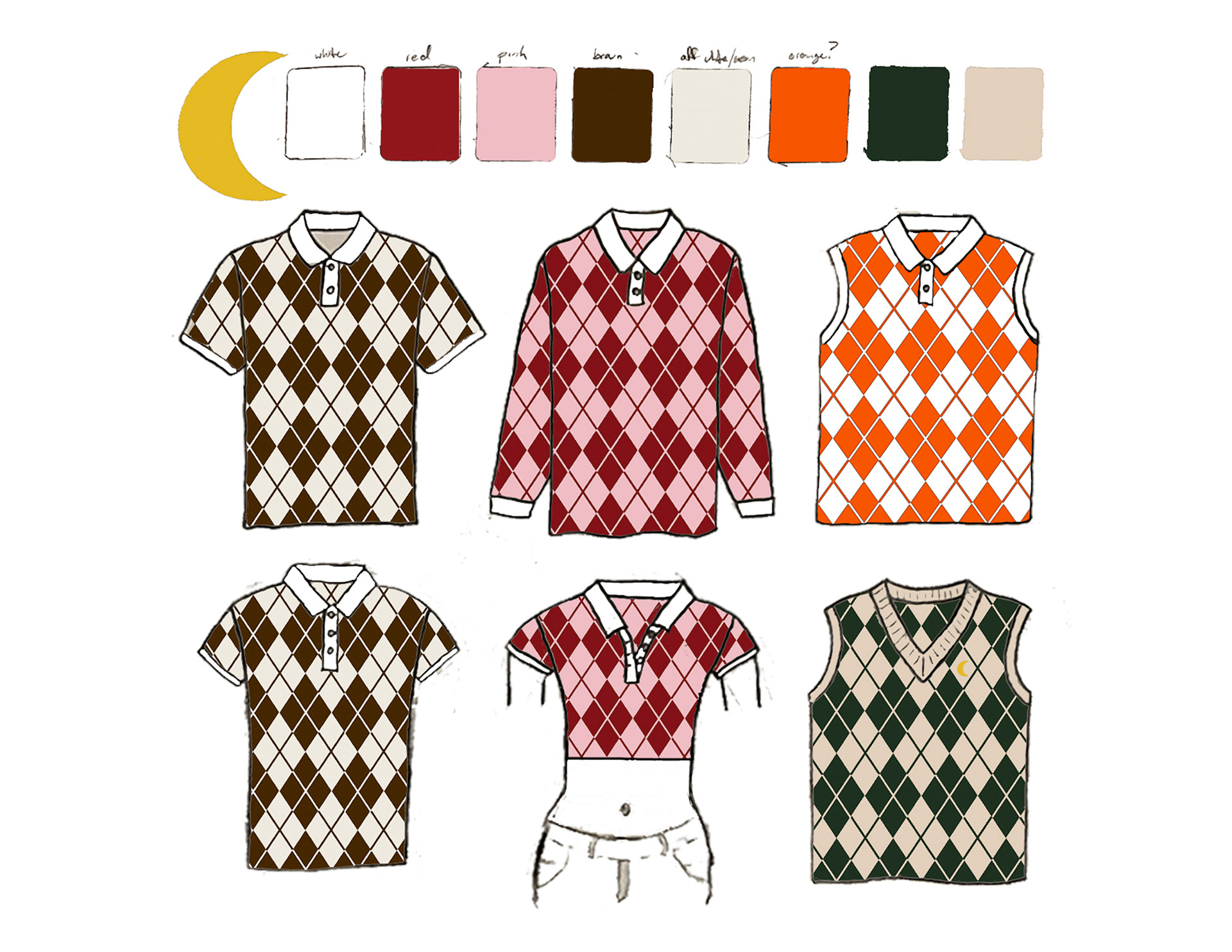
Concept Work
(click to enlarge any image)

Additional BTS & Process Work
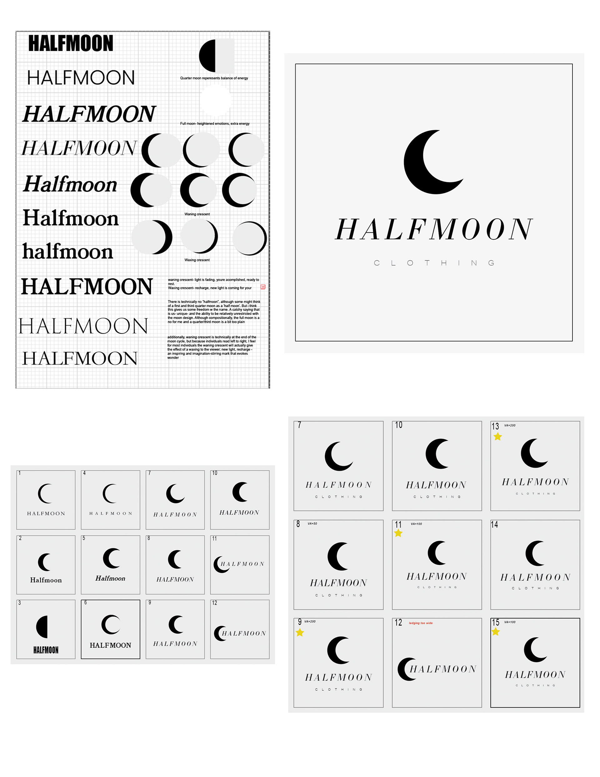
logo study
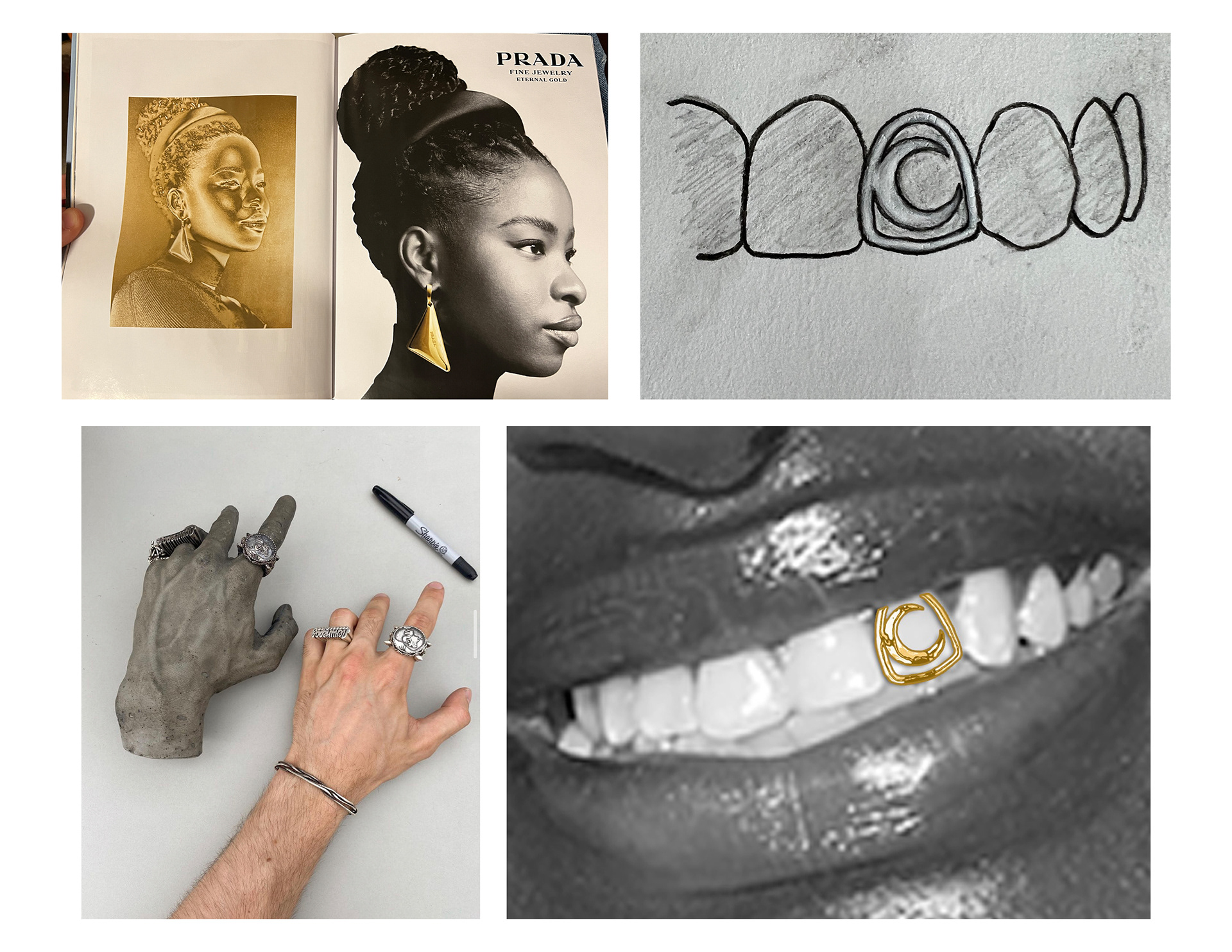
grill
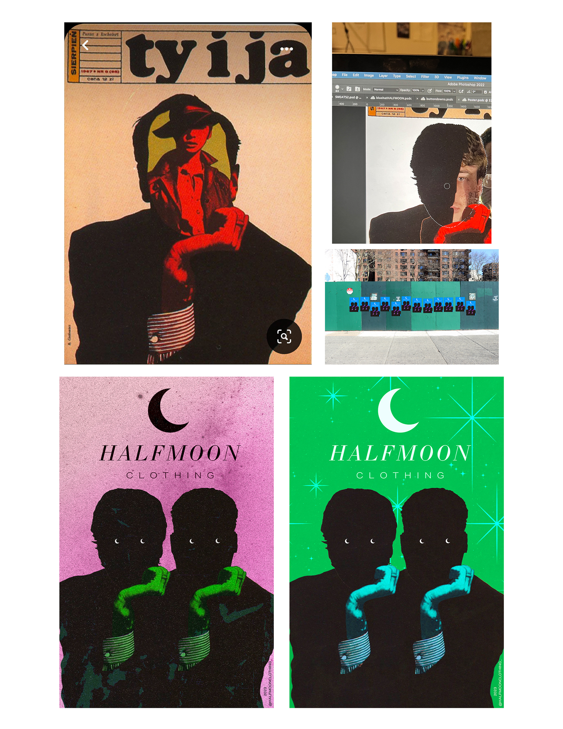
poster reference & process
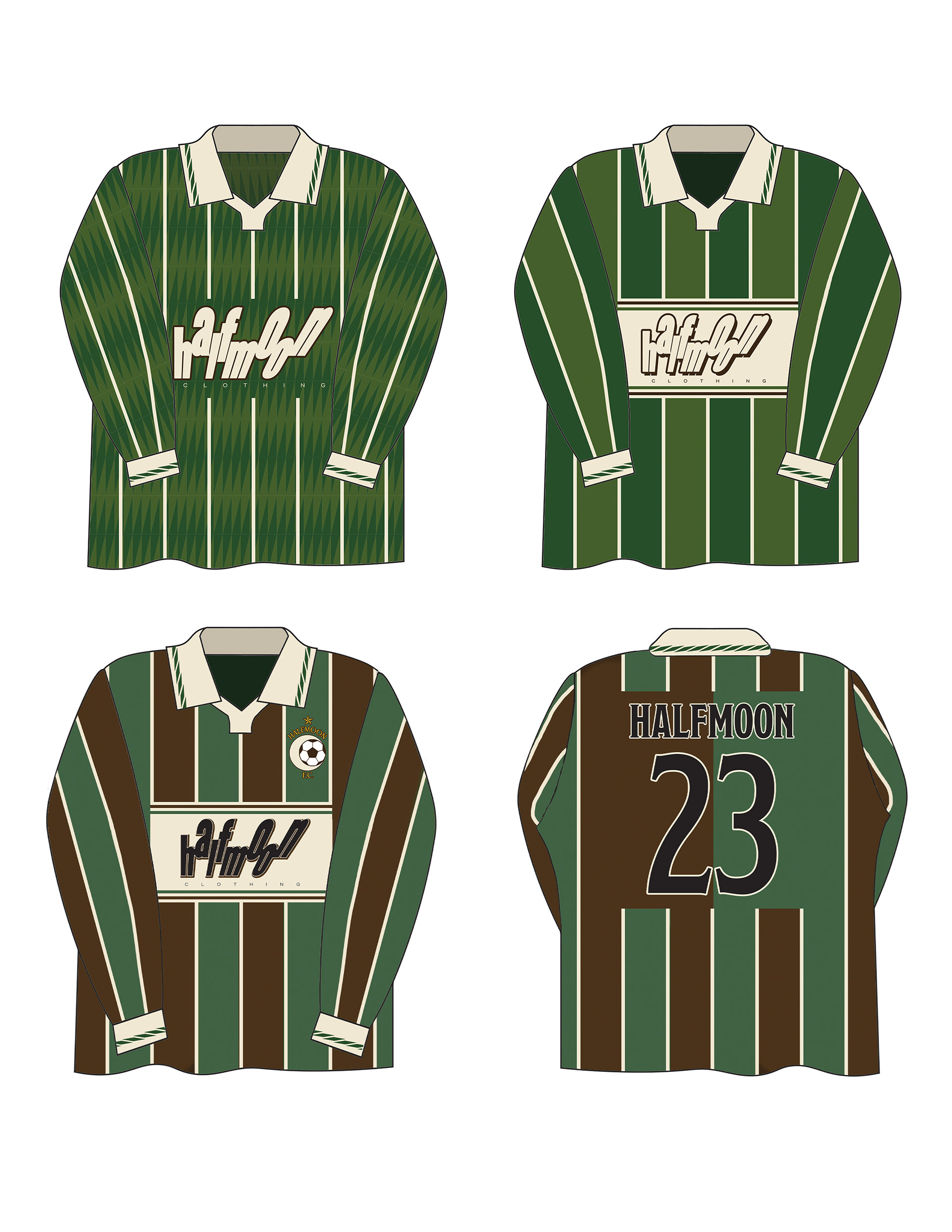
early jersey designs
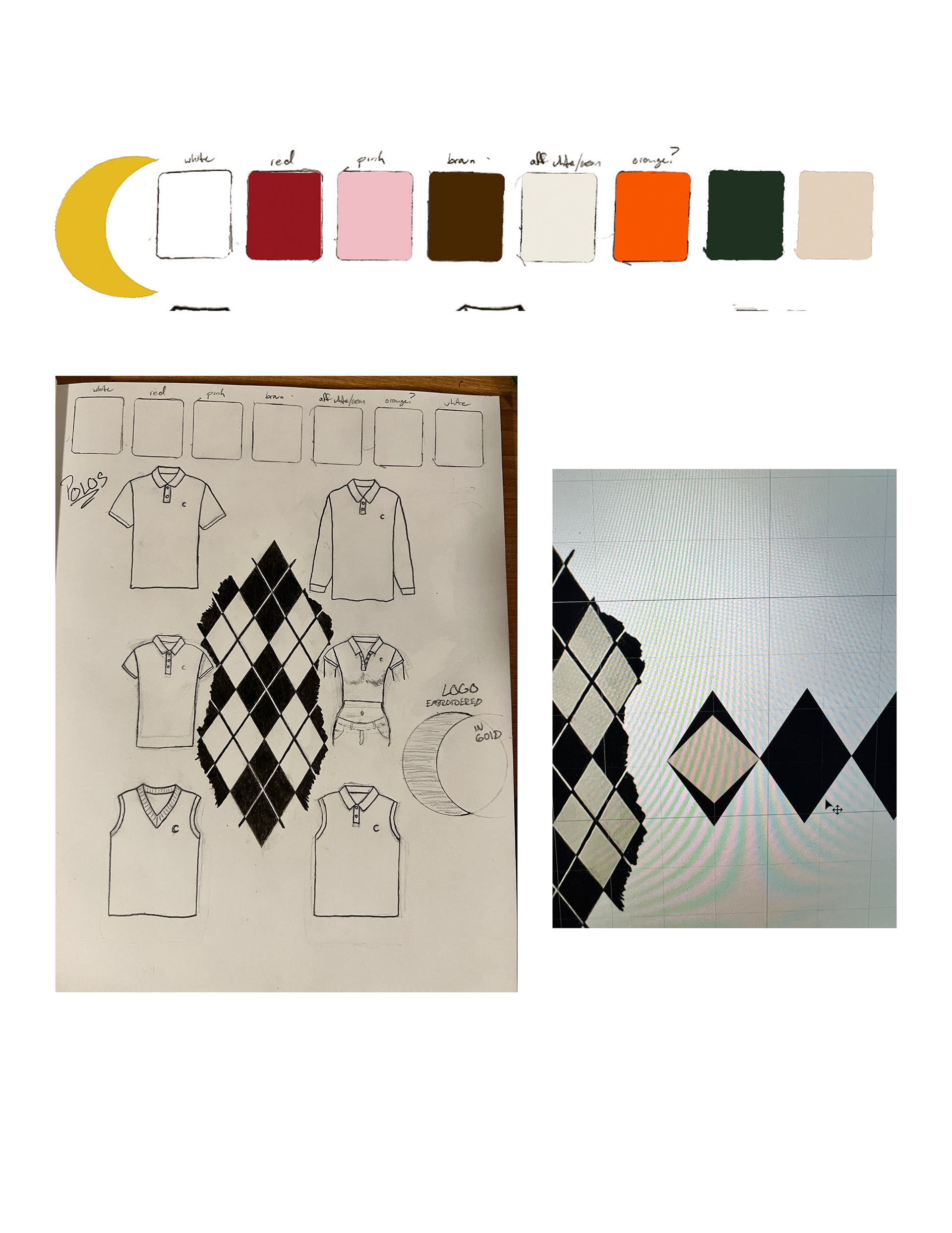
hand sketch to pattern in photoshop
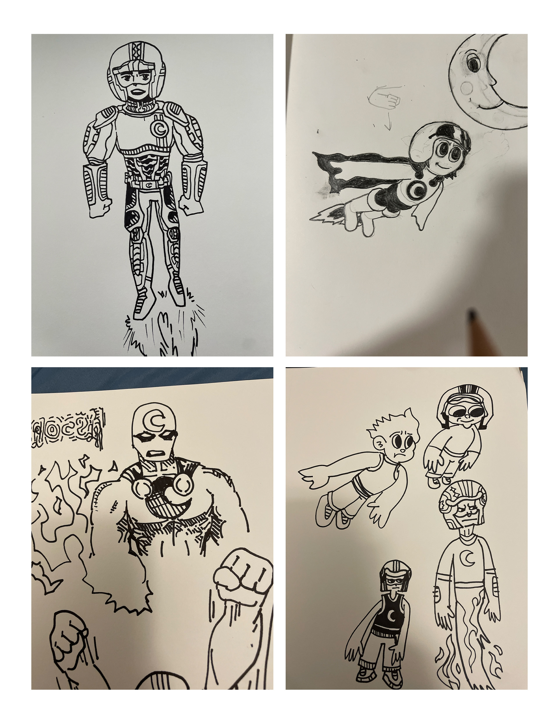
mascot sketches done by my brother and myself

Mood boards and albums (up to 2,929 images)
