Sunday League has never looked so good.
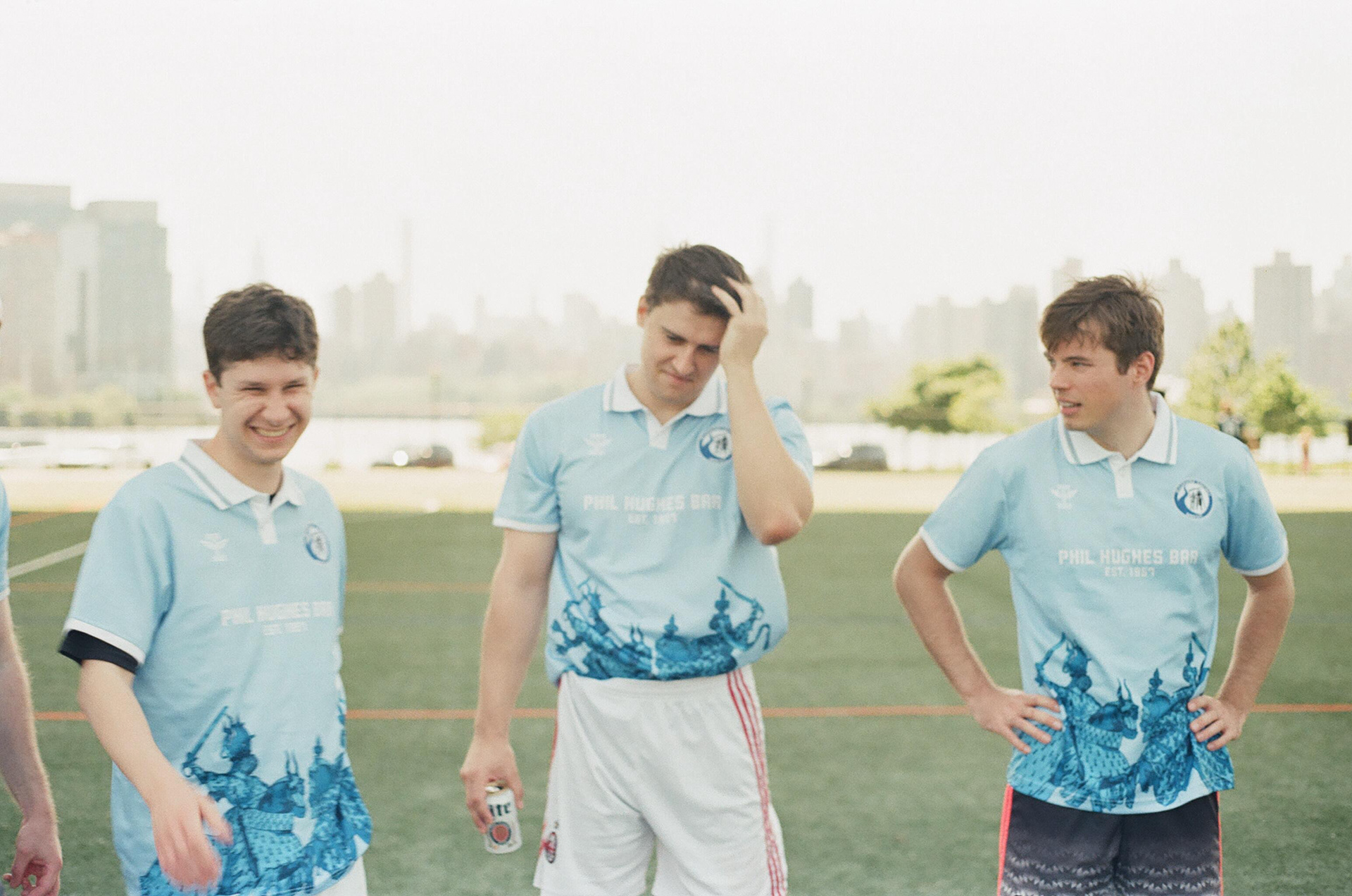
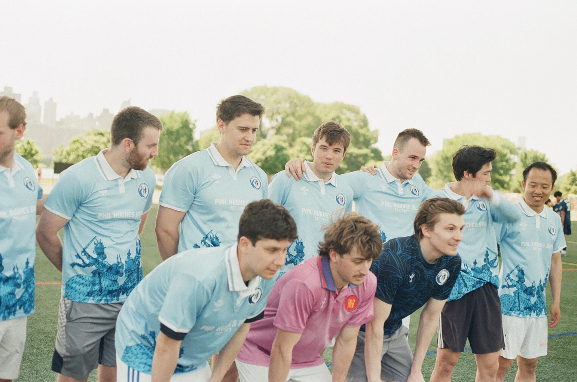
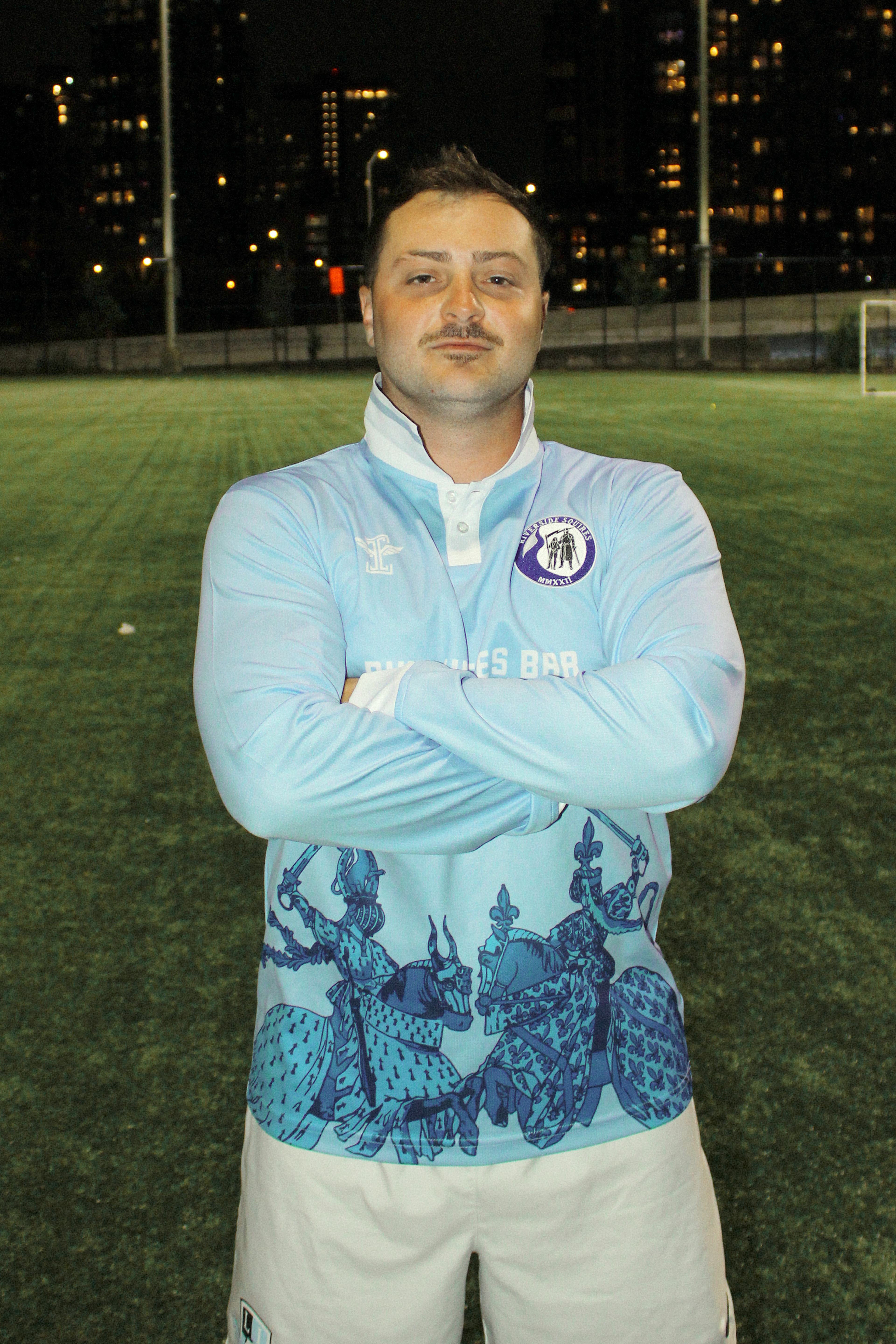
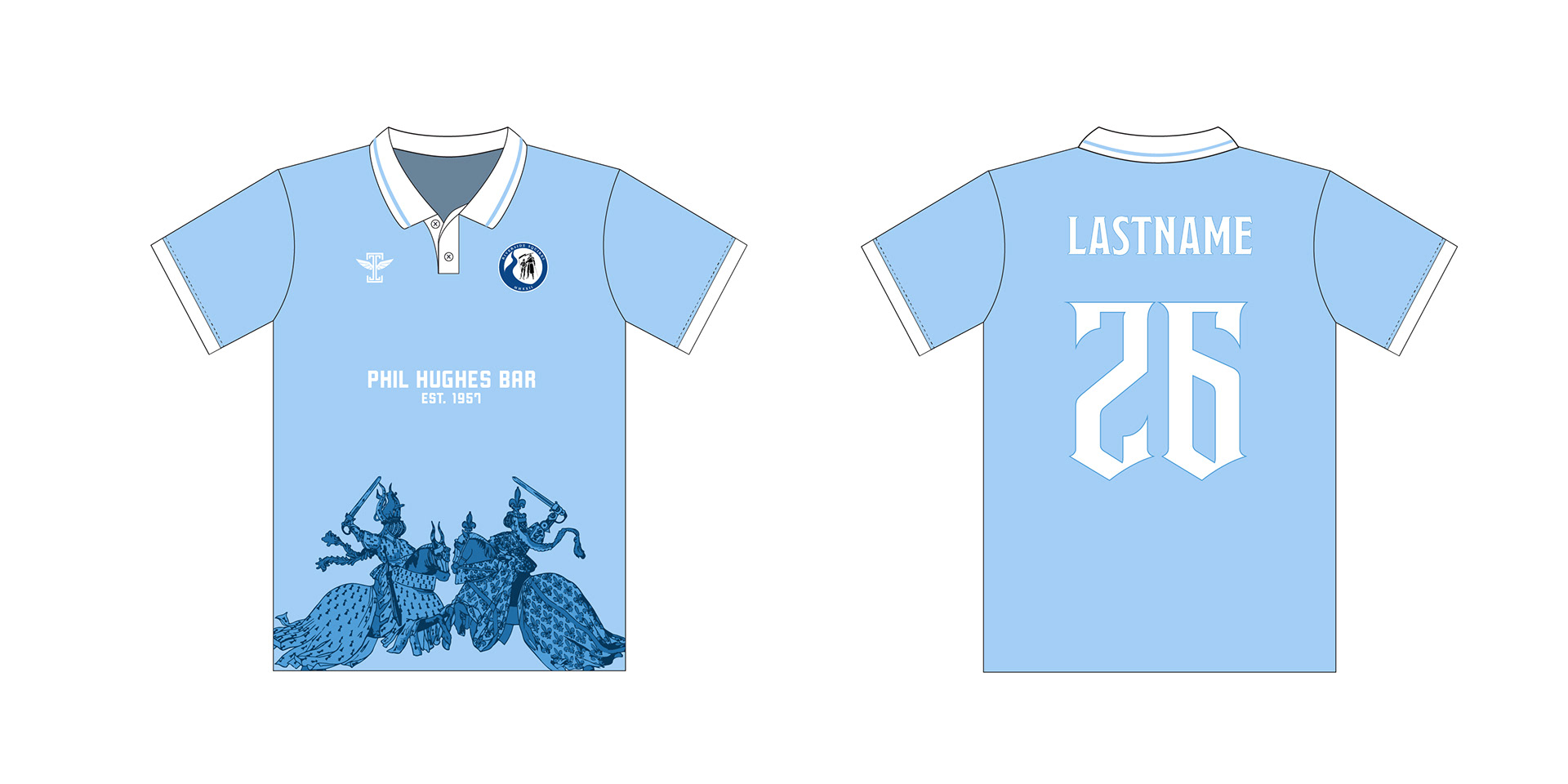
The Riverside Squires are (depending on who is asked) a premier amateur soccer club, competing in NYC's historic Cosmopolitan Soccer League. Their home resides in the upper west side of Manhattan at Riverside Park. A Squire is a knight in training... students of the game, one may say. Fitting for the love of football exuded by the members of the squad.
The goal was to create a fresh take on a retro feel, which felt fitting for a club who's name suggests such proper and classic history, not to mention the history of the league they compete in.
When designing, Giovanni also wanted to capture the essence of the passion that the team plays with.
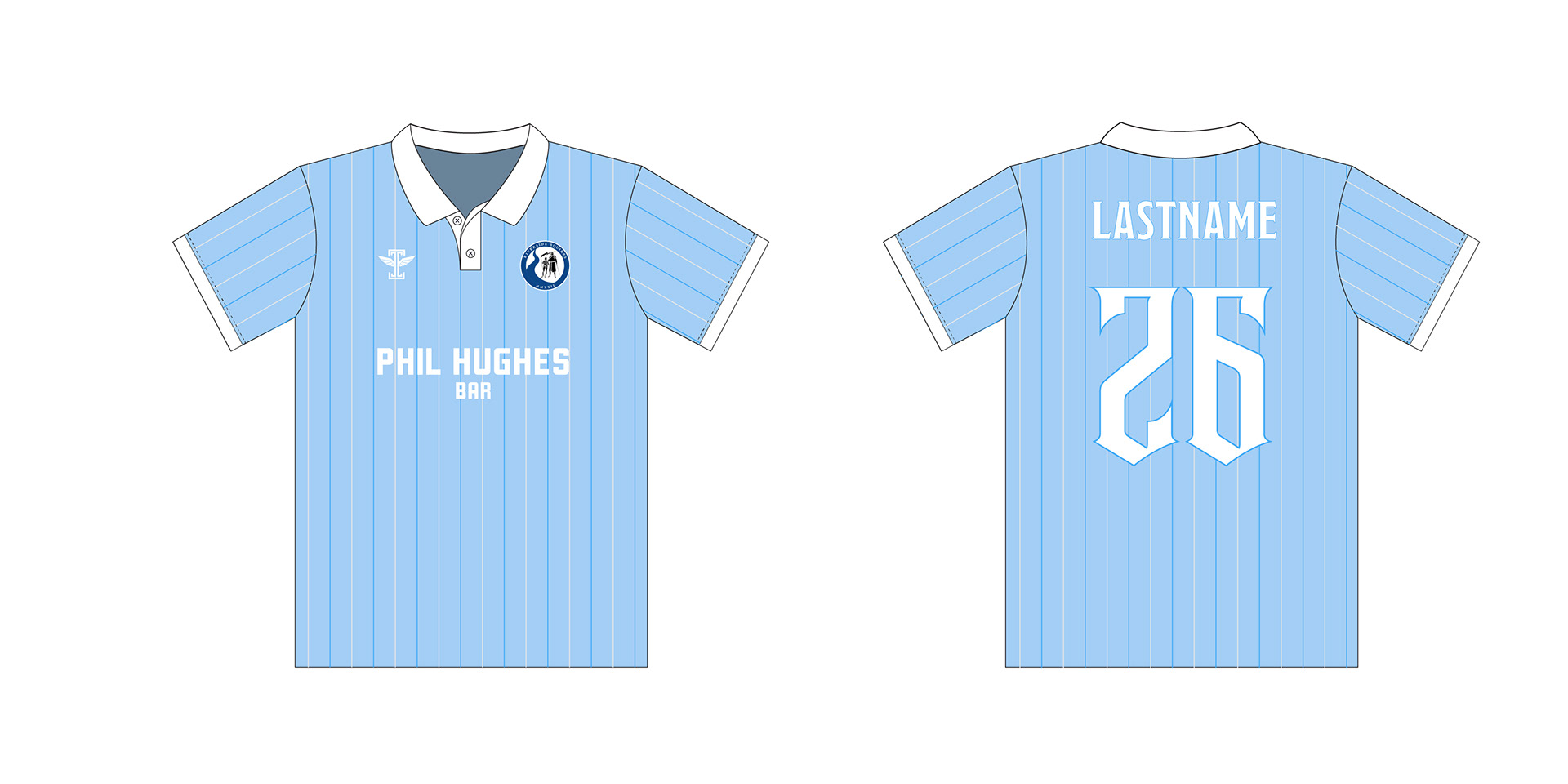
The vibrant baby blue color not only brings energy to the eye, not only represents the gorgeous, pristine flowing water of the Hudson River (definitely no sarcasm there), but also an ode to the clubs roots, beginning as two Columbia University intramural teams merging and taking the leap to play organized league football.
Inspiration:


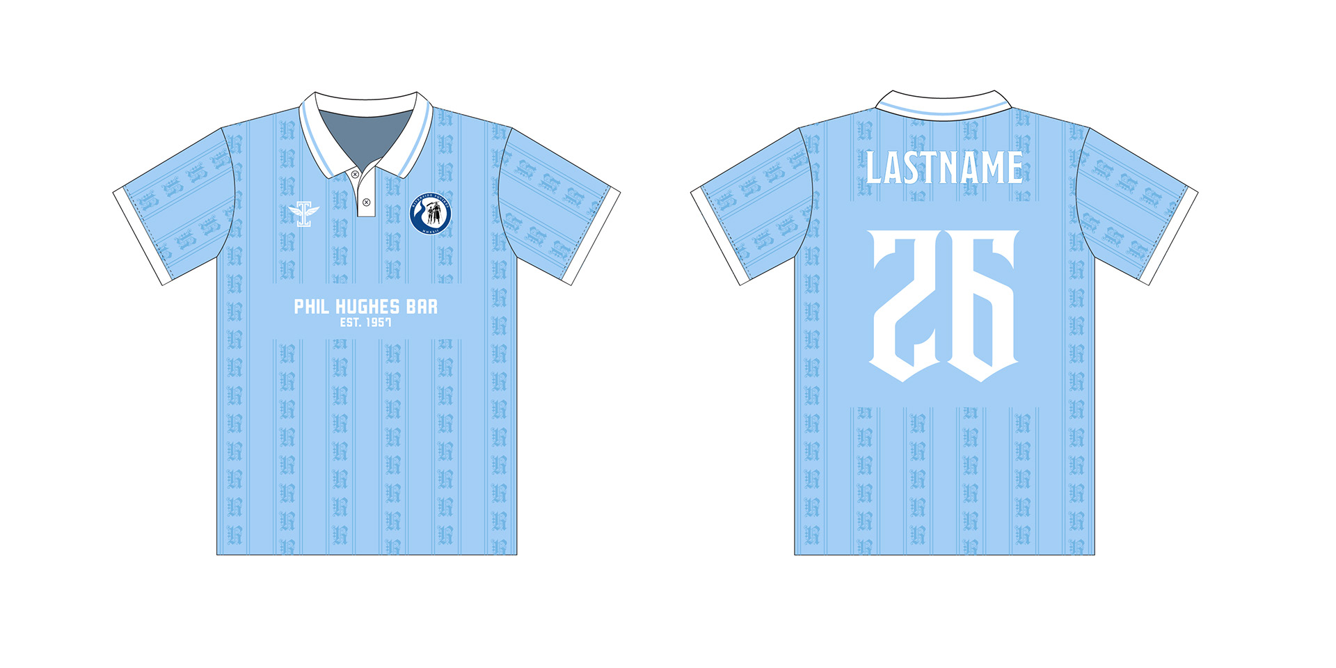
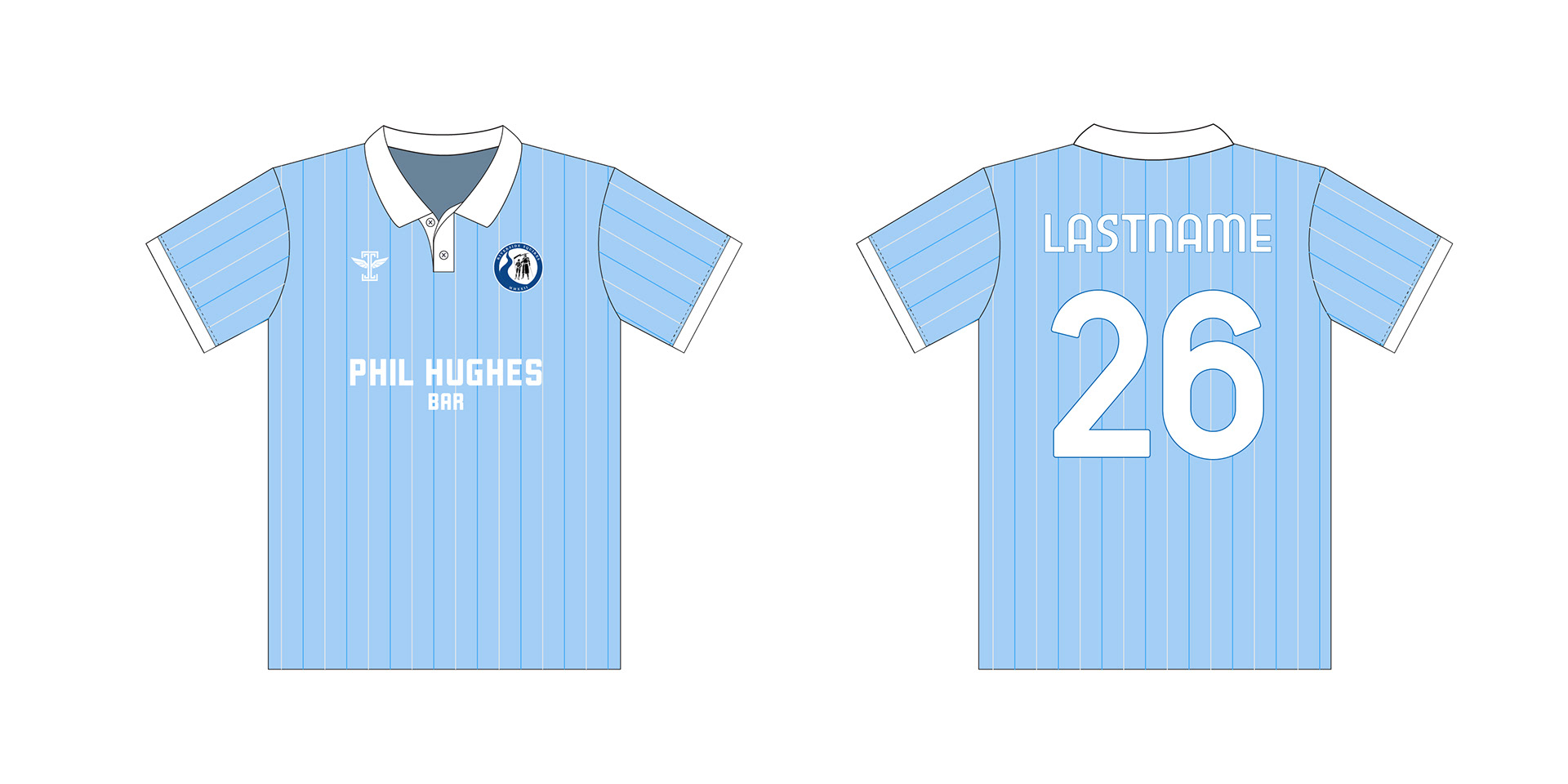
Retro designs were not the only ideas explored & developed. That being said, immediately Giovanni was gravitated toward pinstripe & crest looks. Something with a classic feel that would still undoubtedly stand out.
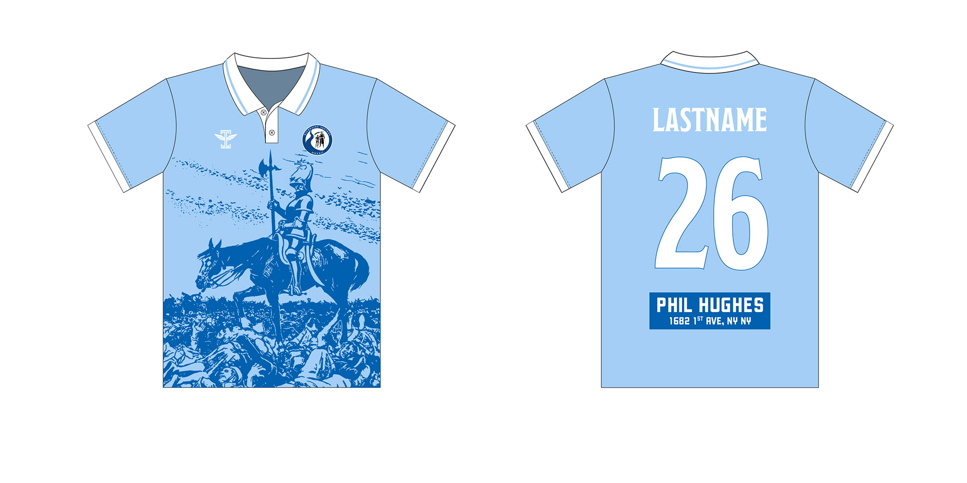
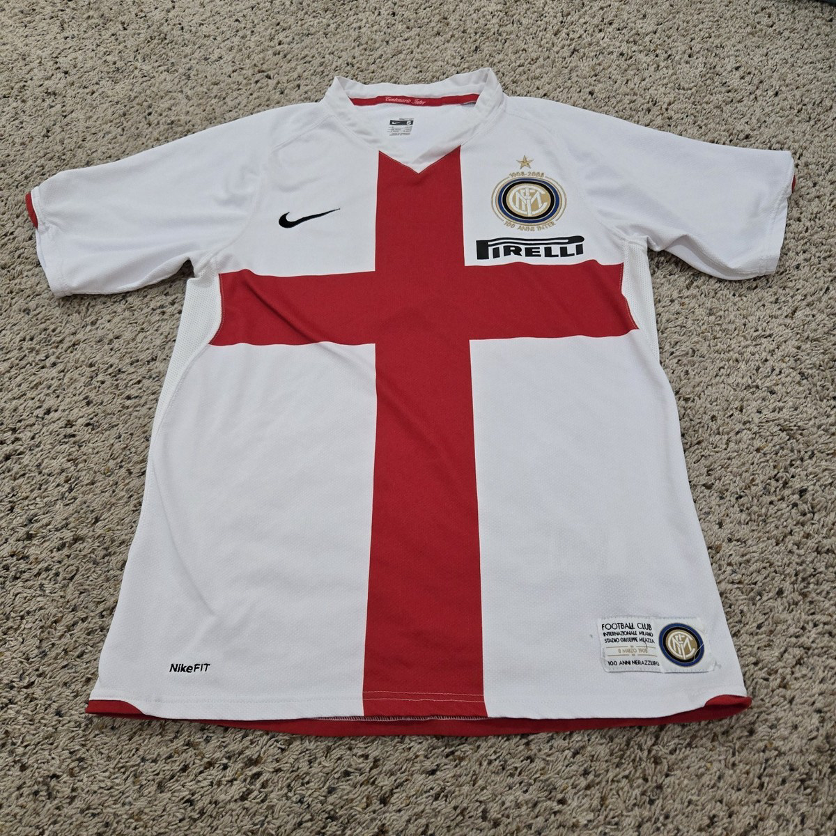
However the inspiration for the final design was largely influenced by this Boreal 23/24 kit.
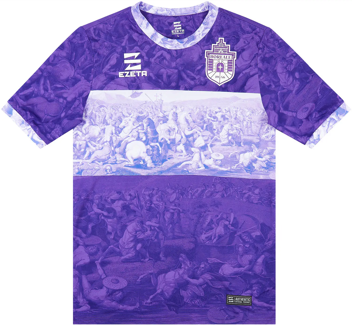
The intricacy and glory showcased through the artwork on the kit, which showcases Constantine's victory over Maxentius and the triumph of Christianity, is almost an emotionally evoking experience to just look at. But we were not only thinking of how the kits would look when designing, but how they would make the players feel when they were put on. Courageous, bold, ready to go to battle with one another. Eventually, it was clear this concept was going to influence the final design.
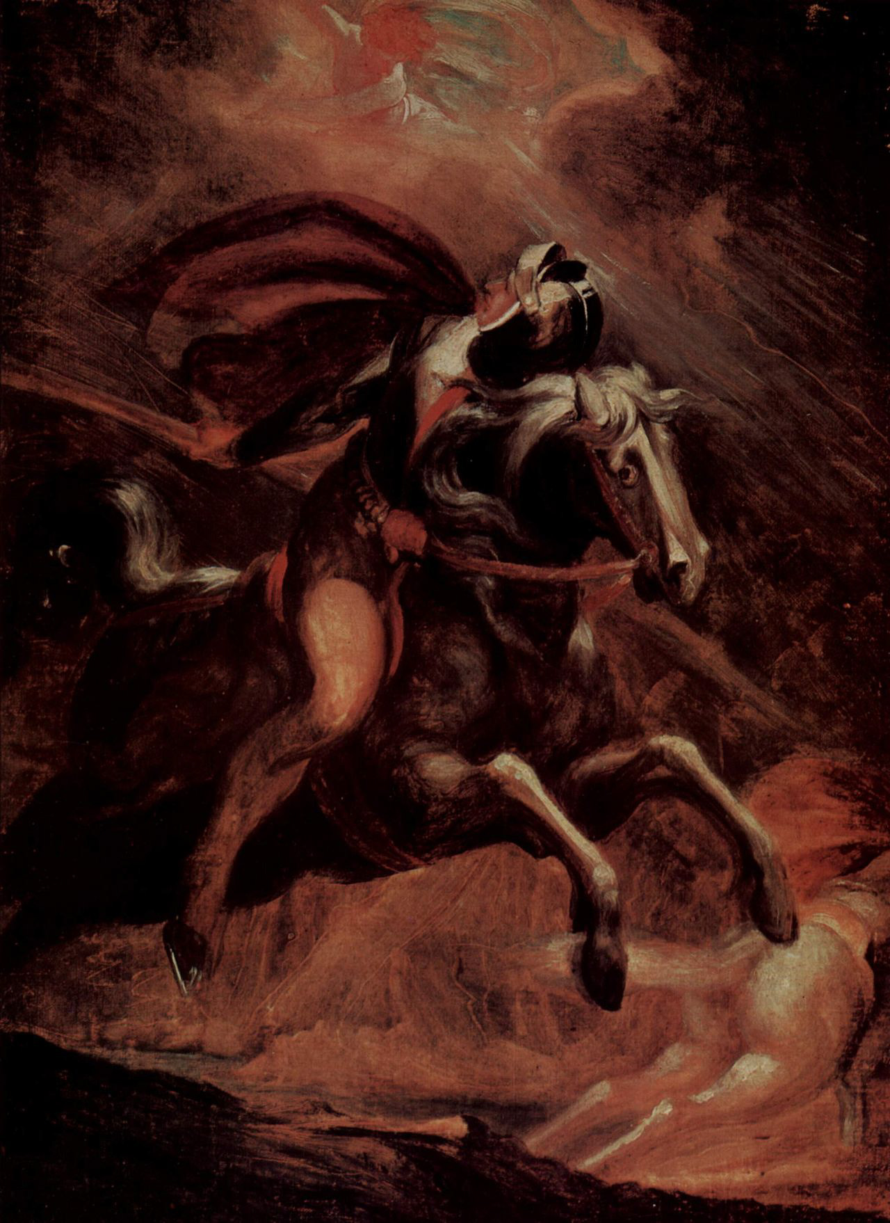
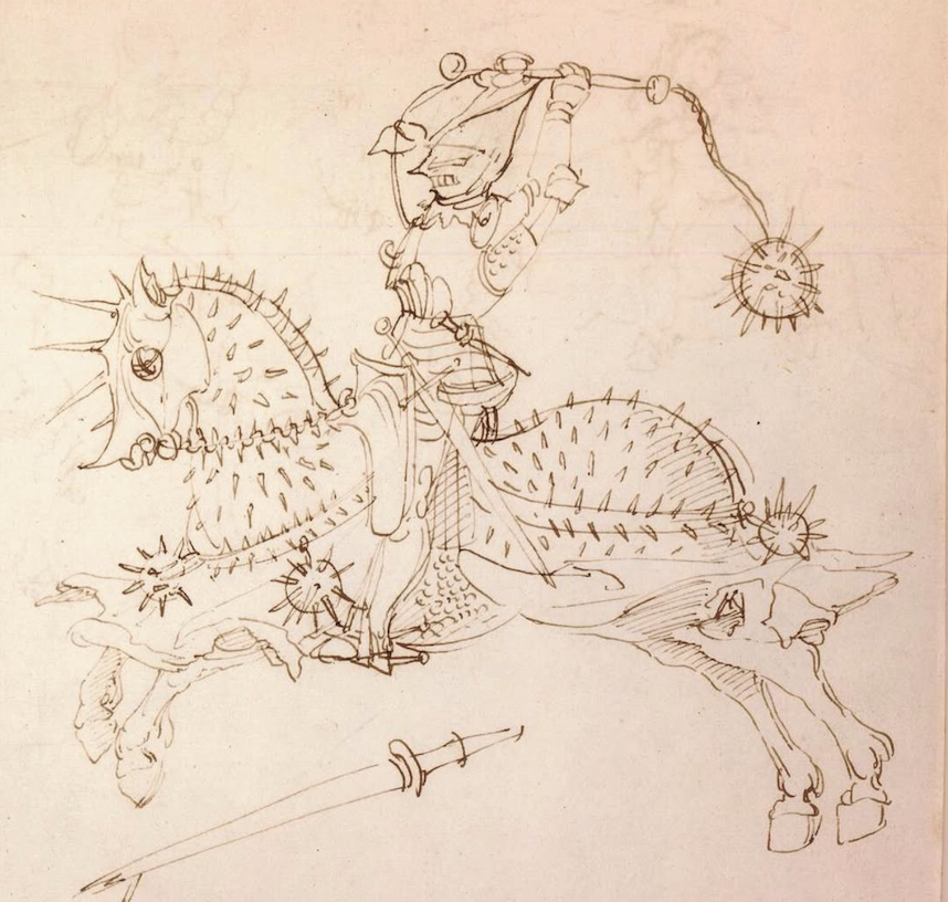
The internet was scoured for knightly artwork, both new and old.
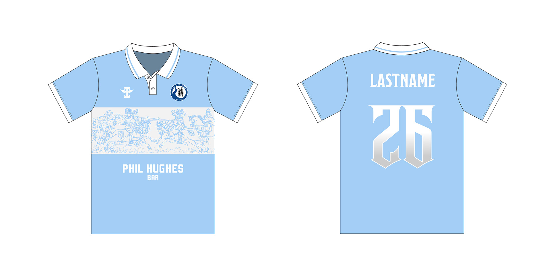
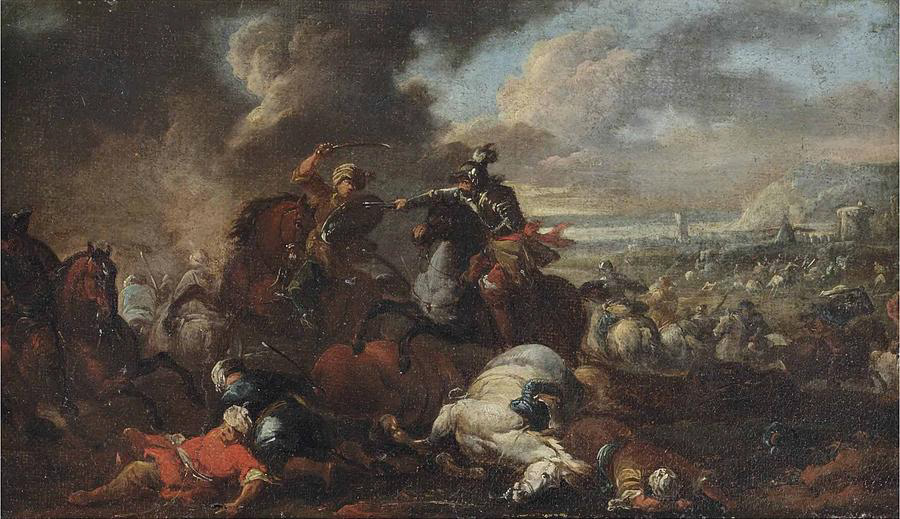
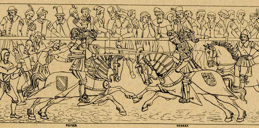
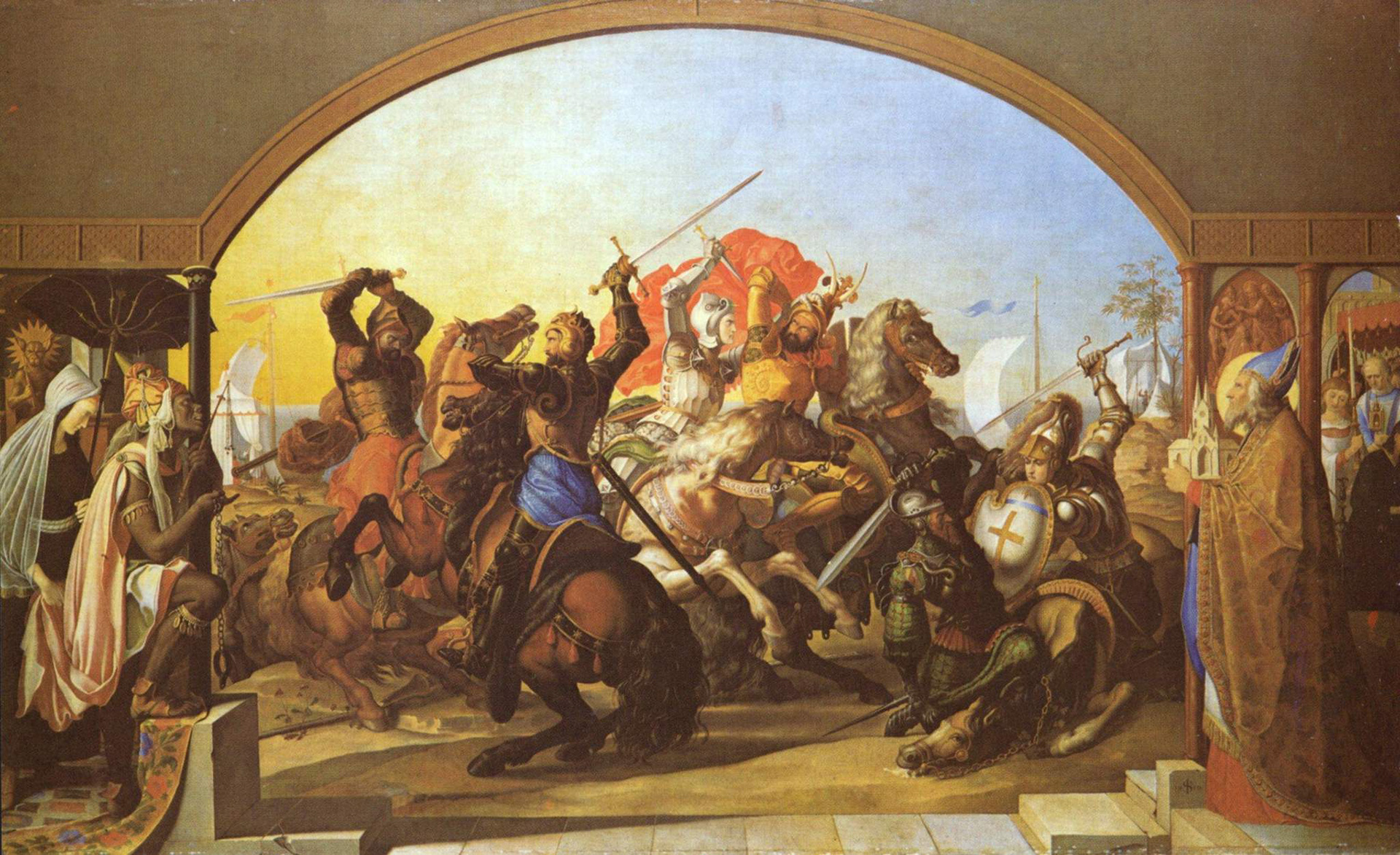
After hours of research, this image was found - an illustration dating back to the mid 15th century, of a jousting battle from the Nantes, France region. The knights are portrayed with remarkable bravery, neither backing down from the other. Fully invested in their sport at hand. The composition was excellent for fitting on the kit. It felt like the perfect artwork to exemplify the Squires identity.
One thing about the Boreal kit is while the details are astounding to view up close, they get lost quickly from a distance. Finding artwork like this illustration that could be easily vectorized was key, because while the same intricate detail is not there, it is much bolder and more recognizable from a distance, by fans and opponents alike.
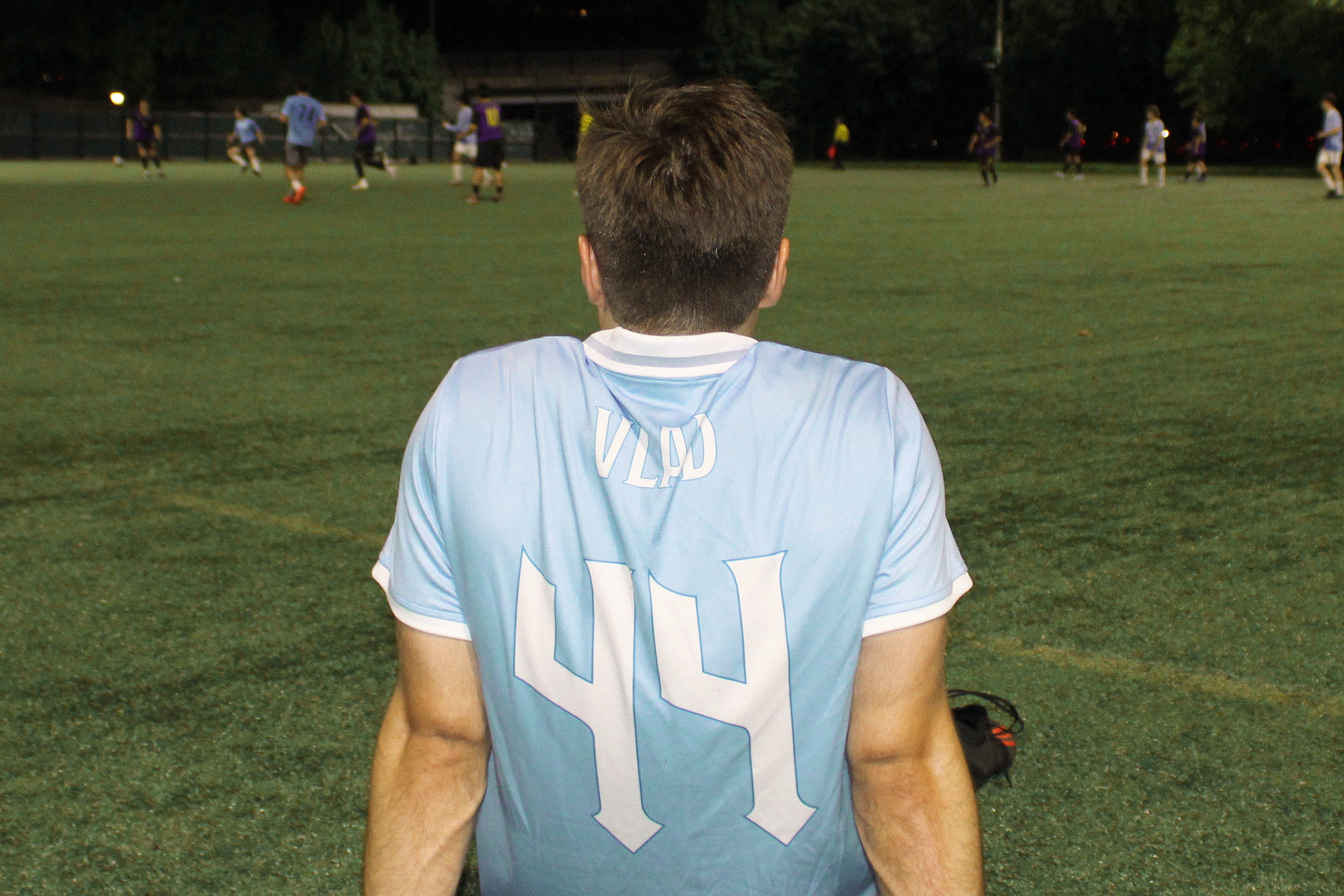
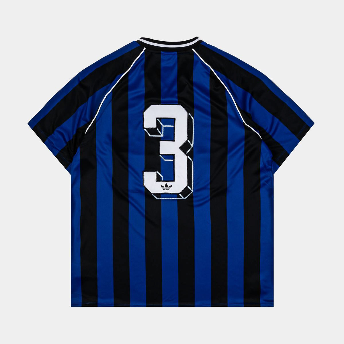
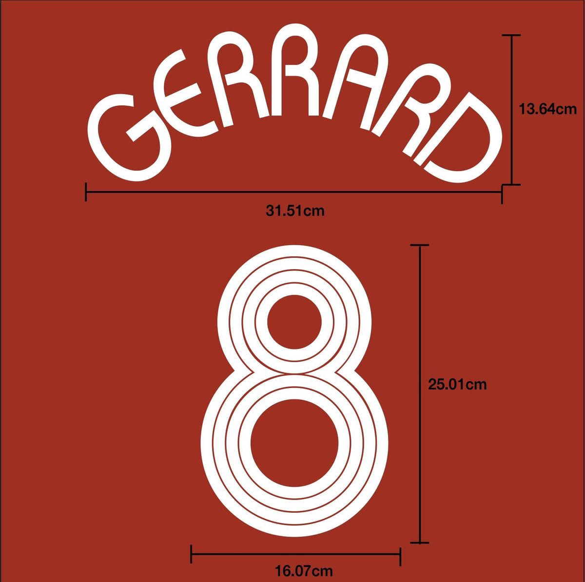
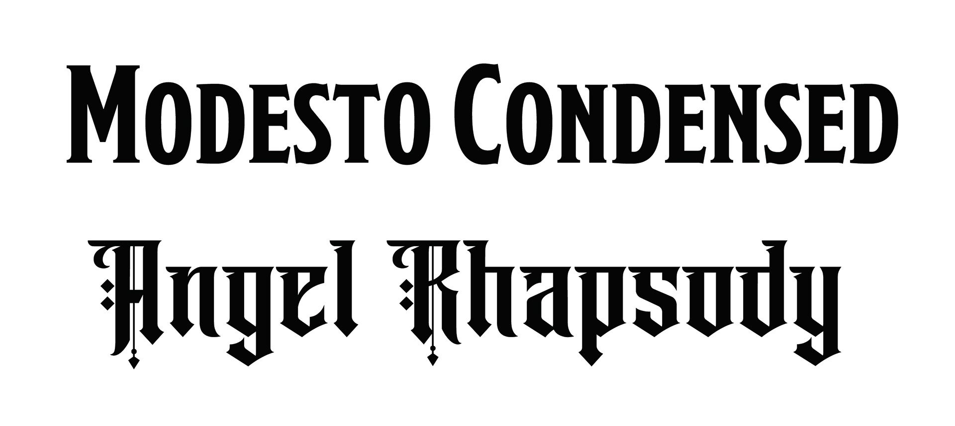
Font and number design


A multitude of fonts were considered, but he gravitated towards a font with classic gothic character that still was easily legible, inspired by various Premier League Teams from recent years.
The final fonts used were Modesto Condensed for the names, and Angel Rhapsody for the numbers.
Paired with a white collar with blue accent stripe, to give an additional touch of class and pop, It all blended together.
And so, the final design was settled upon.
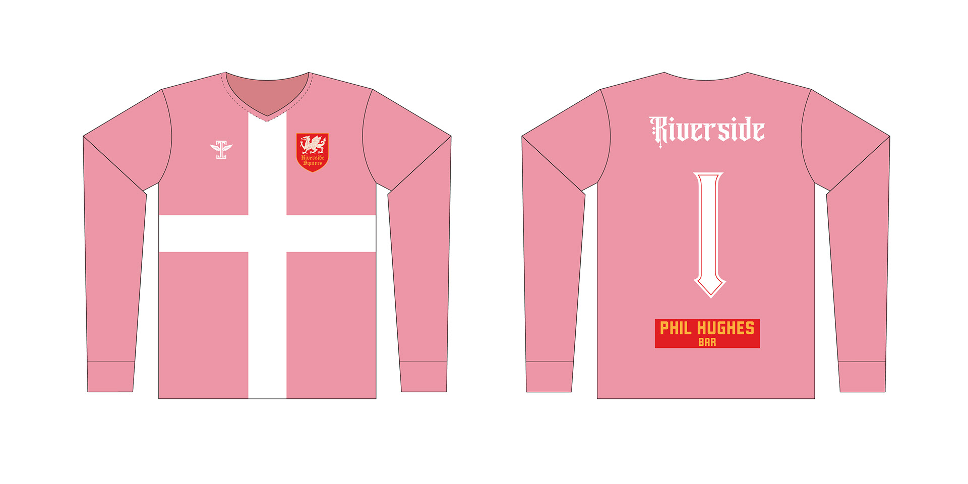
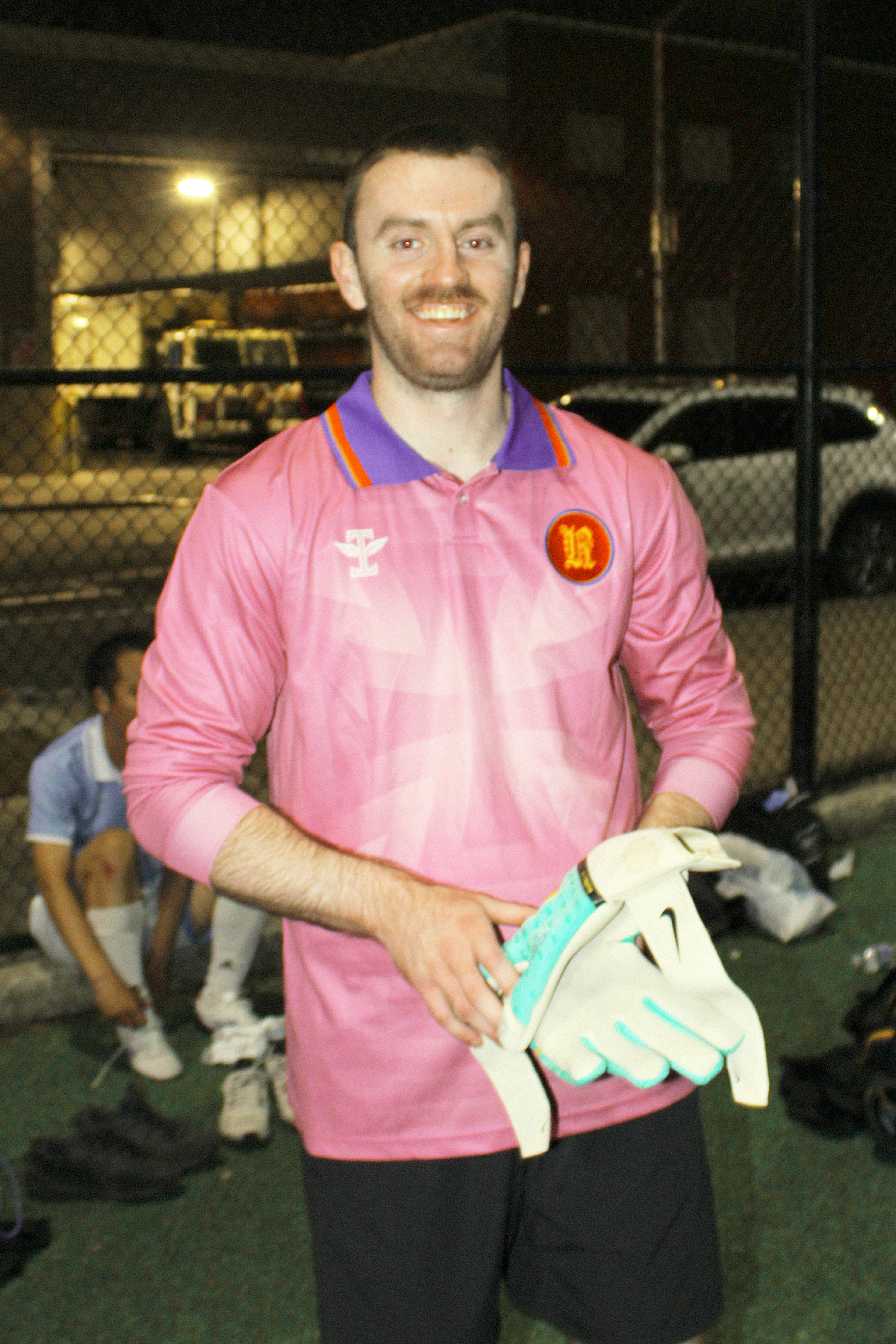
Goalkeeper Kit Design
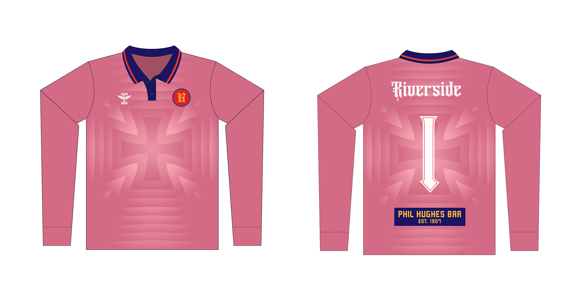
The cross / crest idea was never abandoned; in fact, when paired with a bright pink, it made for an even bolder & louder design.
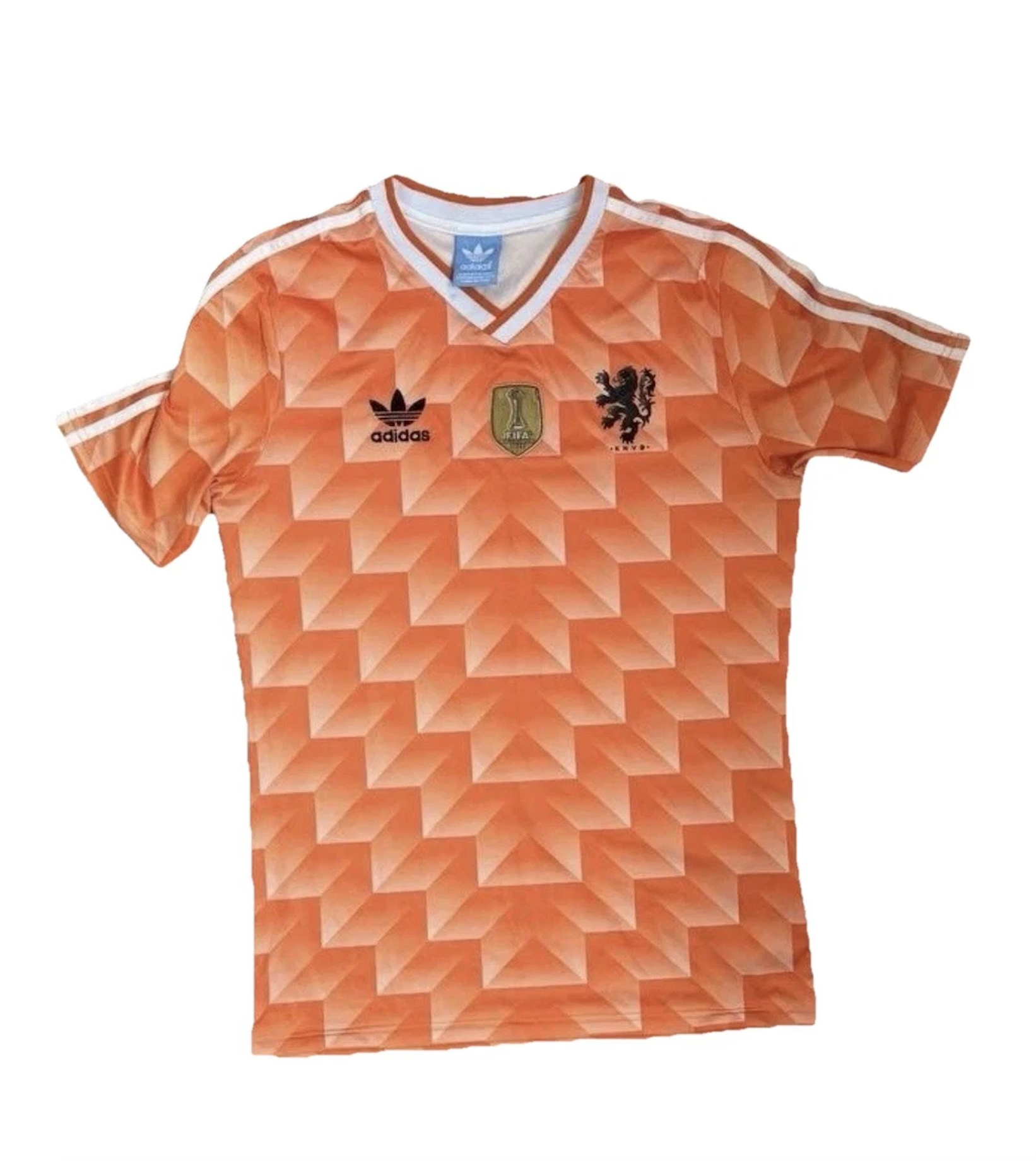
The gradient concept was taken from Iconic 80's world cup kits that have never gone out of style.

The cross and gradient concepts paired together to create an unforgettable design. Goalkeepers are meant to stand out from the pack; not only through uniform, but often times through personality as well. And this kit design certainly achieves that.
And so, the future of the Riverside Squires was defined, boldly & confidently.
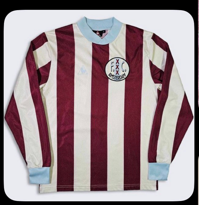
Early & other designs