Jerry Lonergan is (at the time of design) a 70-year-old native of Salina, Kansas, born and raised. In late 2025 Jerry was approached by representatives of the local Democratic party to run as their representative for District 71 in the State House 2026 Elections.
Jerry is not your typical politician. He's not one at all, actually. He was simply a local in the community, well known by peers for his work through local Irish Organizations, and otherwise a largely unknown name in the area.
The challenge was to create a visual identity for his campaign that would help all generations of Salina Kansans see he is the perfect balance of knowledgeable, professional, and fun, in order to earn their trust, and their votes.

Inspiration
Giovanni began by looking to the past and present for inspiration. What has worked in Kansas before? What is working in modern politics this year right now?
The color green
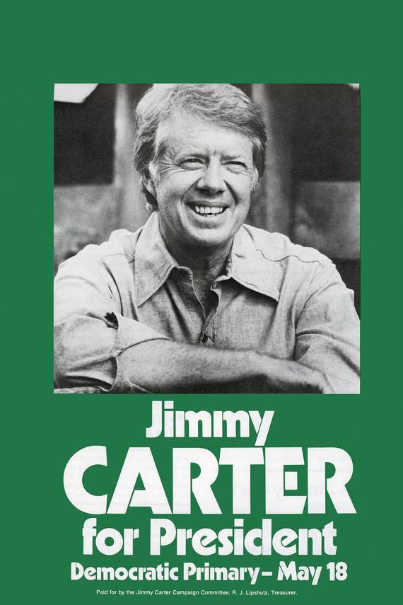
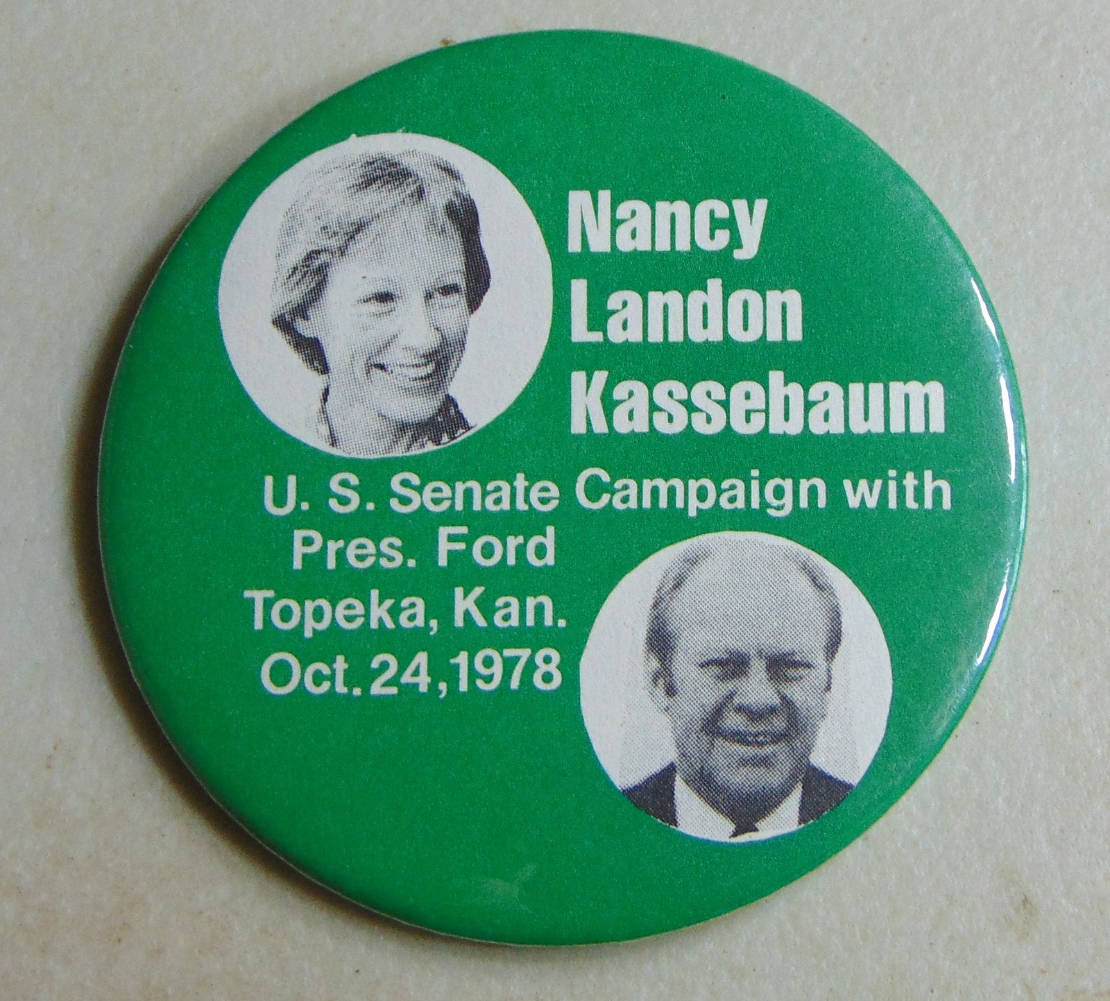
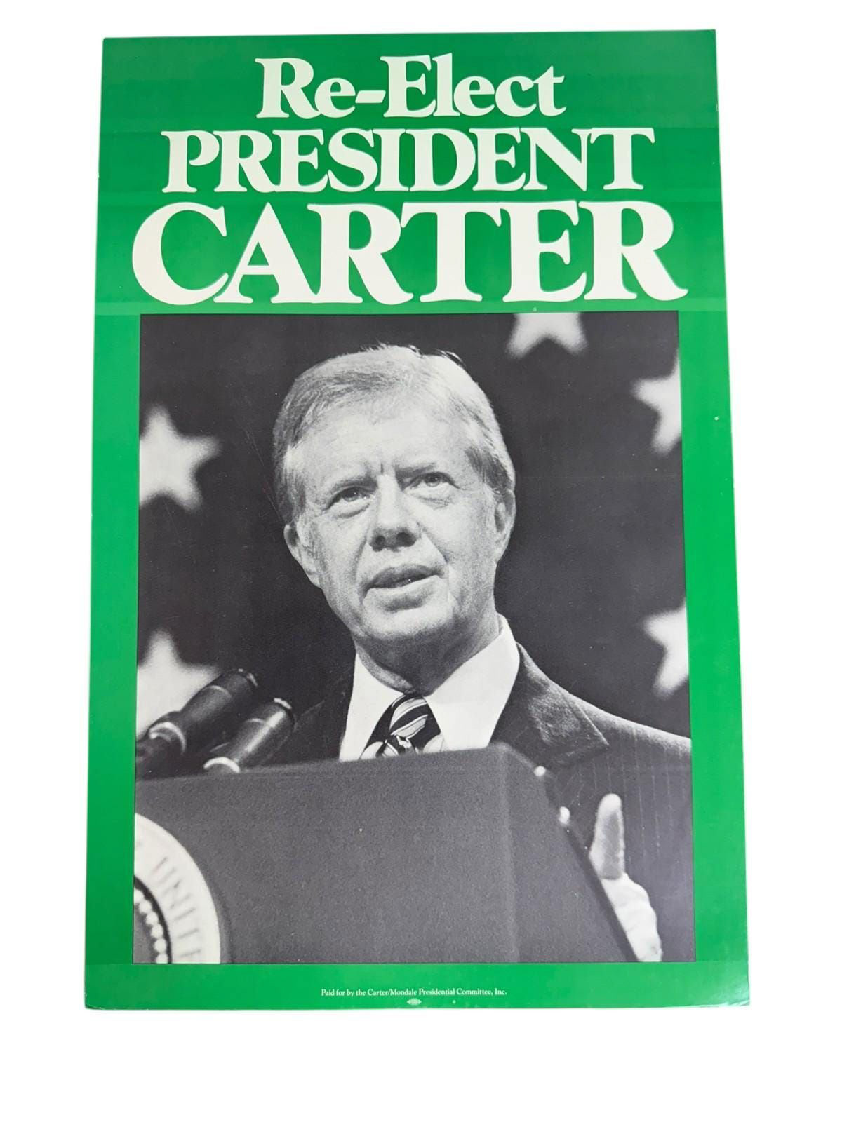
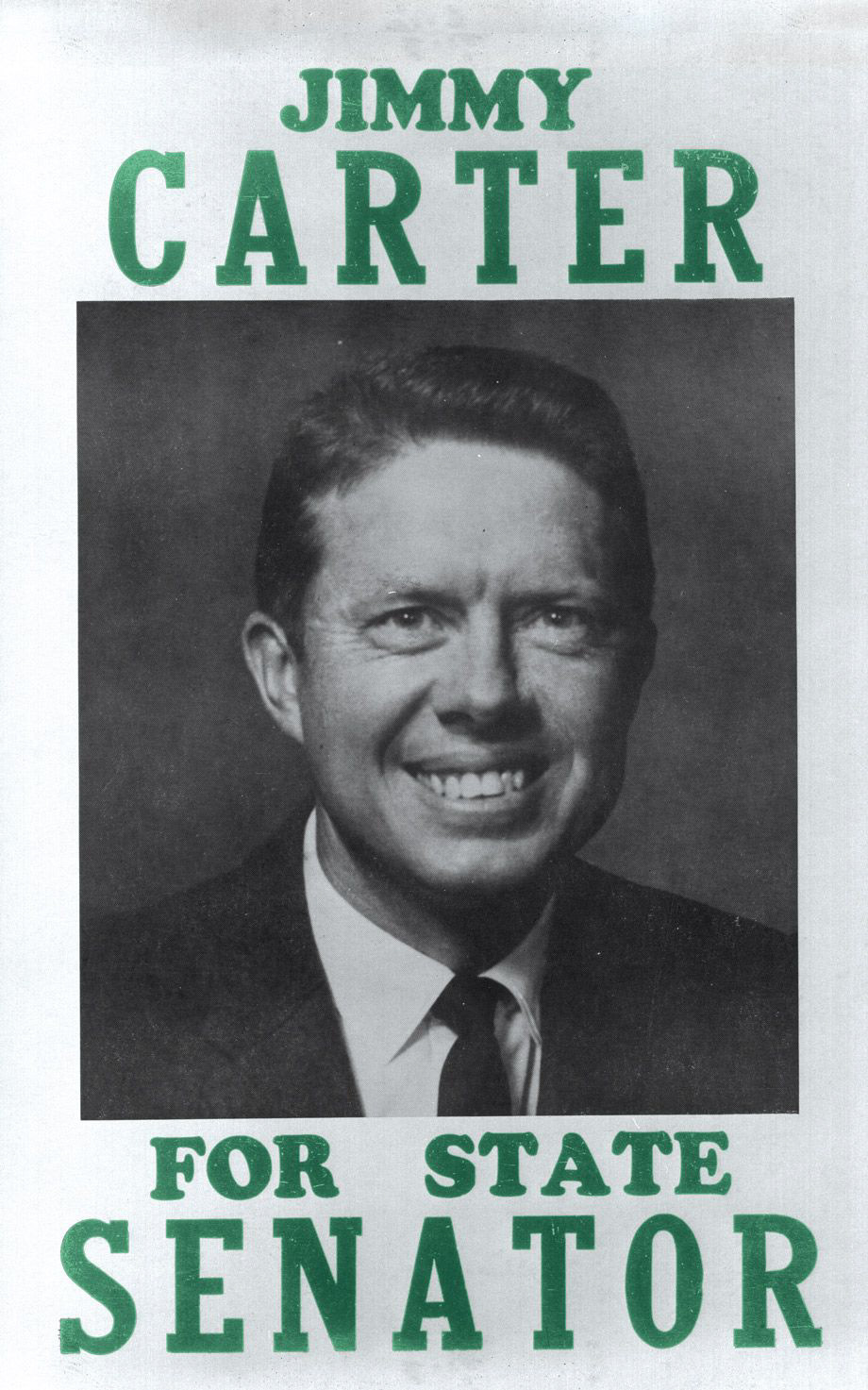
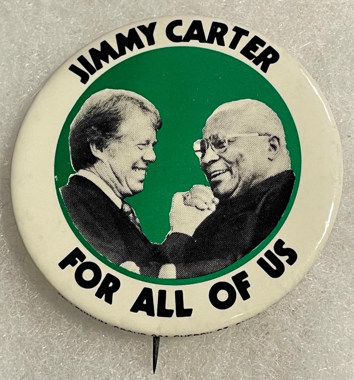
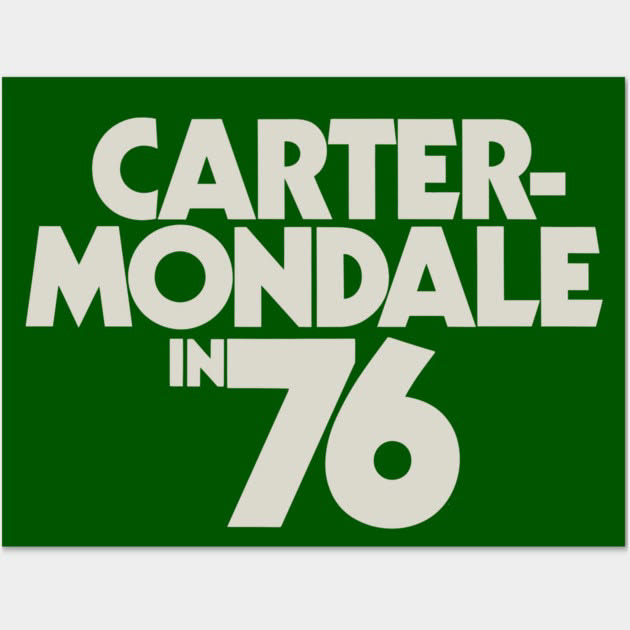
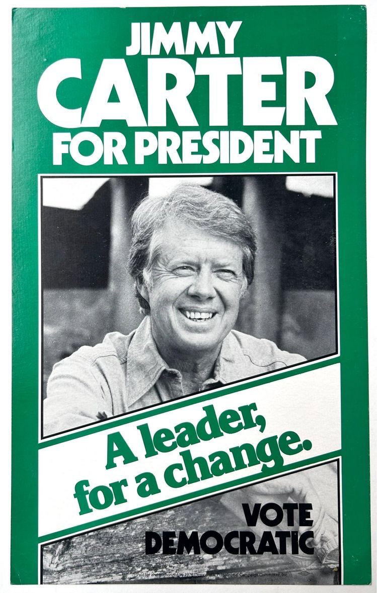
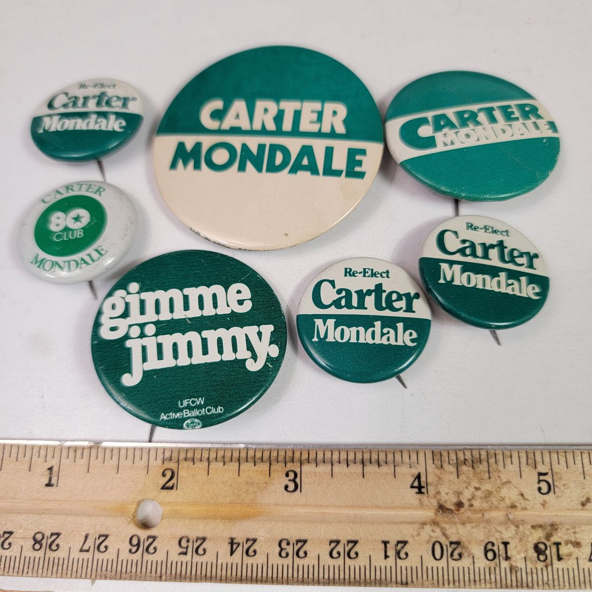
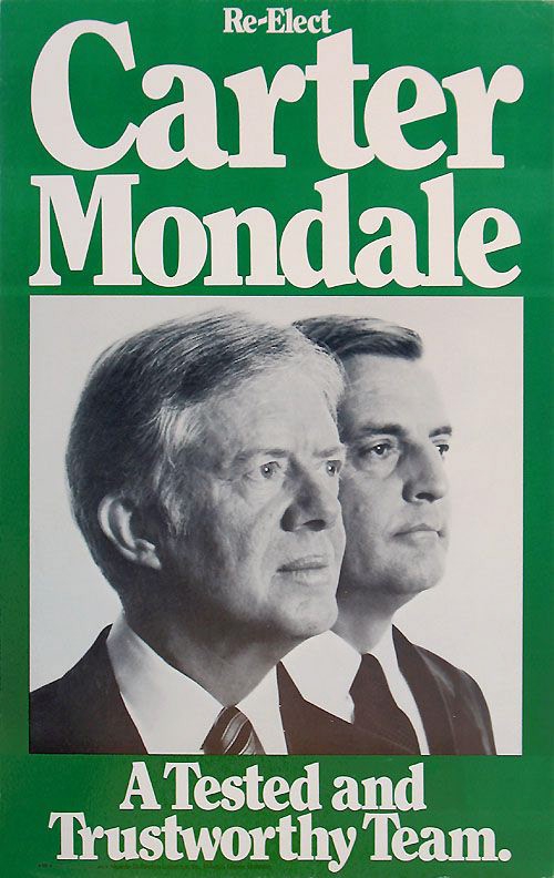
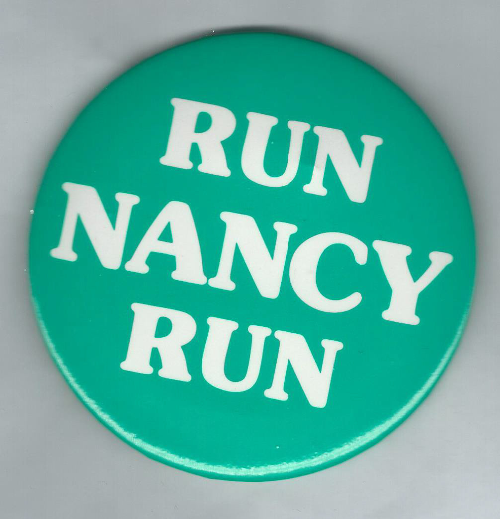
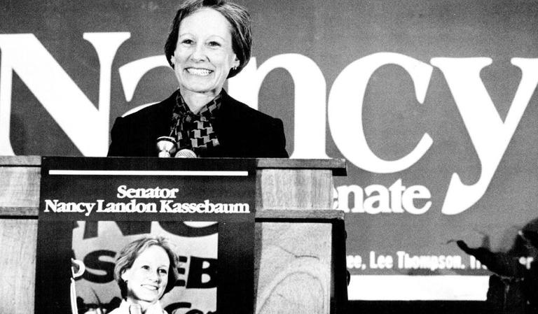
Jerry requested a green color pallet. An undoubtedly unique move, but not unprecedented. Jimmy Carter famously ran for Senate and President using green as his primary color, as did famous Kansan senator Nancy Kassebaum in the late 90's.
Not only does green reflect the Irish roots of Jerry Lonergan, but it also makes it clear he does not want to fully associate with any political party, or be viewed as a traditional politician. This was not only Jerry's intention, but a genuine reflection of his identity, so we felt it worked quite well for him.
He also looked at the current Republican incumbent's signage, who barring a
We determined it would not be too hard to differentiate from something that felt so traditionally political.
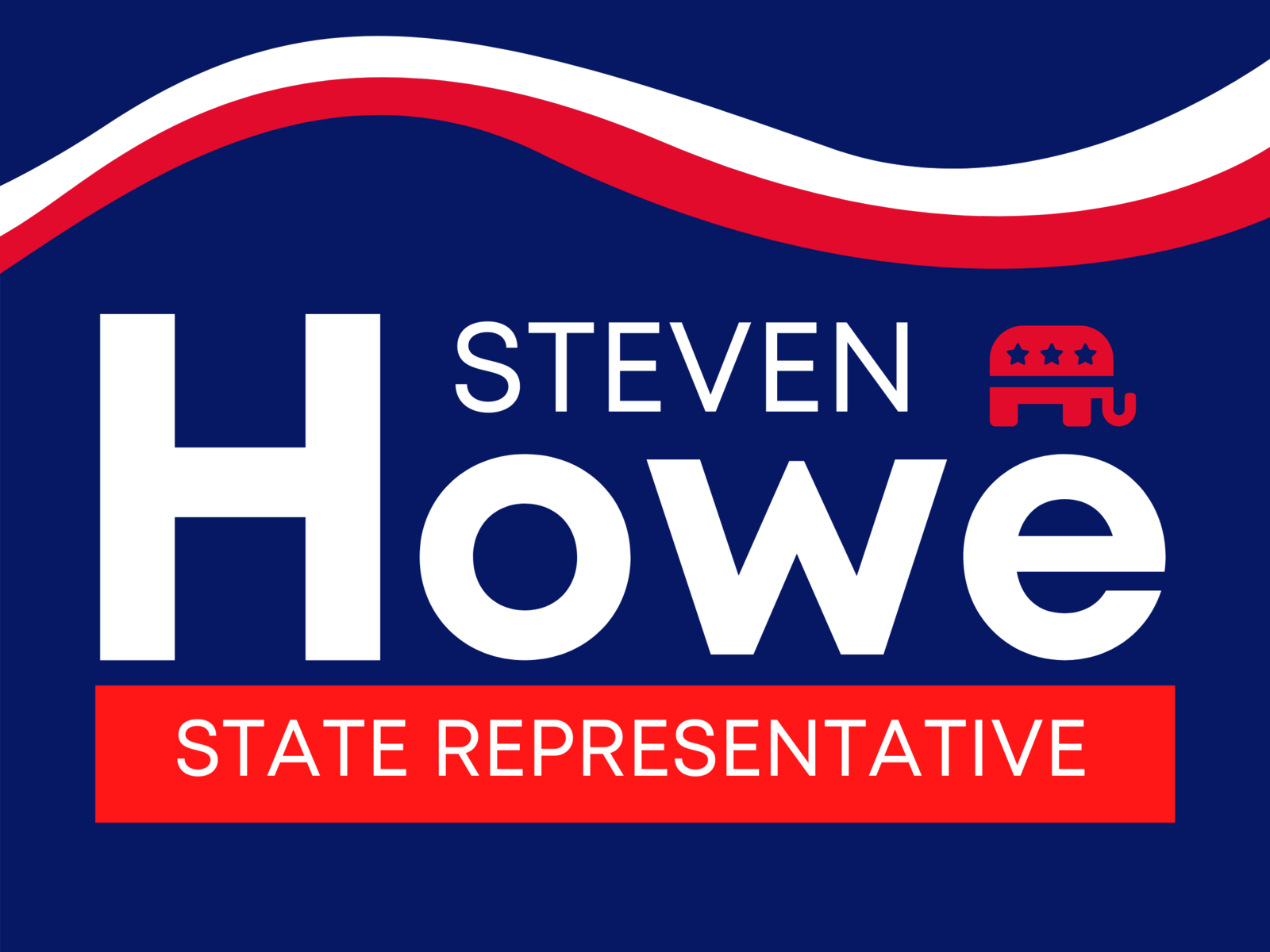
Giovanni did like how the incumbent's full name and seat appeared on his logo / signage; clearly defining what name people will be seeing on their ballots, and what he is running for. He felt it would be good for Jerry to do the same, especially since Howe is more well-known that he. That way people around the area who see his signage will know he is directly running against Howe.
When looking to the fonts, its quite clear that currently big, bold exciting fonts with character are making a comeback throughout all design. Of course, some semblance of professionalism must be maintained. But could we find an easily-legible font that also had subtle character or appeasing elements, rather than be cold and bland.
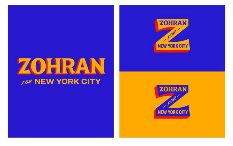
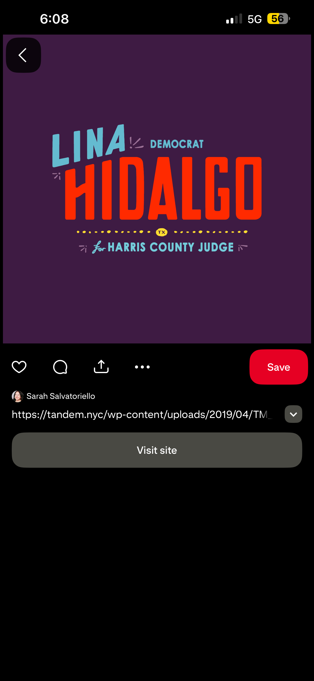
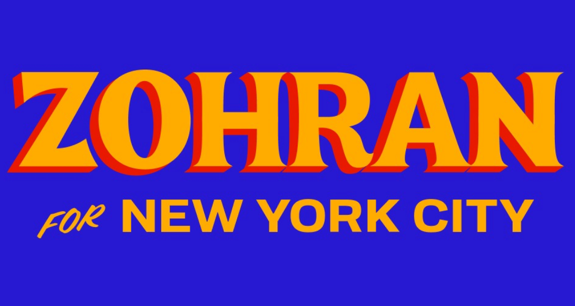
Similarly, adding the element of the drop shadow is a way to incorporate a visually appealing element without adding too much clutter. Zohran Mamdani did both of these quite effectively in his recent mayoral campaign for New York City, something Giovanni took great inspiration from, because being in the city he could see first-hand its effectiveness and appeal amongst New Yorkers of all ages.
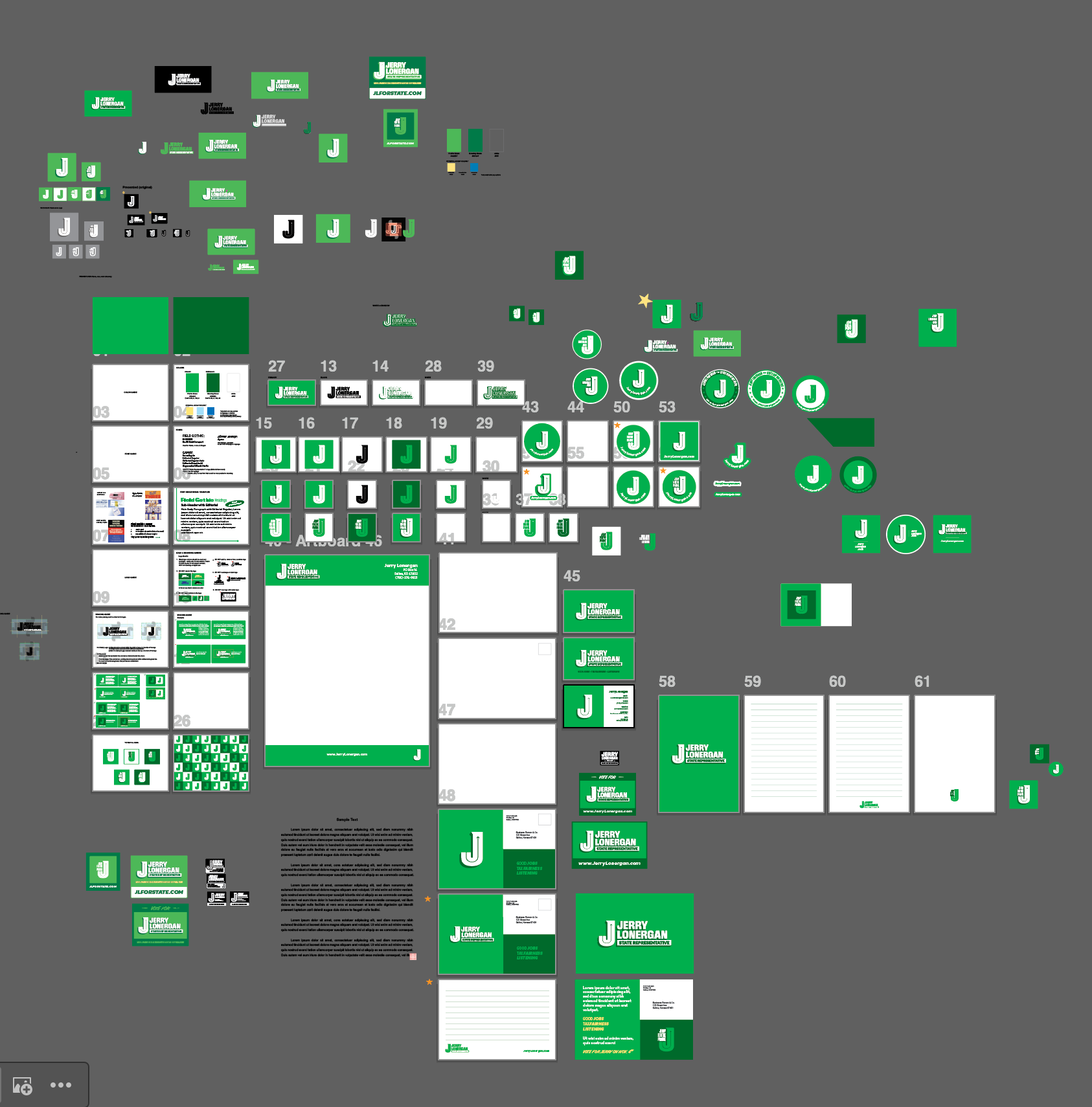
Process:
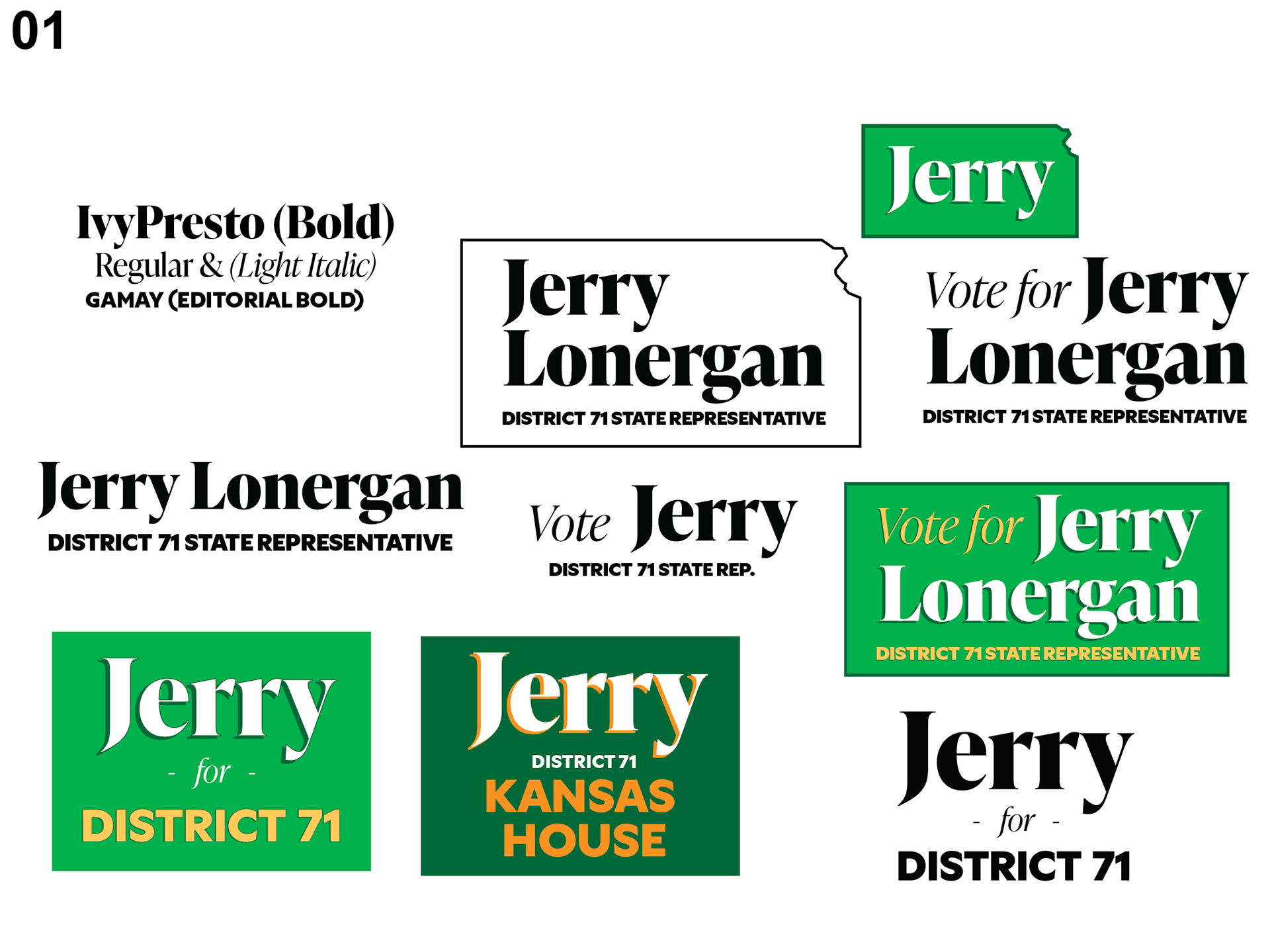
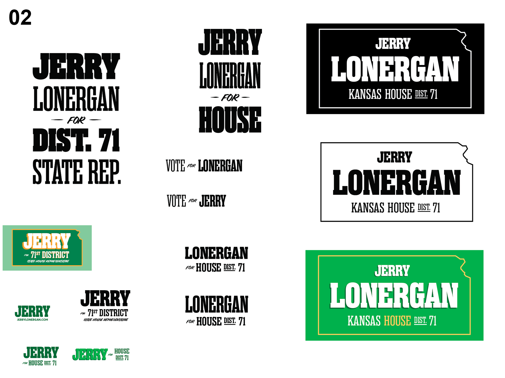
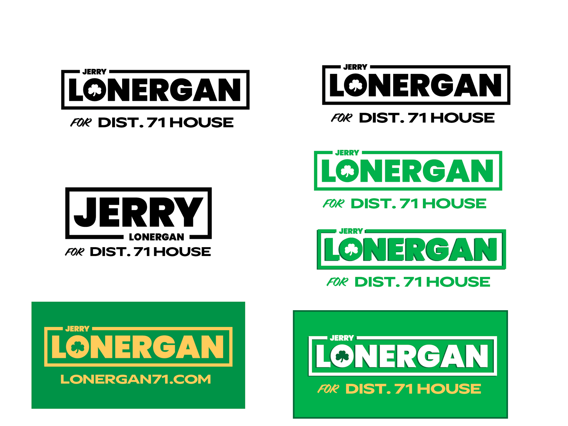
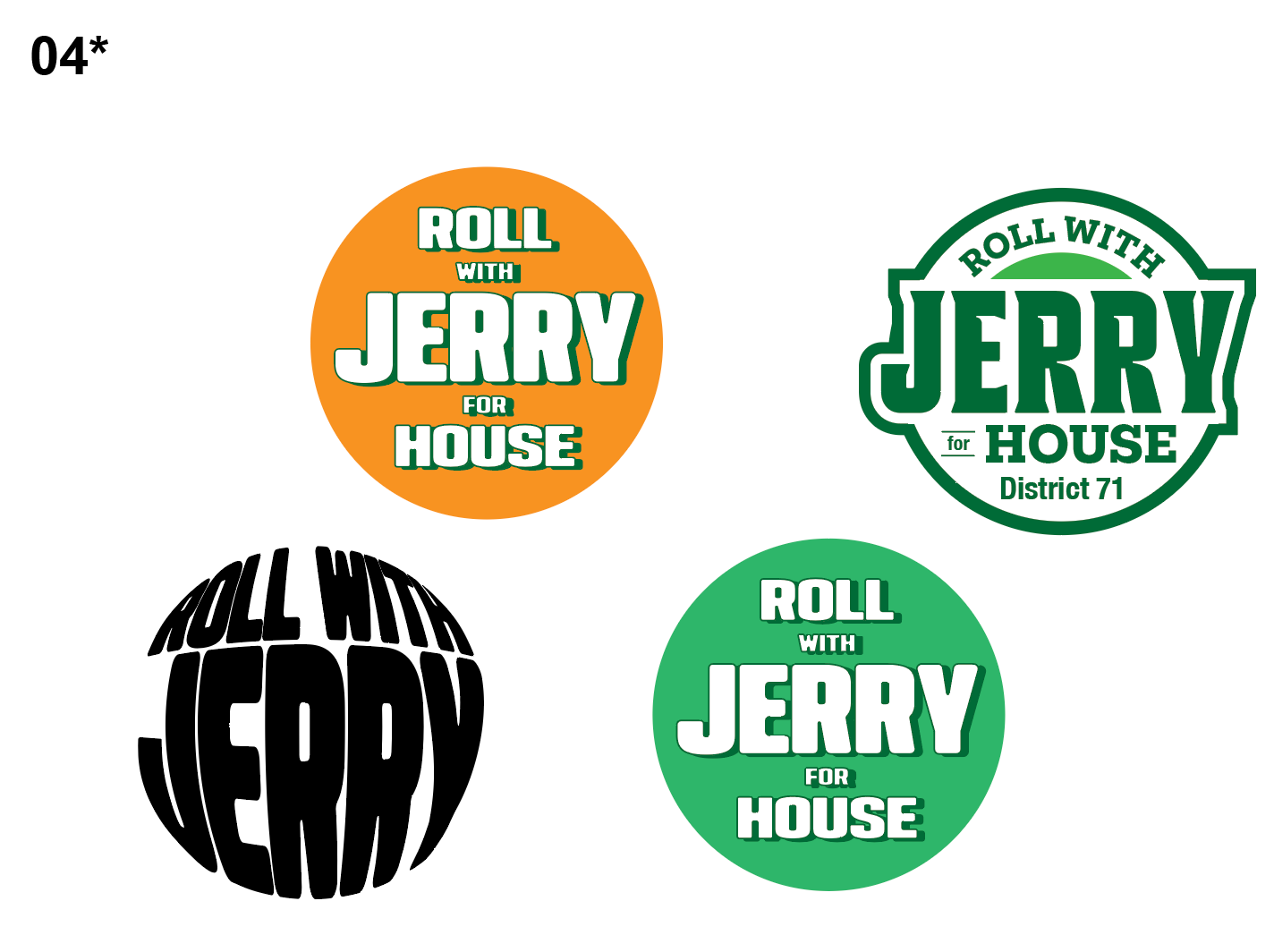
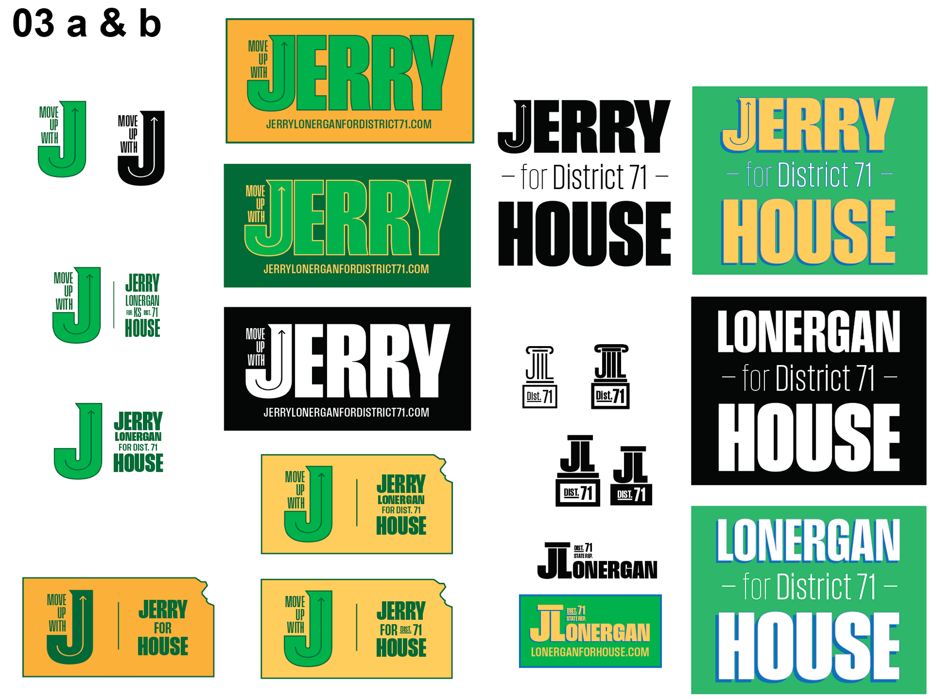
In addition to inspiration of other political marks, there was exploration in putting emphasis on different pieces of Jerry's personality; 02 was designed to come across as more classic signage with midwestern feel. 03 is an obvious ode to Jerry's Irish roots. 04 ties in with Jerry's work with the Irish Road Bowling event in Salina, while also exemplifying his jolly personality.
But Giovanni wanted to be careful not to pin down Jerry's image too narrowly. And as he continued to explore, there was one idea that stood out above the rest to both he and Jerry.
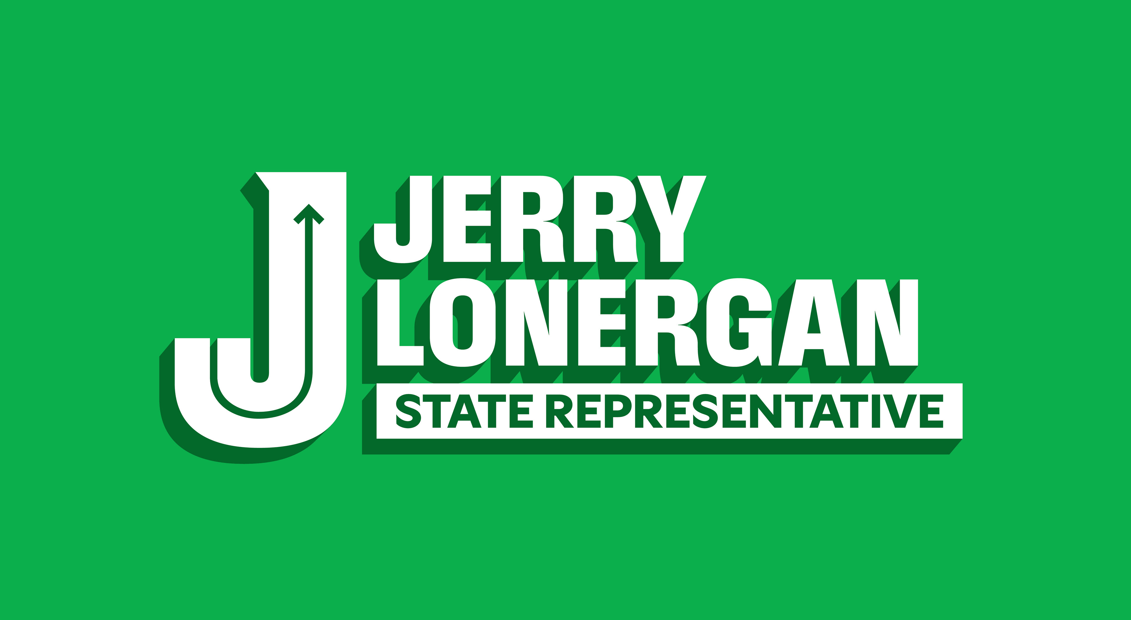
Utilizing field gothic, which provides a fresh and clean san-serif take on a leaner, western feeling font, Giovanni also incorporated the design of an arrow going through the J.
The initial feel was that line represented the growth and progressive movement that Jerry would bring with his campaign. It also was reminiscent of a smile, giving off a friendly appearance.
Through a couple more rounds of revision, this concept would be further developed into what would become the final logo for the campaign.
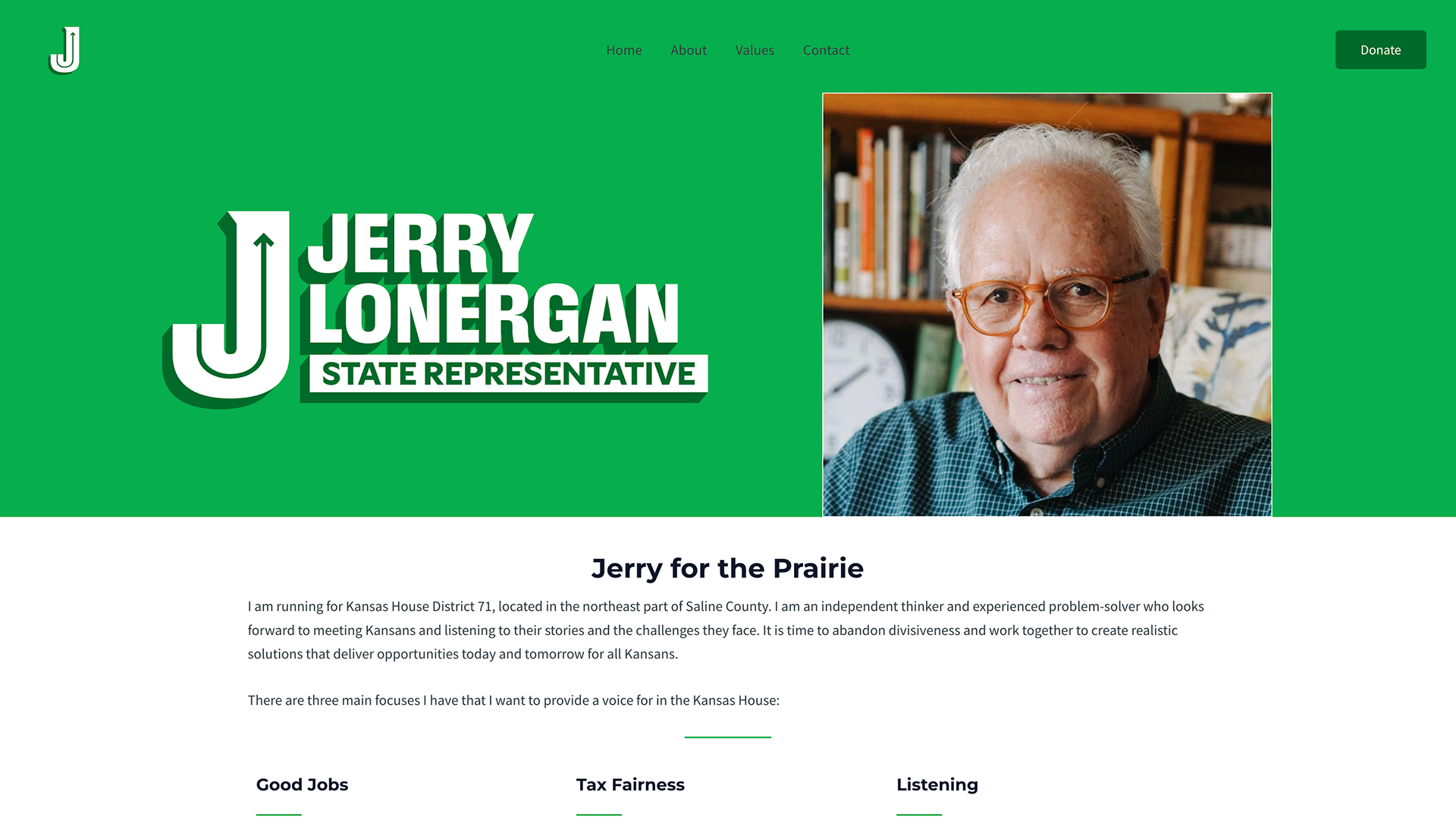
The final logo:

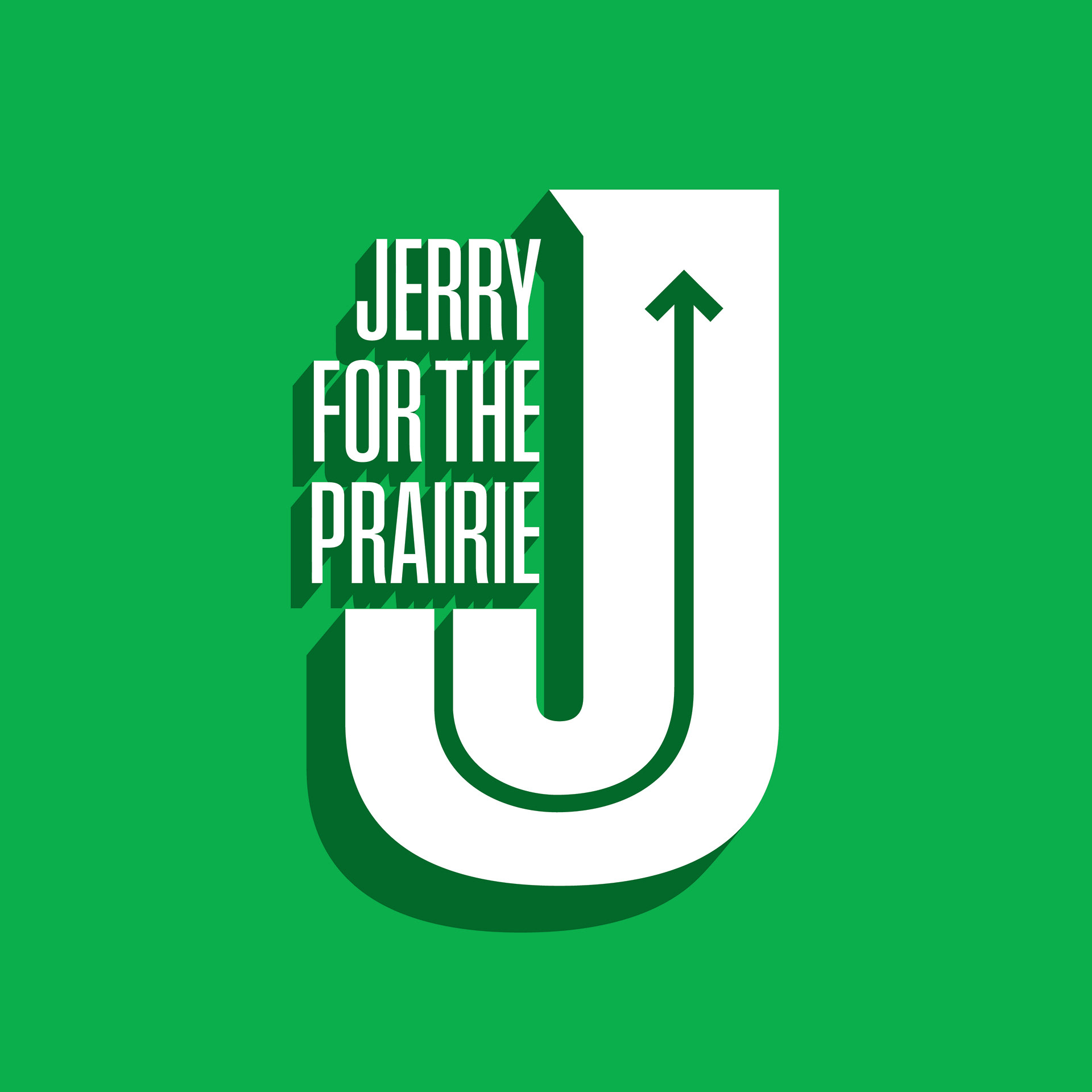
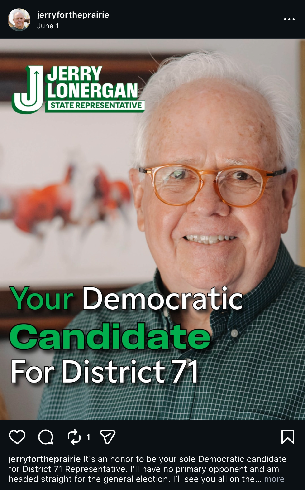
Additional implementation of logo by social design team, not Giovanni directly
Website:
Socials: